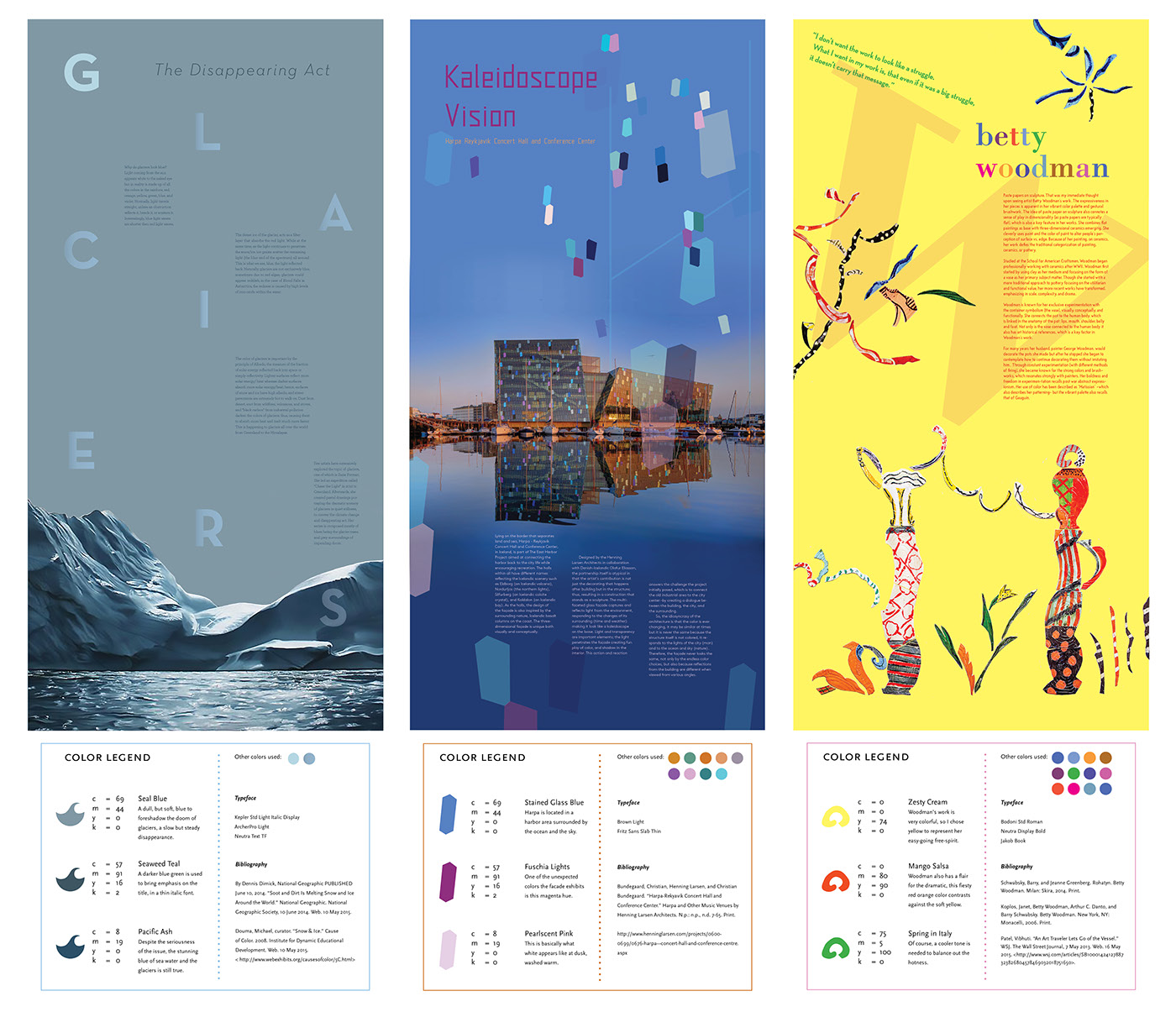
on the posters:
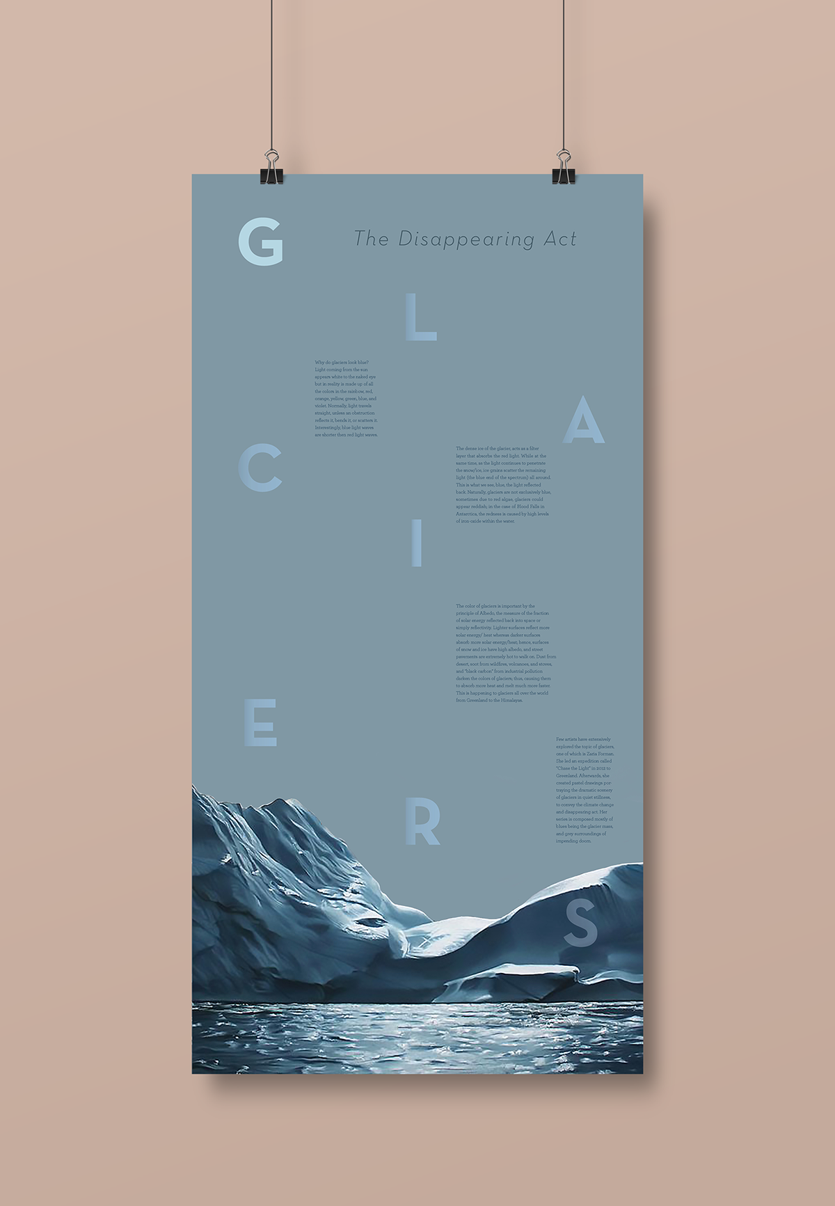
G for Glacier
Why do glaciers look blue? Light coming from the sun appears white to the naked eye but in reality is made up of all the colors in the rainbow, red, orange, yellow, green, blue, and violet. Normally, light travels straight, unless an obstruction reflects it, bends it, or scatters it. Interestingly, blue light waves are shorter then red light waves.
The dense ice of the glacier, acts as a filter layer that absorbs the red light. While at the same time, as the light continues to penetrate the snow/ice, ice grains scatter the remaining light (the blue end of the spectrum) all around. This is what we see, blue, the light reflected back. Naturally, glaciers are not exclusively blue, sometimes due to red algae, glaciers could appear reddish; in the case of Blood Falls in Antarctica, the redness is caused by high levels of iron-oxide within the water.
The color of glaciers is important by the principle of Albedo, the measure of the fraction of solar energy reflected back into space or simply reflectivity. Lighter surfaces reflect more solar energy/ heat whereas darker surfaces absorb more solar energy/heat; hence, surfaces of snow and ice have high albedo, and street pavements are extremely hot to walk on. Dust from desert, soot from wildfires, volcanoes, and stoves, and “black carbon” from industrial pollution darken the colors of glaciers; thus, causing them to absorb more heat and melt much more faster. This is happening to glaciers all over the world from Greenland to the Himalayas.
Few artists have extensively explored the topic of glaciers, one of which is Zaria Forman. She led an expedition called “Chase the Light” in 2012 to Greenland. Afterwards, she created pastel drawings portraying the dramatic scenery of glaciers in quiet stillness, to convey the climate change and disappearing act. Her series is composed mostly of blues being the glacier mass, and grey surroundings of impending doom.
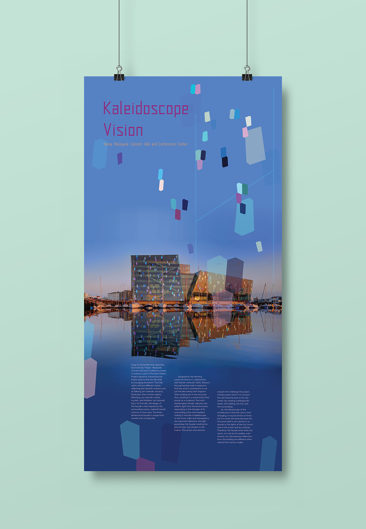
H for Harpa Reykjavik Concert Hall and Conference Center
Lying on the border that separates land and sea, Harpa - Reykjavik Concert Hall and Conference Center, in Iceland, is part of The East Harbor
Project aimed at connecting the harbor back to the city life while encouraging recreation. The halls within all have different names reflecting the Icelandic scenery such as Eldborg (an Icelandic volcano), Nordurljos (the northern lights), Silfurberg (an Icelandic calcite crystal), and Kaldalon (an Icelandic bay). As the halls, the design of the façade is also inspired by the surrounding nature, Icelandic basalt columns on the coast. The three-dimensional façade is unique both visually and conceptually.
Project aimed at connecting the harbor back to the city life while encouraging recreation. The halls within all have different names reflecting the Icelandic scenery such as Eldborg (an Icelandic volcano), Nordurljos (the northern lights), Silfurberg (an Icelandic calcite crystal), and Kaldalon (an Icelandic bay). As the halls, the design of the façade is also inspired by the surrounding nature, Icelandic basalt columns on the coast. The three-dimensional façade is unique both visually and conceptually.
Designed by the Henning Larsen Architects in collaboration with Danish Icelandic Olafur Eliasson, the partnership itself is atypical in that the artist’s
contribution is not just the decorating that happens after building but in the structure; thus, resulting in a construction that stands as a sculpture. The
multifaceted glass façade captures and reflects light from the environment, responding to the changes of its surrounding (time and weather) making it look like a kaleidoscope on the loose. Light and transparency are important elements; the light penetrates the façade creating fun play of color, and shadow in the interior. This action and reaction answers the challenge the project initially posed, which is to connect the old industrial area to the city center –by creating a dialogue between the building, the city, and the surrounding.
So, the idiosyncrasy of the architecture is that the color is ever changing, it may be similar at times but it is never the same because the structure itself is not colored, it responds to the lights of the city (man) and to the ocean and sky (nature). Therefore, the façade never looks the same, not only by the endless color choices, but also because reflections from the building are different when viewed from various angles.
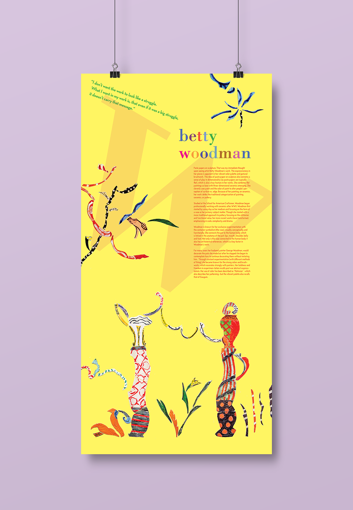
W for Woodman, Betty
Paste papers on sculpture. That was my immediate thought upon seeing artist Betty Woodman’s work. The expressiveness in her pieces is apparent in her vibrant color palette and gestural brushwork. The idea of paste paper on sculpture also connotes a sense of play in dimensionality (as paste papers are typically flat), which is also a key feature in her works. She combines flat paintings as base with three-dimensional ceramics emerging. She cleverly uses paint and the color of paint to alter people’s perception of surface vs. edge. Because of her painting, on ceramics, her work defies the traditional categorization of painting, ceramics, or pottery.
Studied at the School for American Craftsmen, Woodman began professionally working with ceramics after WWII. Woodman first started by using clay as her medium and focusing on the form of a vase as her primary subject matter. Though she started with a more traditional approach to pottery
focusing on the utilitarian and functional value, her more recent works have transformed, emphasizing in scale, complexity, and drama.
Woodman is known for her exclusive experimentation with the container symbolism (the vase), visually, conceptually, and functionally. She connects
the pot to the human body, which is linked in the anatomy of the pot: lips, mouth, shoulder, belly and foot. Not only is the vase connected to the human body it also has art historical references, which is a key factor in Woodman’s work.
For many years her husband, painter George Woodman, would decorate the pots she made but after he stopped she began to contemplate how to continue decorating them without imitating him. Through constant experimentation (with different methods of firing), she became known for the strong colors and brush-works, which resonates strongly with painters. Her boldness and freedom in experimentation recalls post war abstract expressionism. Her use of color has been described as “Matissian” -which also describes her patterning- but the vibrant palette also recalls that of Gauguin.
