#salvesimpatia
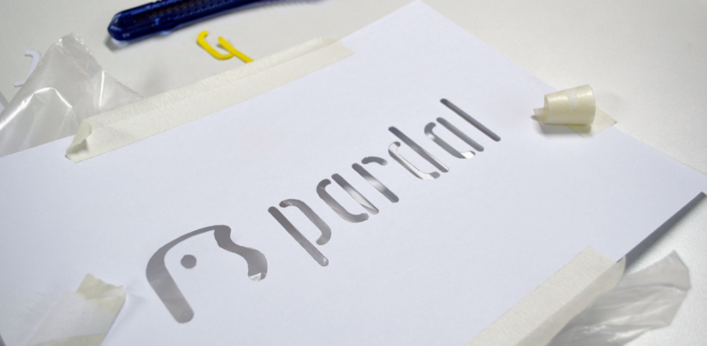
For the popsicles and ice cream brand “Pardal” (the name of a bird species of Brazil), we've created an identity with the concept: “An analogical experience in a digital world”.
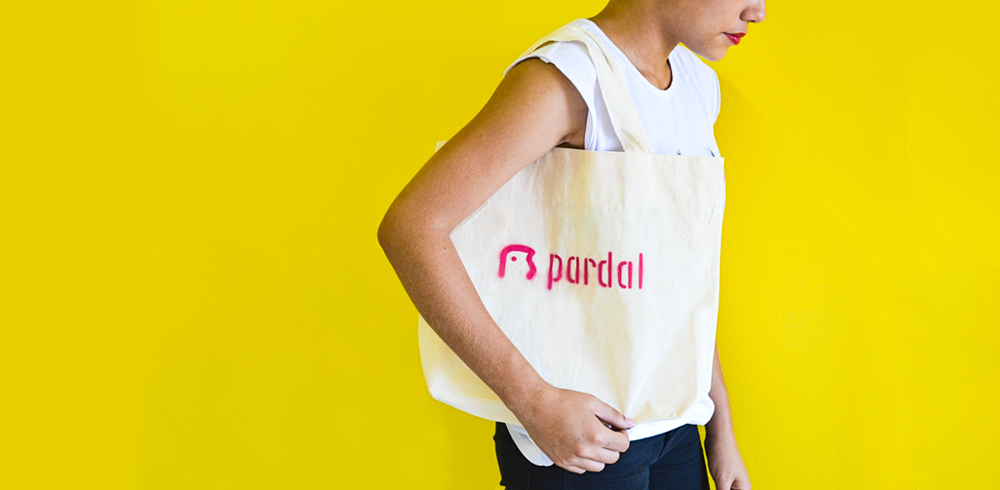
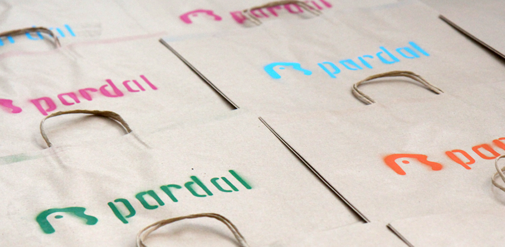
Our goal was to engage people through a brand identity. A brand that comes “out of the paper” and involves our audience. We want to invite people to go outside and live through our brand, interacting with it.
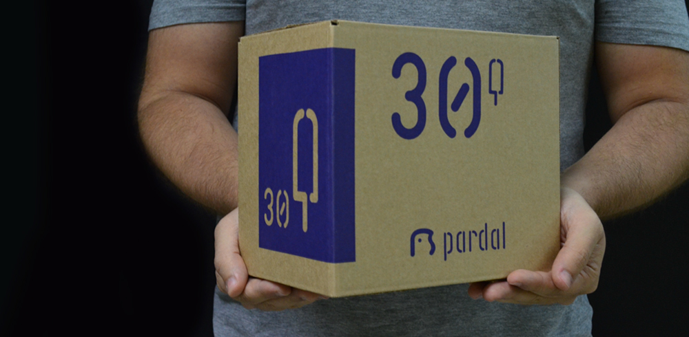
The project was built from its own typeface, the font "Picolé" (Popsicle). This font was inspired by the shape of the popsicle sticks and the stencil technique. The stencil technique, also defined the design of the symbol: the "Pardal" bird.