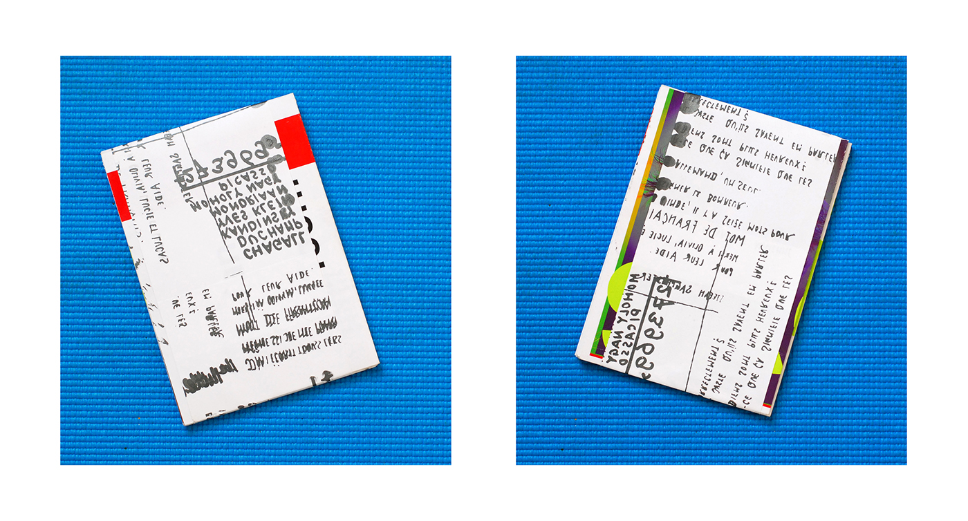
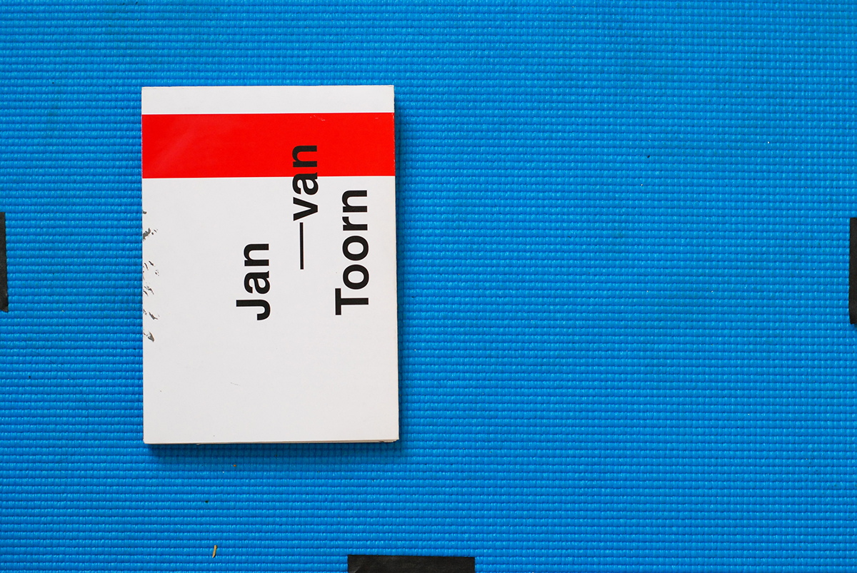
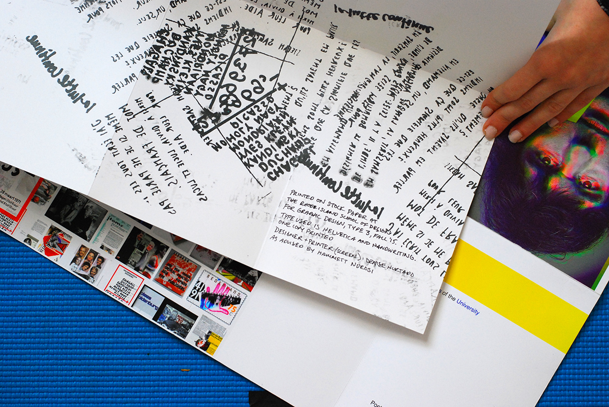
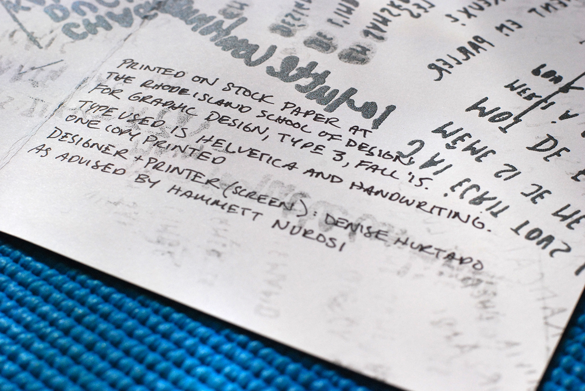
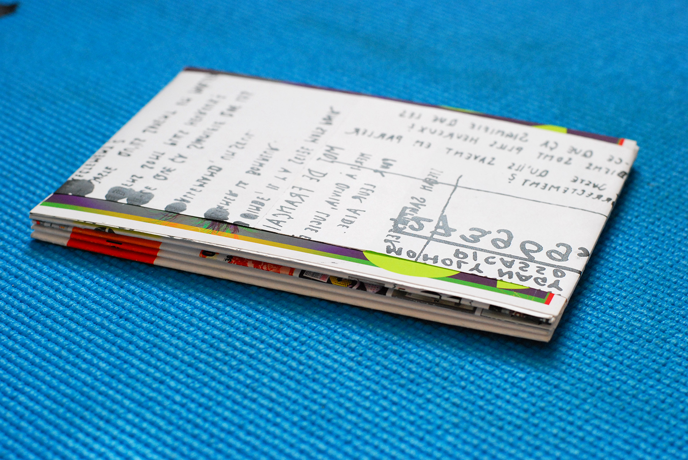
5.5" x 8". Inkjet, Screenprint, and Handwriting on Heavyweight Coated Paper. Accordian Fold. Providence, RI. 2015.
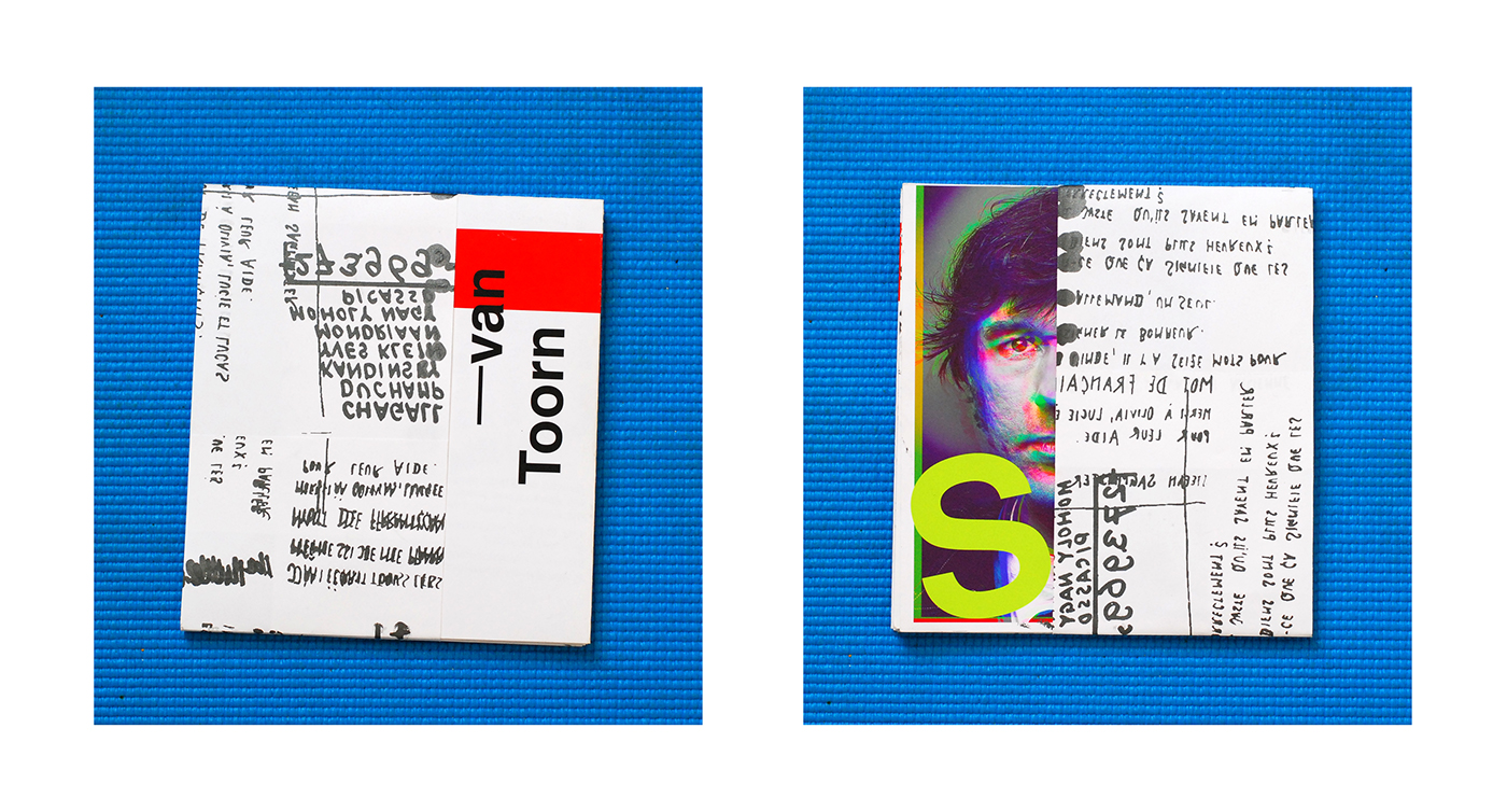
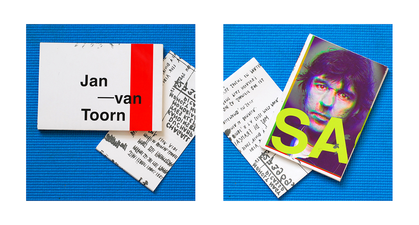
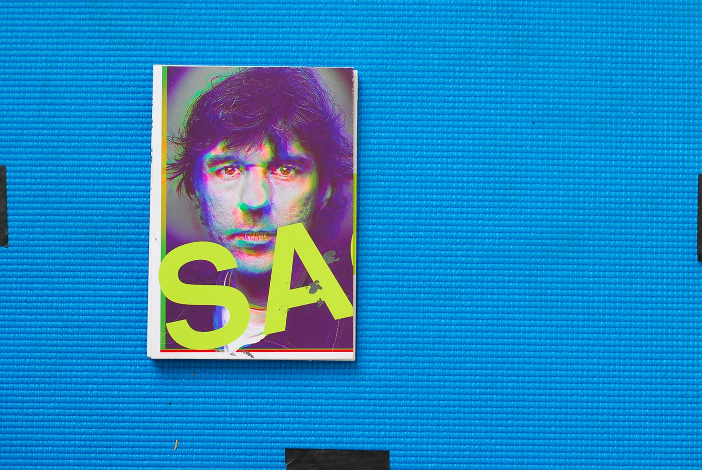
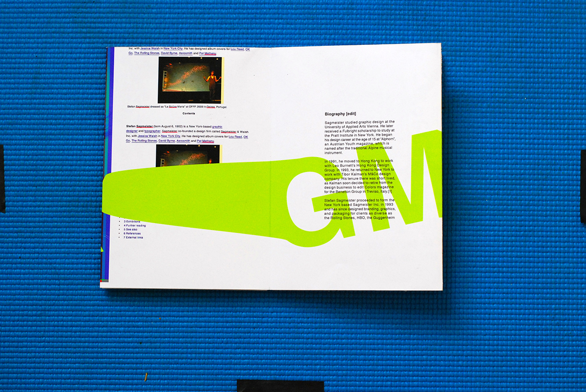
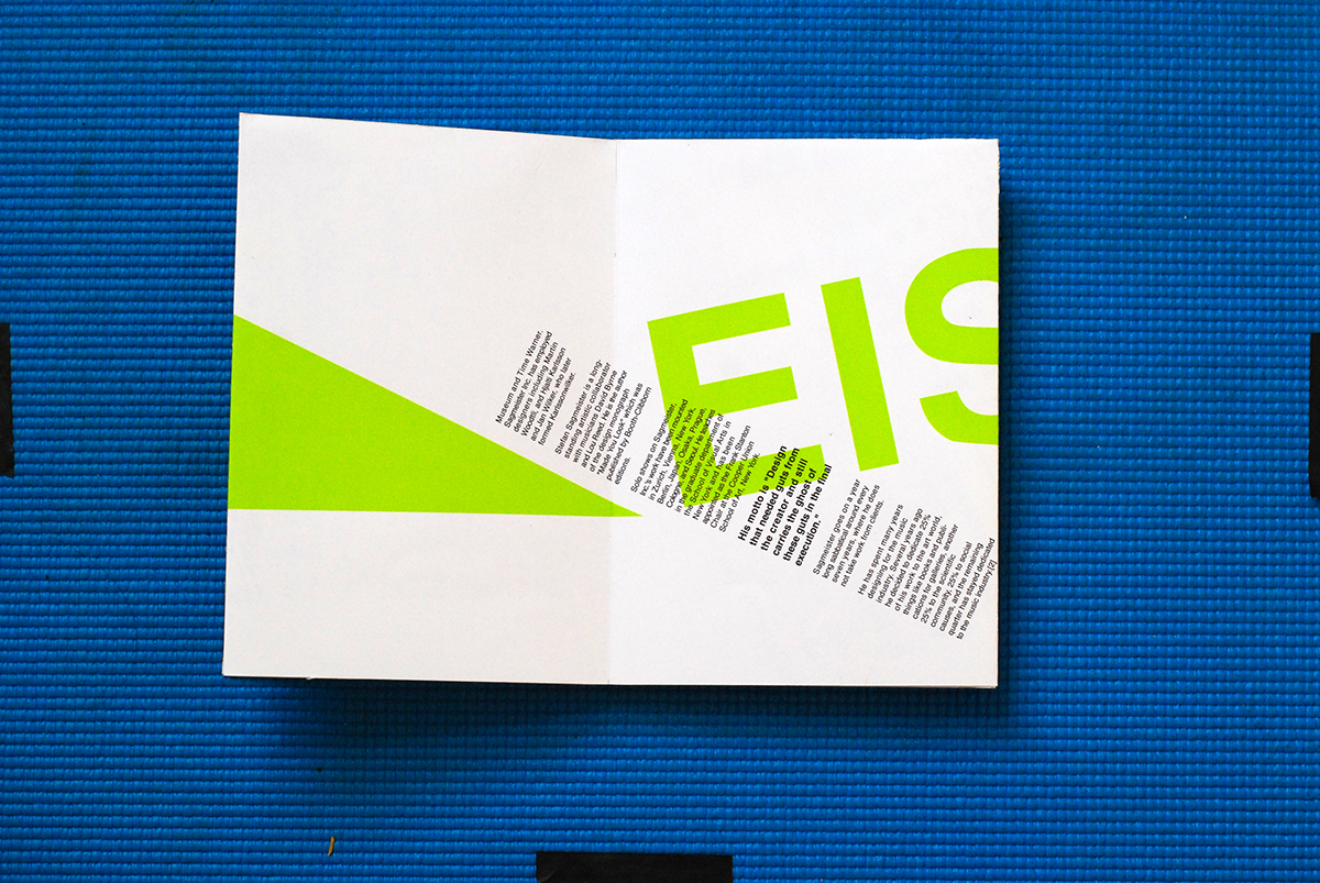
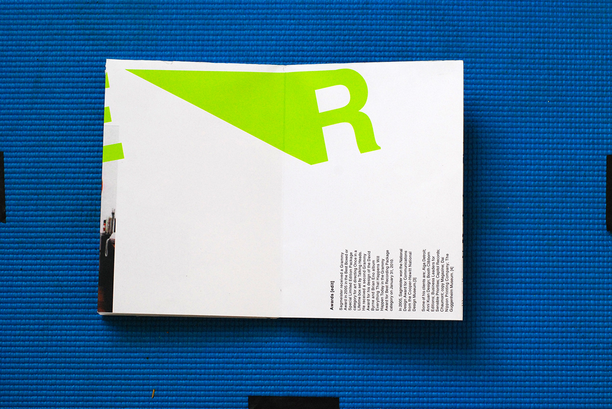
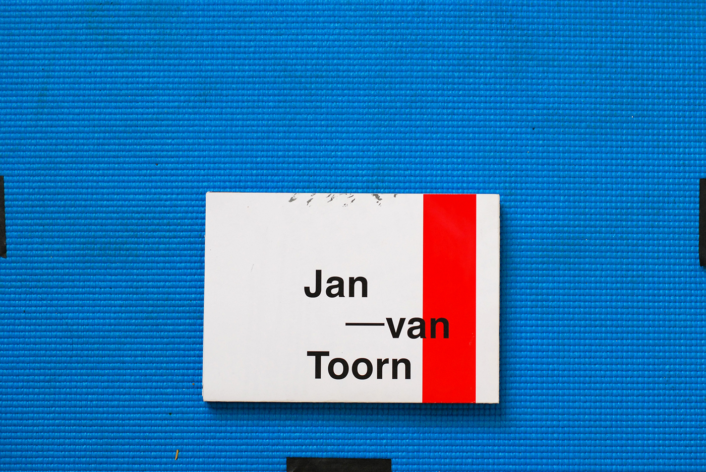
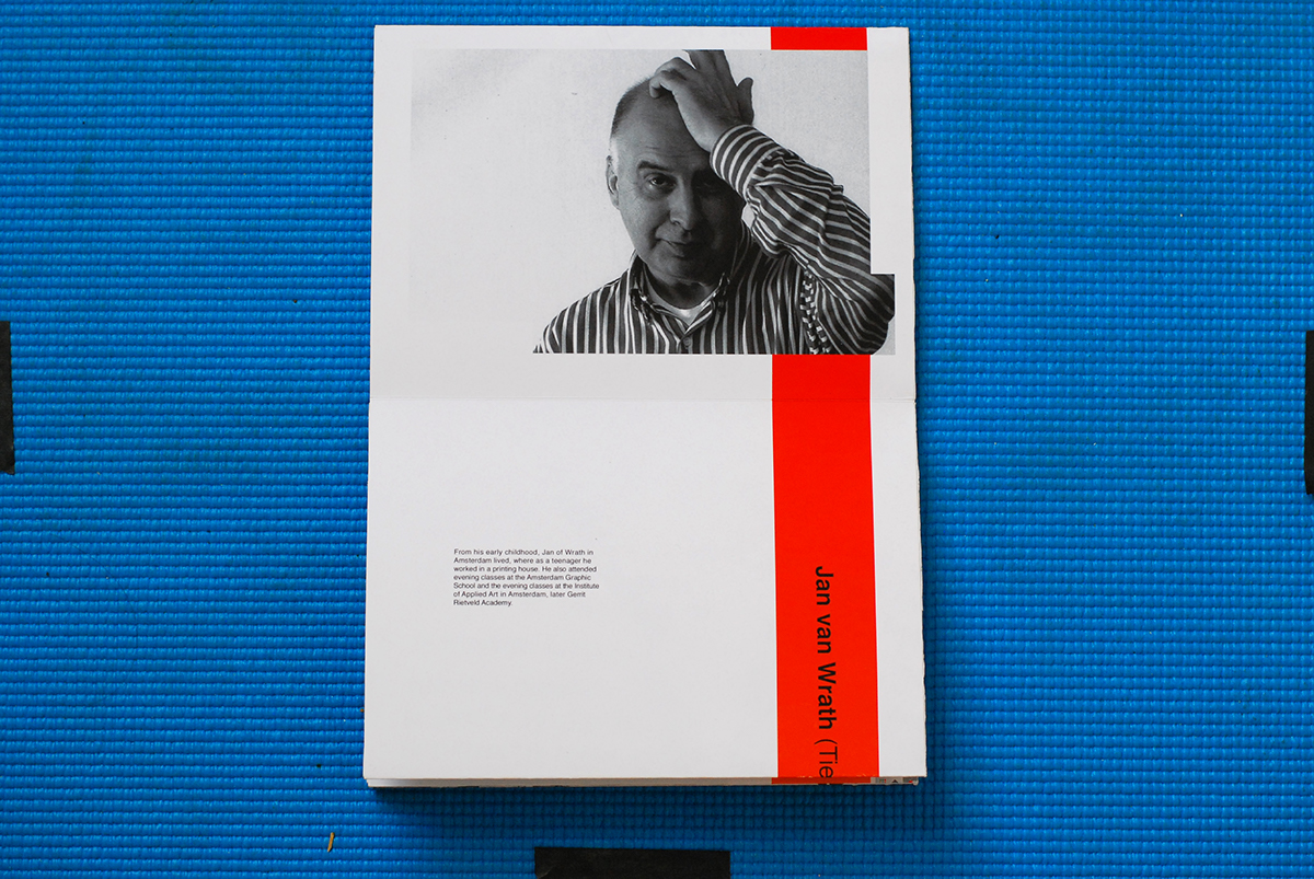
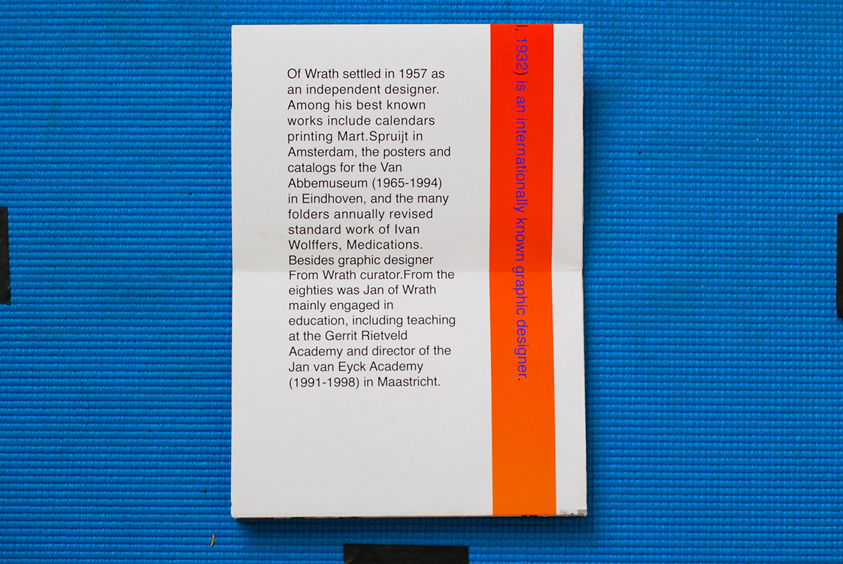
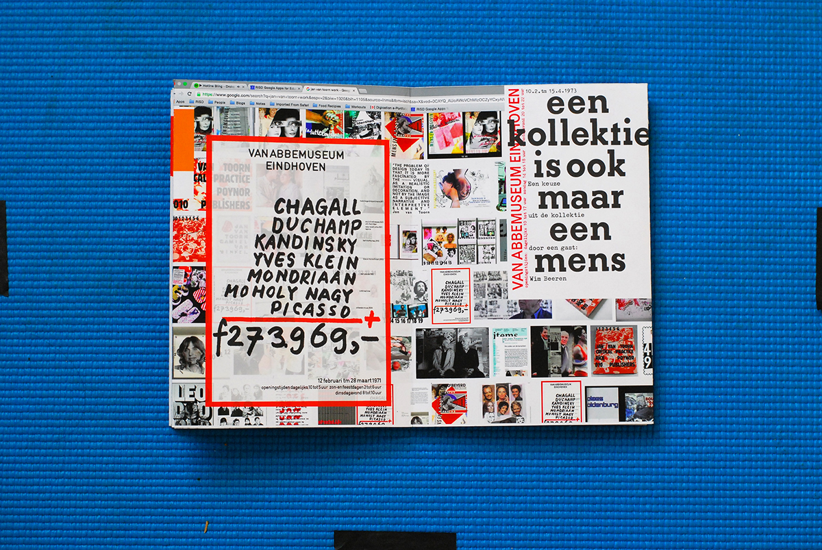
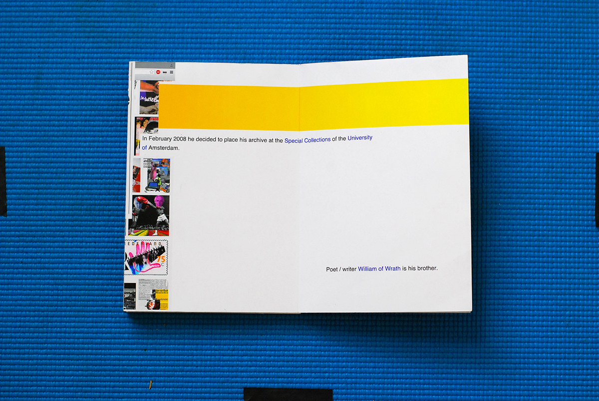
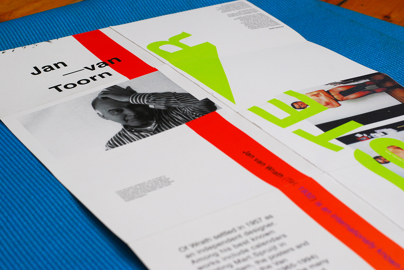
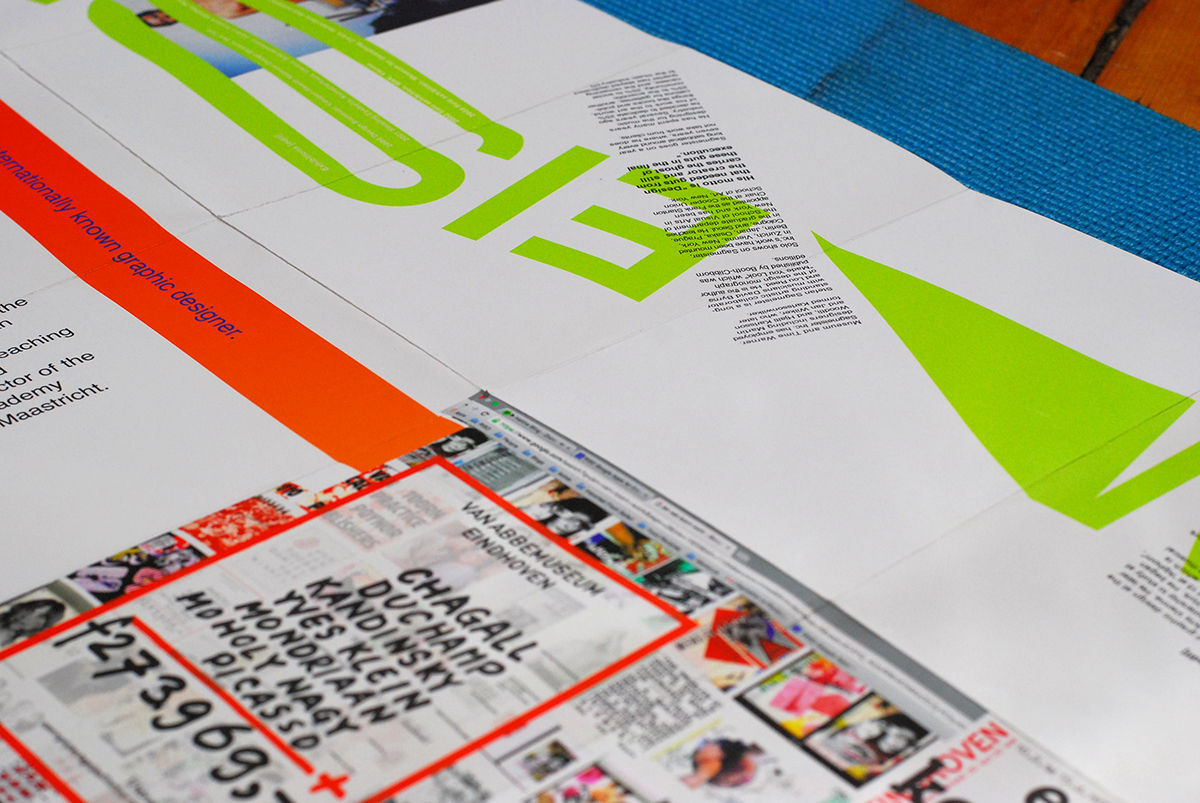
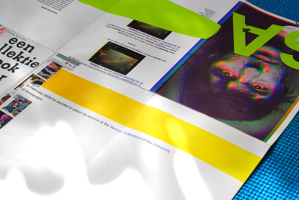
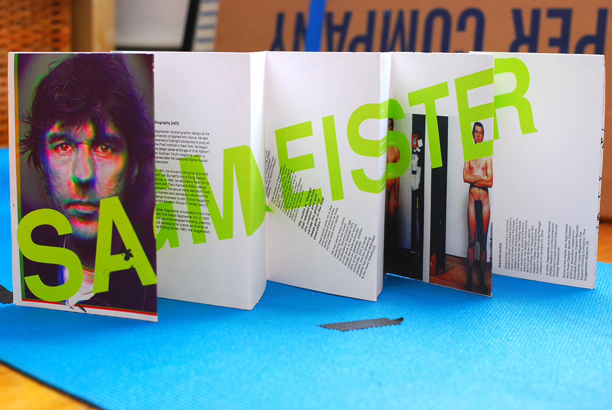
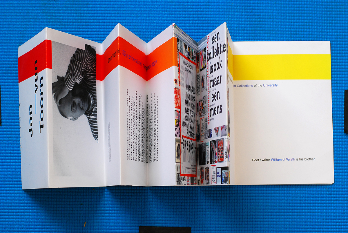
Translating Wikipedia: Sagmeister vs Jan Van Toorn
Comparing both designers while incorporating the physicality of their corresponding Wikipedia pages.
Things to note:
Opposing color schemes inspired from their work: Red vs Green.
Being a visually hidden designer vs being visually present.
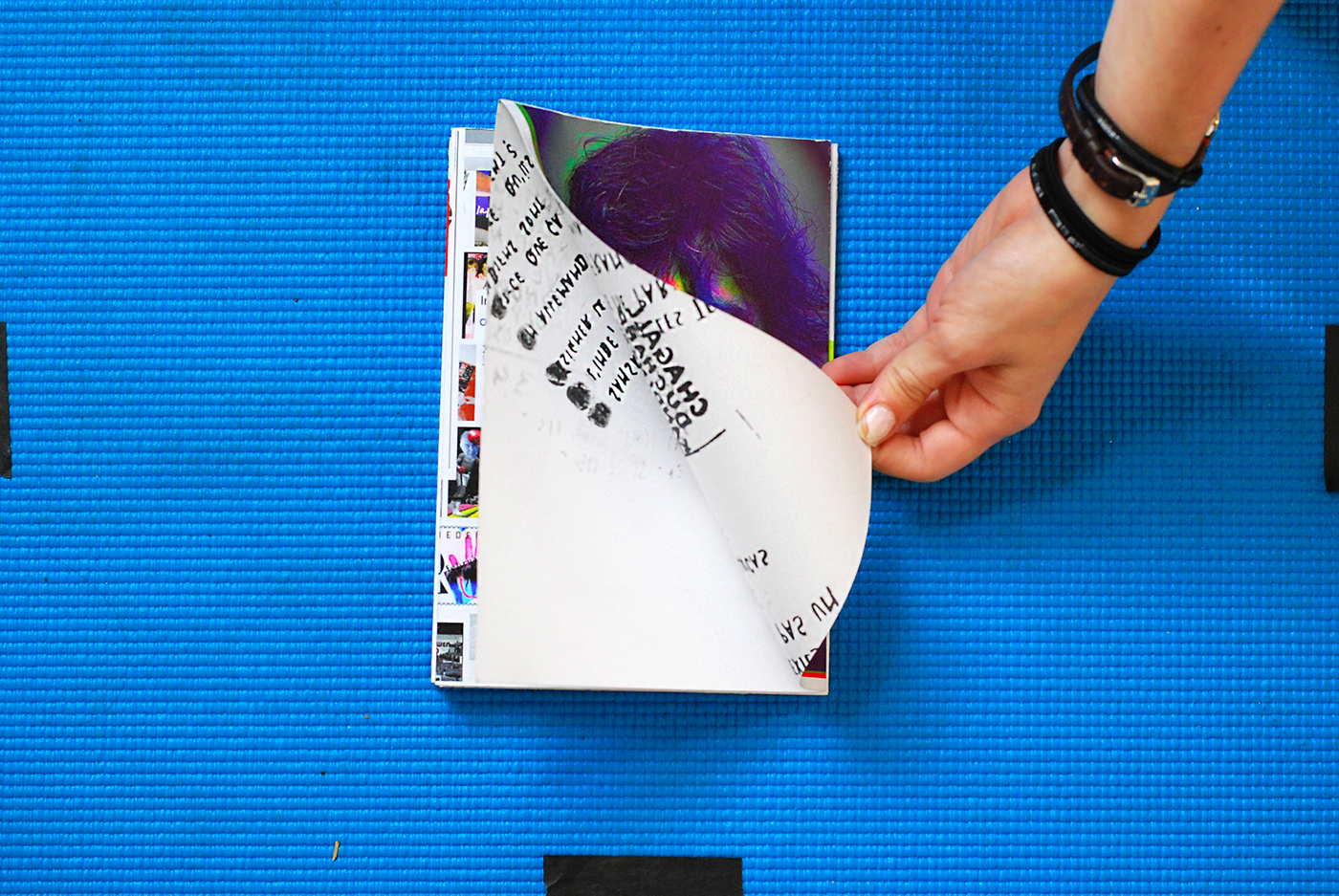
The narrative is continuous - no clear beginning or end.
The narrative forces users to alter their direction.
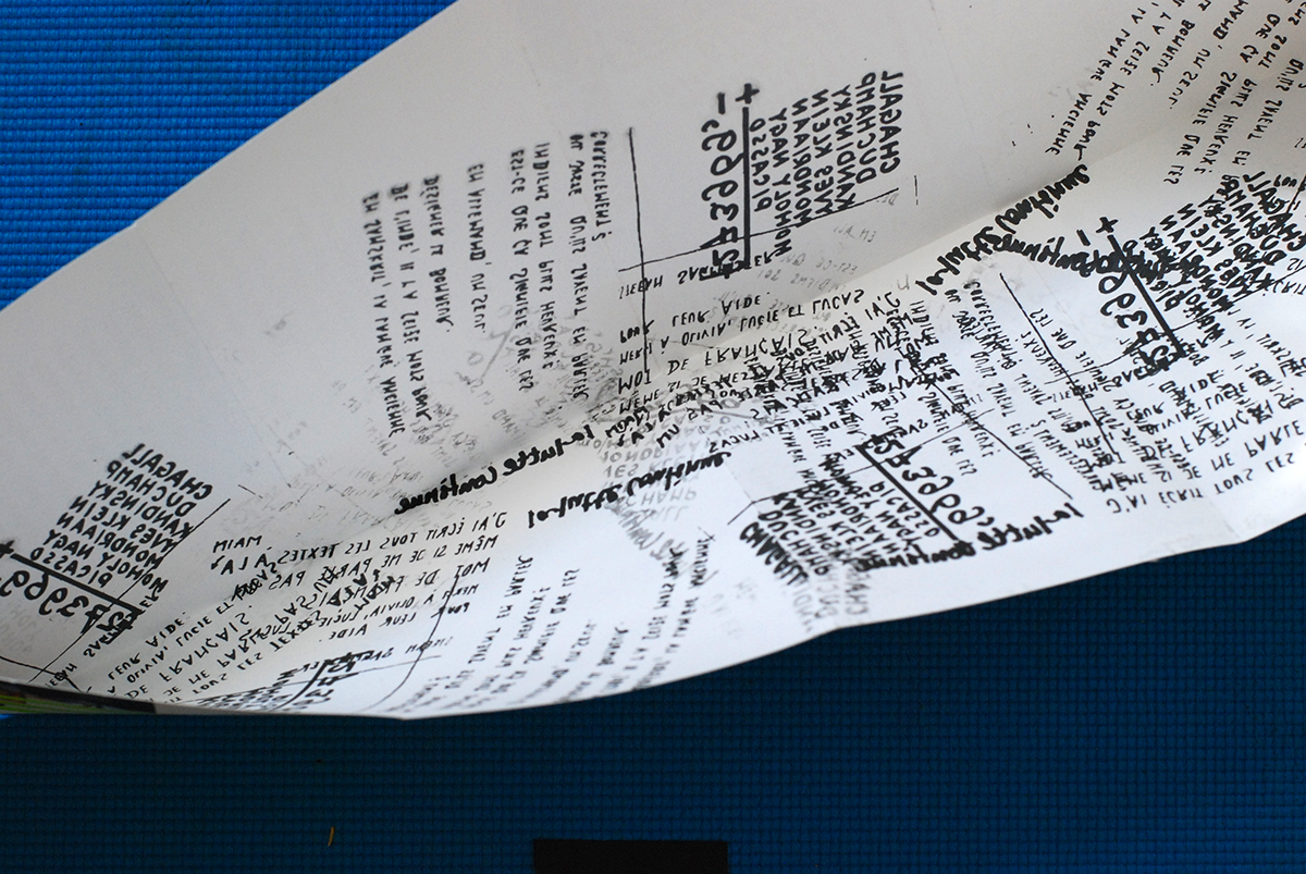
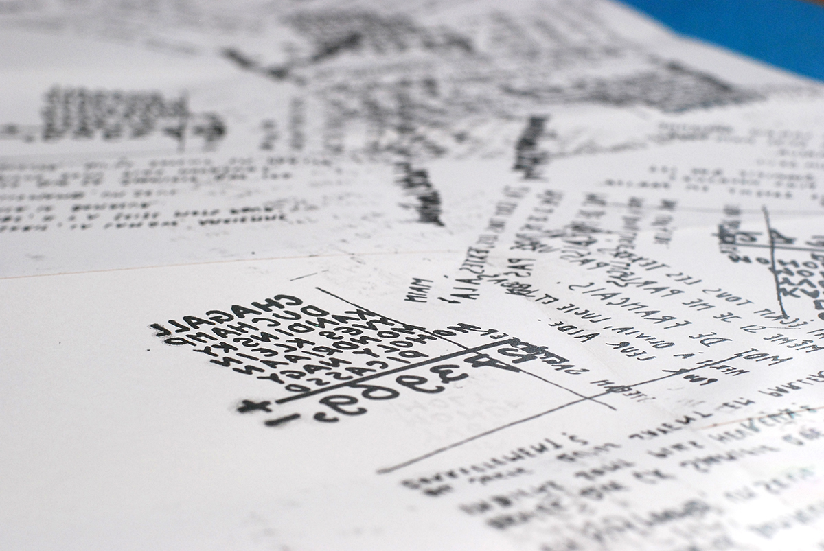
There is a hidden collage of their handwritings on the inside, which has the colophon in my hand writing embedded in it.