

AFTER
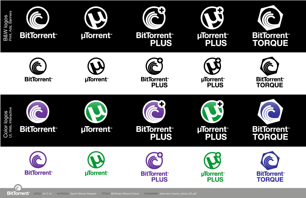
BitTorrent's website overhaul was to mimic µTorrent's own... To consolidate the message of "one company, two products" by sharing architecture, layout, iconography, and stylistically cues on a modular branding. Contrasting colors were used to set apart these otherwise siamese brands.
BitTorrent's website overhaul was to mimic µTorrent's own... To consolidate the message of "one company, two products" by sharing architecture, layout, iconography, and stylistically cues on a modular branding. Contrasting colors were used to set apart these otherwise siamese brands.
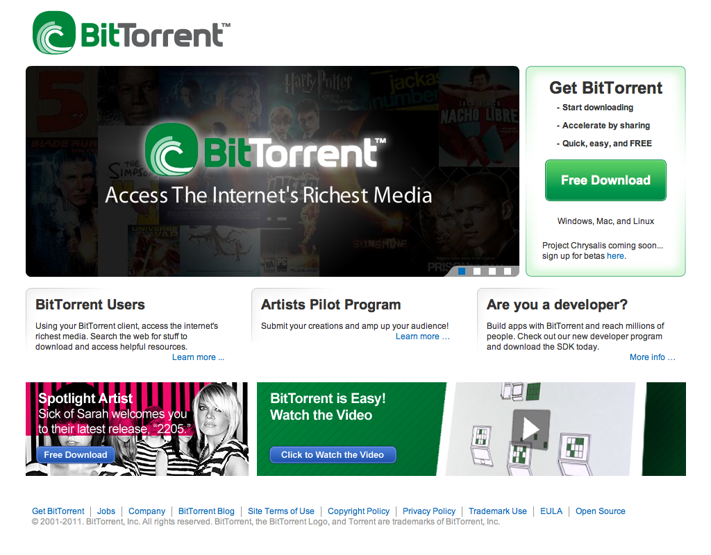
BEFORE
... this is the brand and website I had to start with. The logo was dated, and the message was blurry with unclear or conflicting calls to action. Execution was inconsistent and incompatible with a world-class offering.
... this is the brand and website I had to start with. The logo was dated, and the message was blurry with unclear or conflicting calls to action. Execution was inconsistent and incompatible with a world-class offering.
... And the proposed brand refresh for 2012

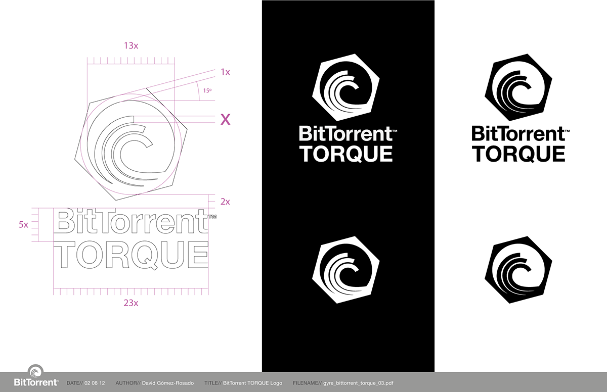
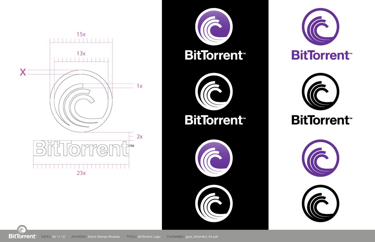
BitTorrent... Part of a new brand ecosystem
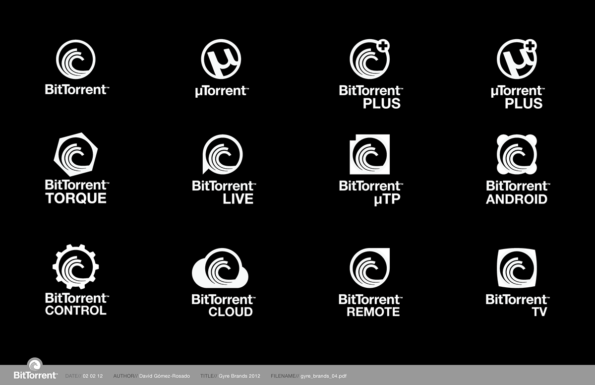
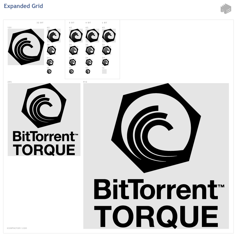
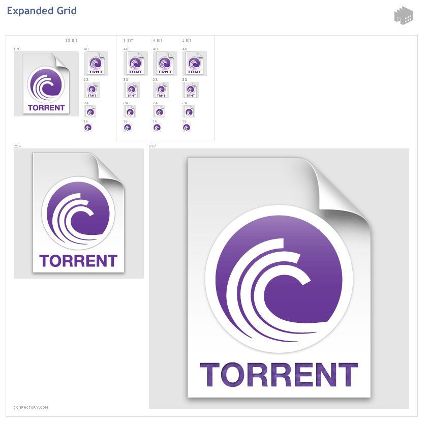
Scalable brand architecture... to accomodate potential product growth
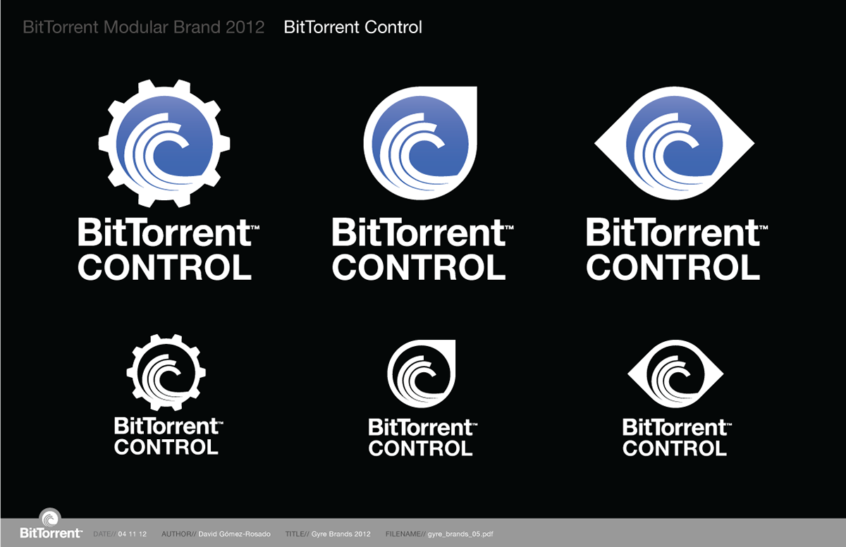
BitTorrent Control Logo Exploration