BitTorrent's new software, code-named "Chrysalis Project" (aka BT v8 Alpha), was the next generation of its mainline client in early 2011. In addition to a complete redesign of the interface, UX, and all features, the beta revealed a new capability previously unseen in any other BitTorrent client: Personal content channels.
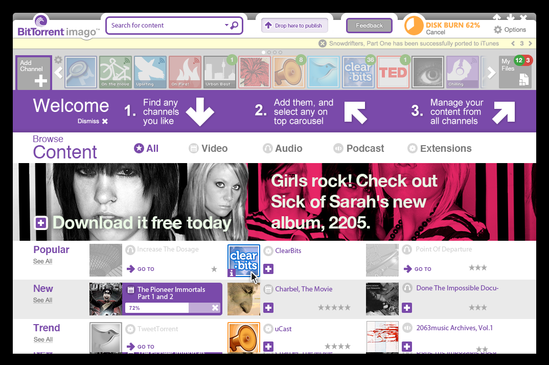
AFTER
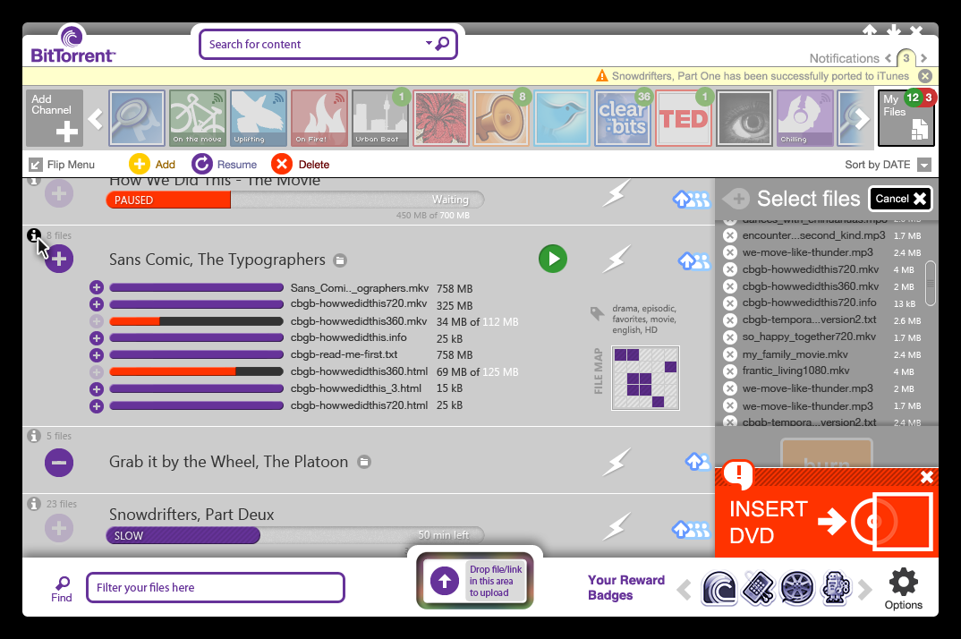
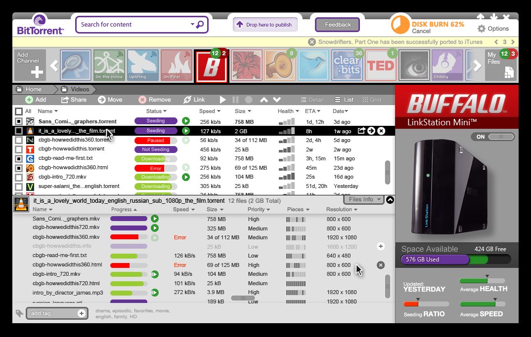
I believe Interface has to offer delightful moments that self-justify themselves… Like this warning (lower-right corner) for a missing DVD-ROM, sliding up and partially obfuscating the "Burn" action until is taken care of. The relationship of both elements is made more intuitive by layering an obvious sequence: First pay attention to the top issue so the one behind can be accessed.
In this prototype, a badge-based reward system (lower frame) is implemented to encourage optimal use of the BitTorrent ecosystem (feeding user-generated content, leaving the client activated at night, increasing bandwidth for uploading, etc).
Right in the middle bottom edge, a drag & drop funnel (with an engaging animation when activated) was designed to promote contribution of content by making the feature visible and fun to use.
BEFORE
BitTorrent/µTorrent was not a product, it was a utility. A download manager of shorts. The transformation needed was to approach that of an "Open iTunes": A destination for all your media and content management needs, open to content partners and focused to the viral expansion of membership through the instigation of personal sharing and broadcast.
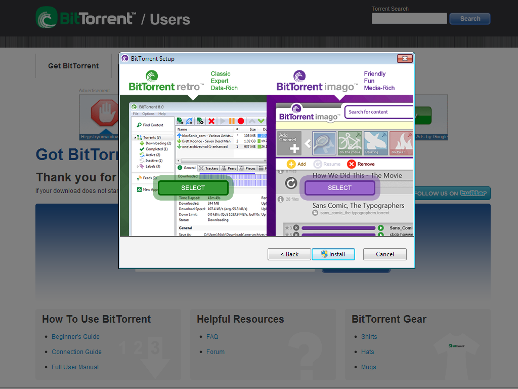
Users of the Version 8 of BitTorrent were to be given a choice of user experience on their BitTorrent client: A "classic" one (named "retro") respecting the legacy UI for those comfortable with the way things were (albeit more technical) and a newer, more content-centric, channel-driven, simplified experience (Friendly, Fun, Media-Rich).
This is one of many best-practices available to introduce product innovation and reaching new demographics …without upsetting the stablished loyal user-base (typically reticent to change).
This is one of many best-practices available to introduce product innovation and reaching new demographics …without upsetting the stablished loyal user-base (typically reticent to change).
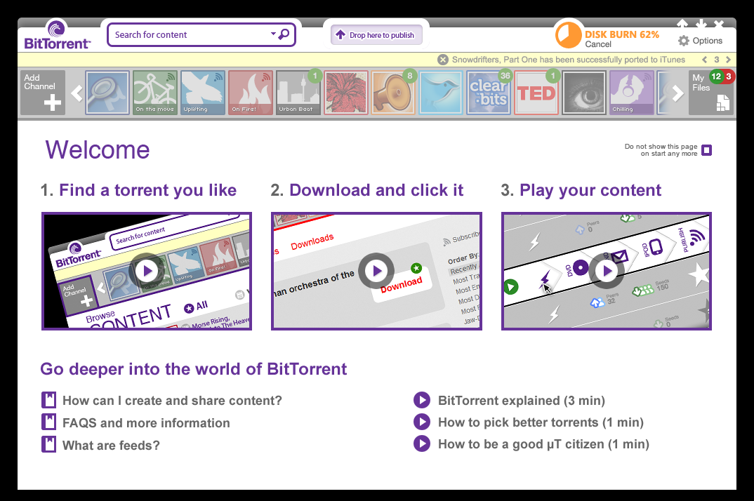
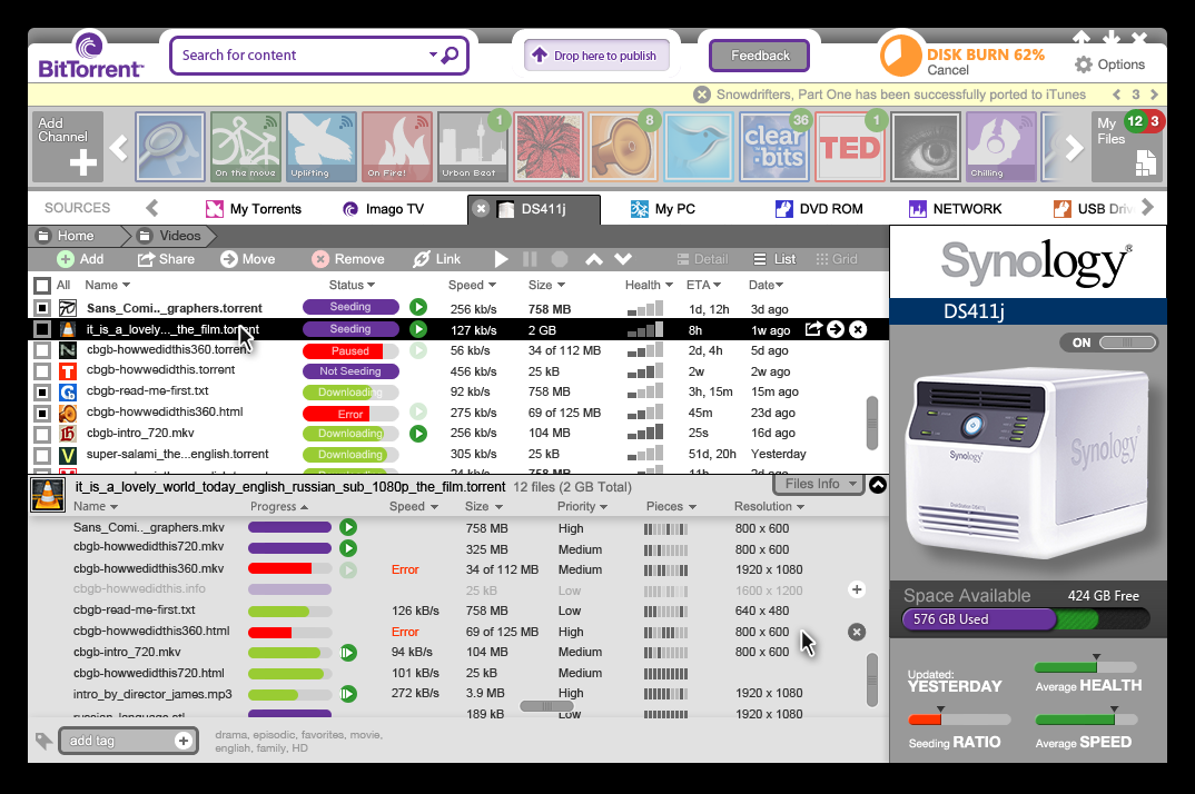
On this version of the interface, the chrome has been drastically reduced. Suppressing the bottom frame and bringing drag & drop upload area to a central top position. Also newly introduced is background status on the top right corner (Such as DVD burning).
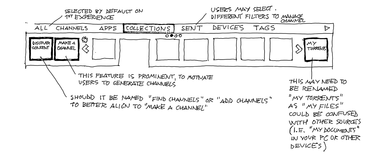
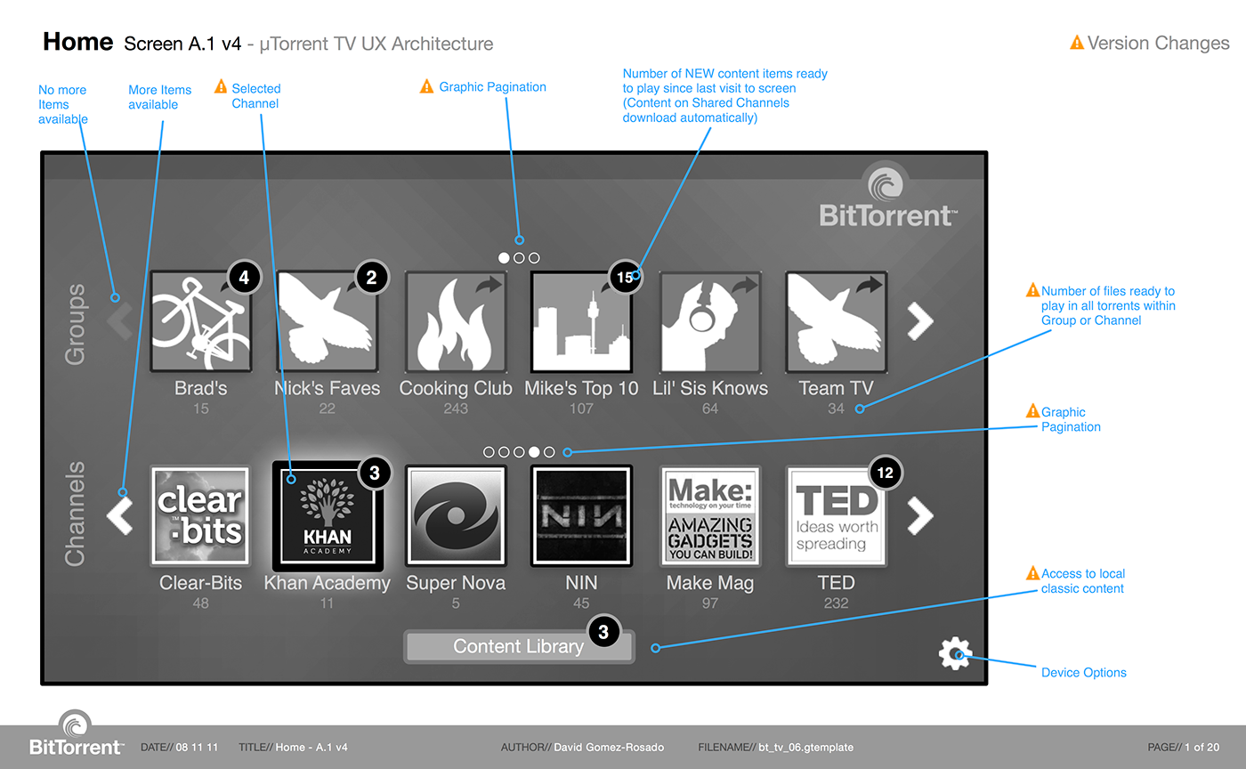
This is the landing or home page, on-boarding new users to the new concept of channels. Beyond "apps", the "channels" represent the second foray of BitTorrent into partnering with content providers as well as the introduction of personal, shareable, user-generated channels of content (what later will become the stand-alone product SoShare).
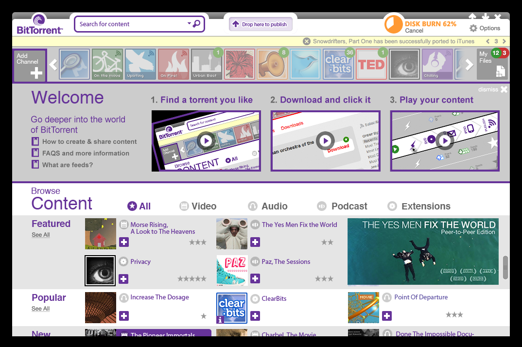
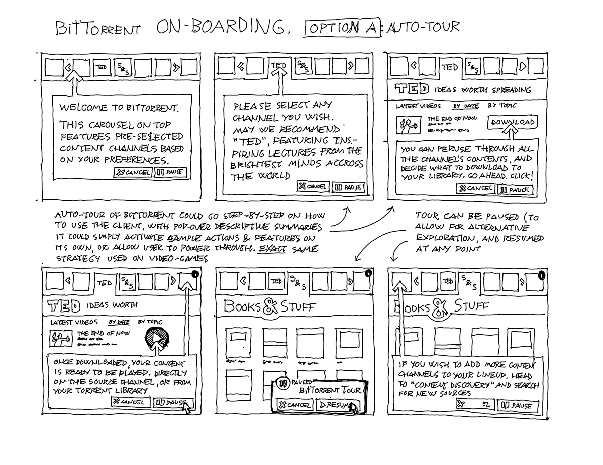
After some initial testing, the on-boarding experience was further optimized, with bolder, more succinct call to action and an enhanced curated browser for content discovery.

Thanks to its interface built entirely with web technologies, Chrysalis (aka Imago) was able to allow full ownership of the experience for each content provider (great for branding and integration with their own UX beliefs) . Files could be downloaded and activated within their page, as well as in an aggregated file/download manager page for all sources of content.

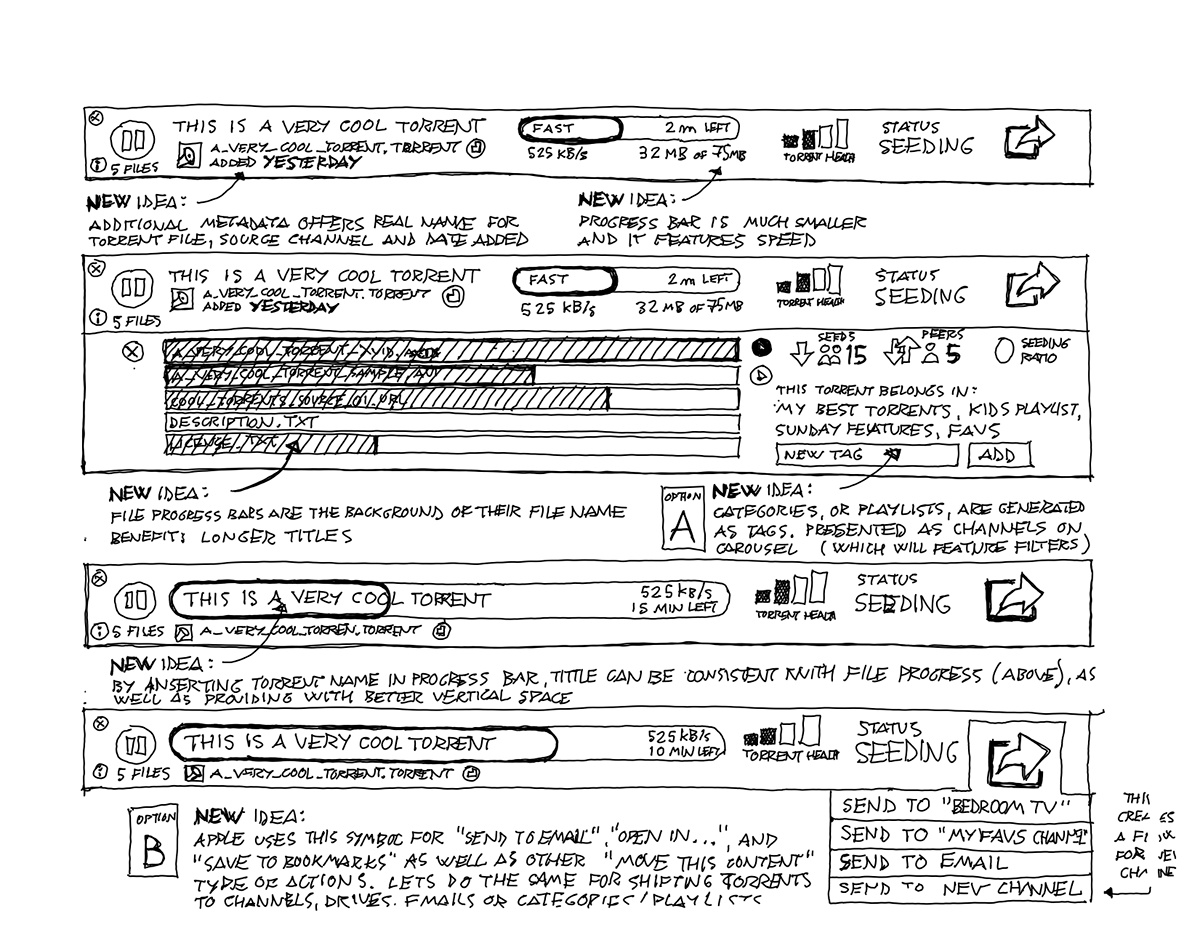
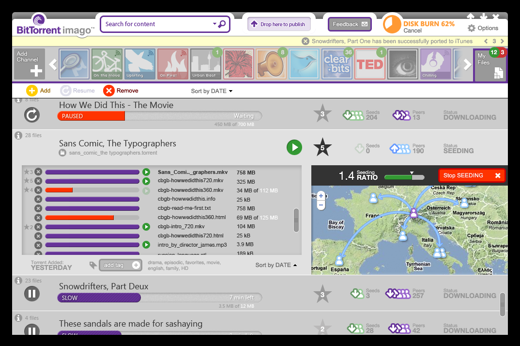
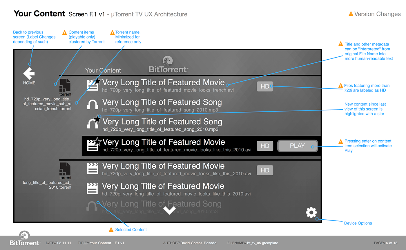
On the initial prototypes for Chrysalis, many of the more technical aspects of Torrent management were hidden or delegated to second-level reveal, in an attempt to put more emphasis on the content, less on the process how to get it. For example, speed of files were categorized as relative "Fast", "Slow", etc... versus a cryptic 23 Mbit/s, specially to the novice users we were aiming for. Additionally, we introduces a limited set of iconography to optimize quick legibility identifiably discrete measures (few, some, many)... Many actions were only shown on rollover reveal, to reduce the amount of repetitive UI, increasing the ratio of signal Vs. noise.
For those users still interested with the specific details of a torrent (number of seeders, leechers, ratio,etc)... A visual approach to information with emphasis on geographical relationships was available, in an attempt to entice content discovery among people with same interests (downloading the same file) and to understand the user responsibility to share back to those using her/his torrent files.
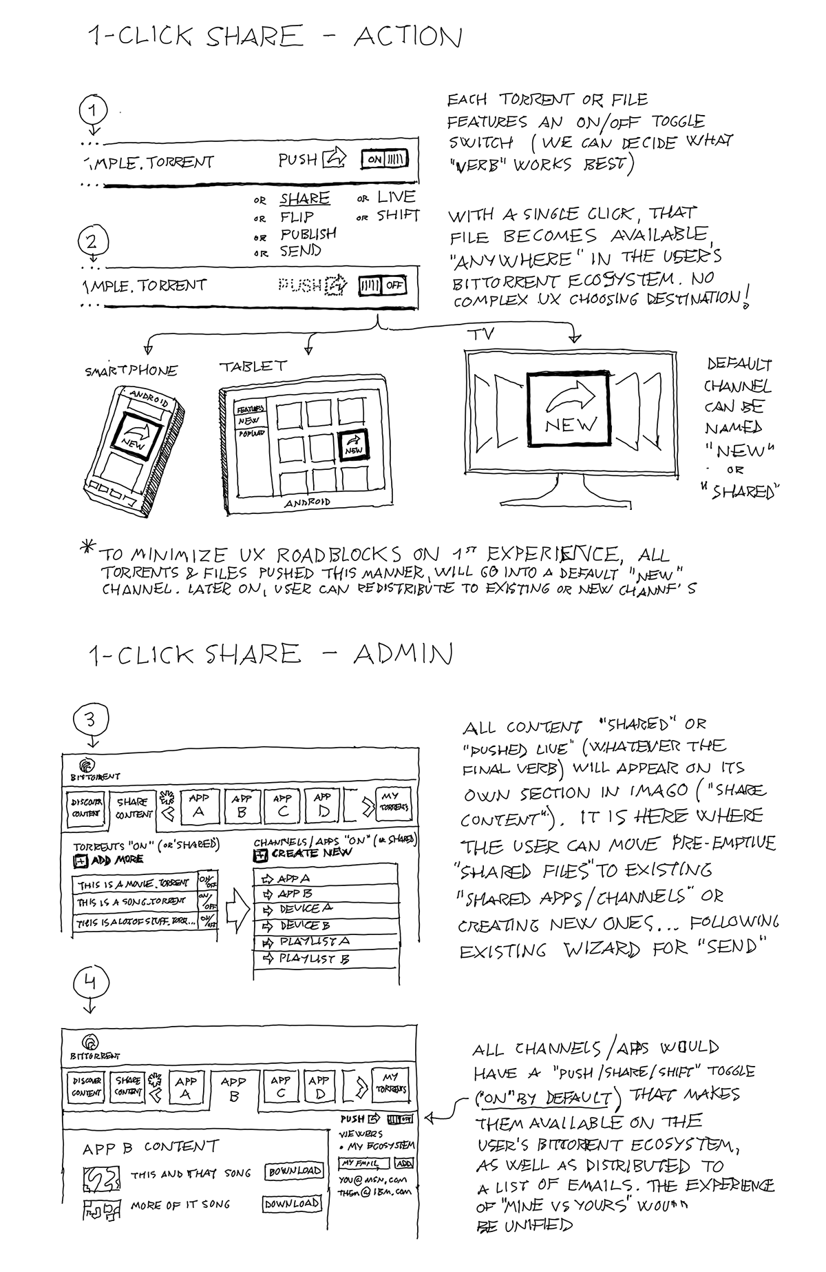
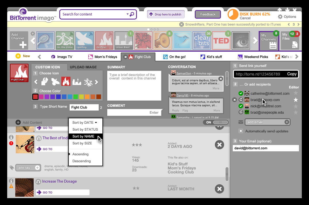
This is one of the earliest attempts to design the share component of Chrysalis, (later to become stand-alone SoShare). The attempt was to provide early capabilities to publish channels of user-generated content to closed groups of friends... With light ability to customize, accept comments and send the curated stream to BitTorrent-certified devices like TVs and mobile handsets.
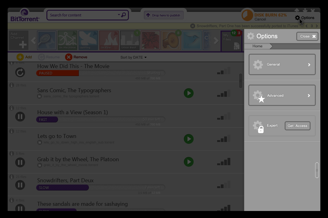

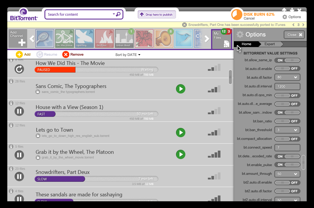
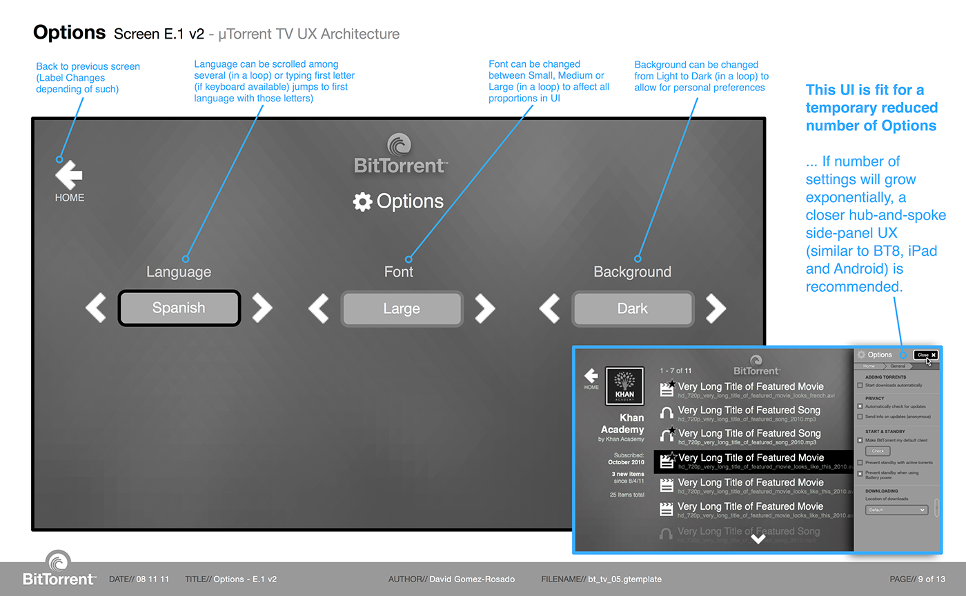
One of the challenges of dealing with a highly configurable product such as BitTorrent is the amount of potential settings and options the program has to offer. Literally hundreds of them! To best accommodate what was previously a nightmare scenario, a wheel-and-spokes simple navigation of vertically scrolling lists was adopted.


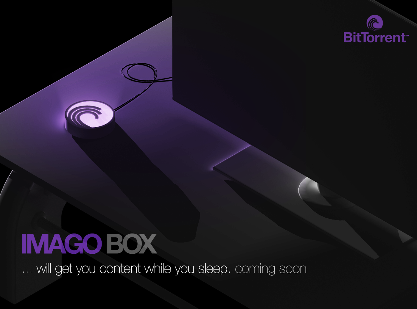
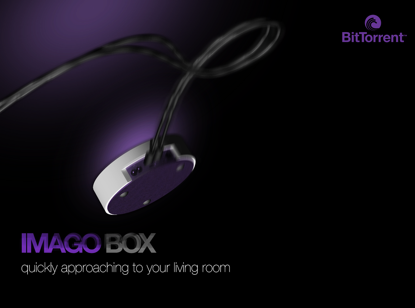
Designing the experience of the new BitTorrent client did not stop at software, I actually went into hardware explorations, imagining a potential set-top box (The Imago Box) that could be the ambassador to the brand and proof-of-concept for the industry to follow.
I created the following concepts using 3D software (handy skills from my industrial design days). I championed simplicity (Many times less choice/options bring greater satisfaction ... Wii, iPhone and countless other examples) and I turned drawbacks ("long downloads') into potential benefits ("Getting you content while you sleep'). Other product highlights:
I created the following concepts using 3D software (handy skills from my industrial design days). I championed simplicity (Many times less choice/options bring greater satisfaction ... Wii, iPhone and countless other examples) and I turned drawbacks ("long downloads') into potential benefits ("Getting you content while you sleep'). Other product highlights: