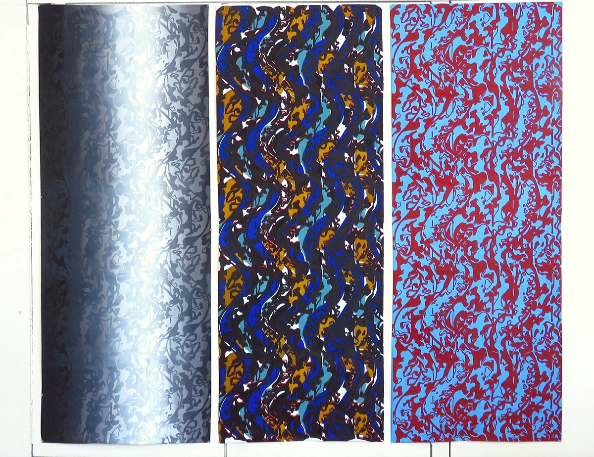
"In Between" is a series of fabric silkscreen pieces that started out with a 3-yard fabric that only consists a basic repeat of prints and two other 3-yard fabrics that incorporated other design elements. My print inspiration for "In Between" first started out from a painting by Jean Metzinger. The painting is characterized by fragmented stripes of abstract shapes of a human figure. I kept the fragmented element of this painting while designing my print. In order to add a sense of flow to the print I also made added wavy lines to the straight stripes that are inspired by the painting. With further research I found out that most of his works focused on human figures and every day objects. Therefore, in composing the elements of my print, I decided to focus on instead of the actual shape of everyday object, the negative space in between each and every everyday object.
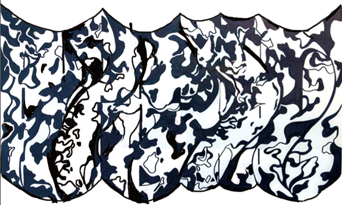
The first piece(right) is a 3-yard fabric that is dyed with mx dyes and only consists a basic repetition of my print.
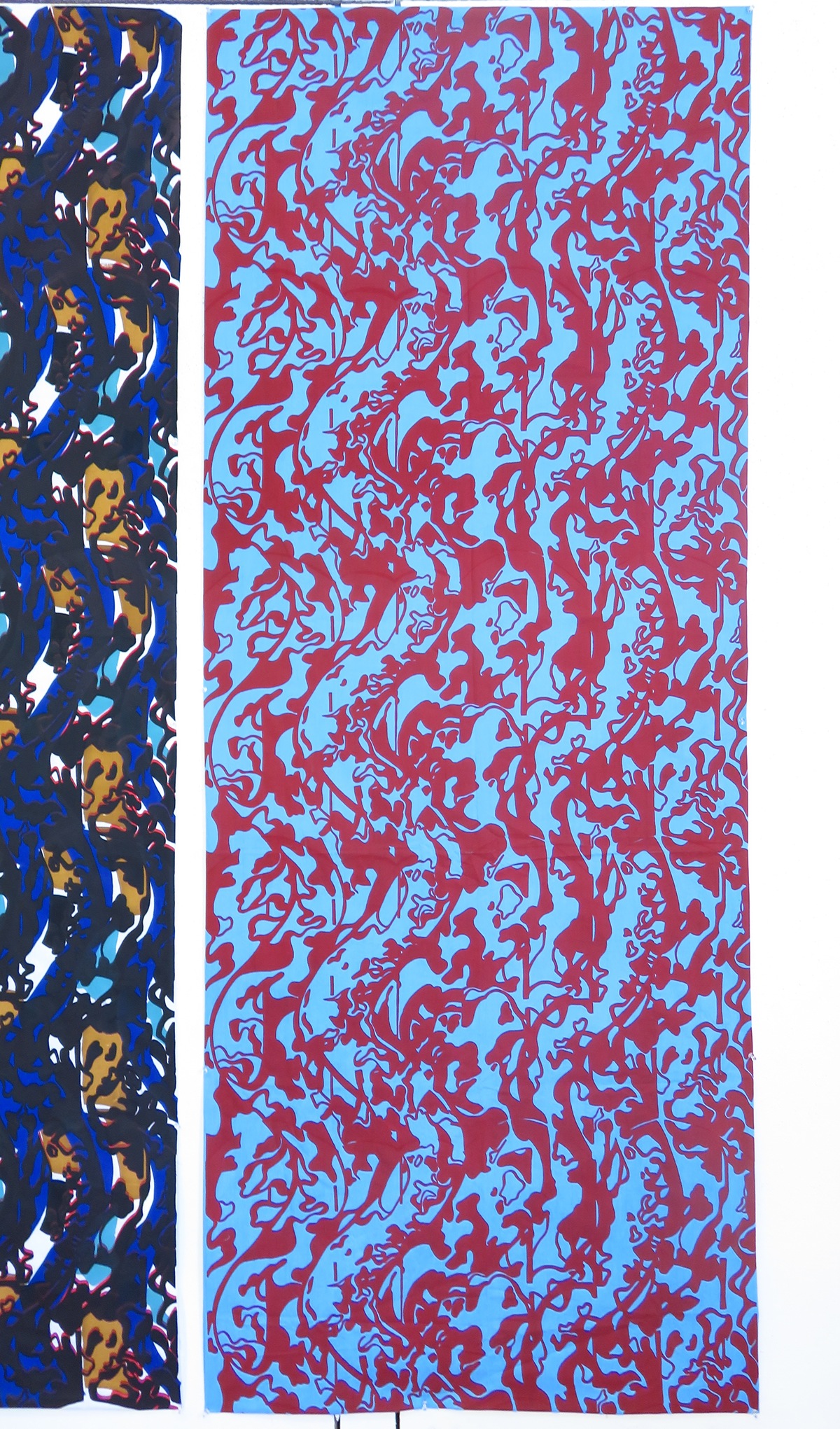
The second piece(left) is first applied with a layer of gradating pigment and then printed with ombre that corresponds with the gradation of the background.
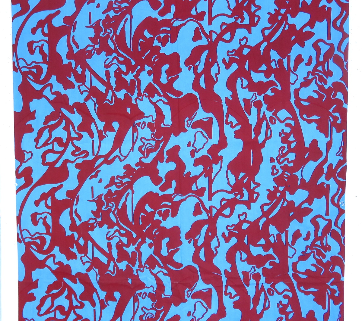
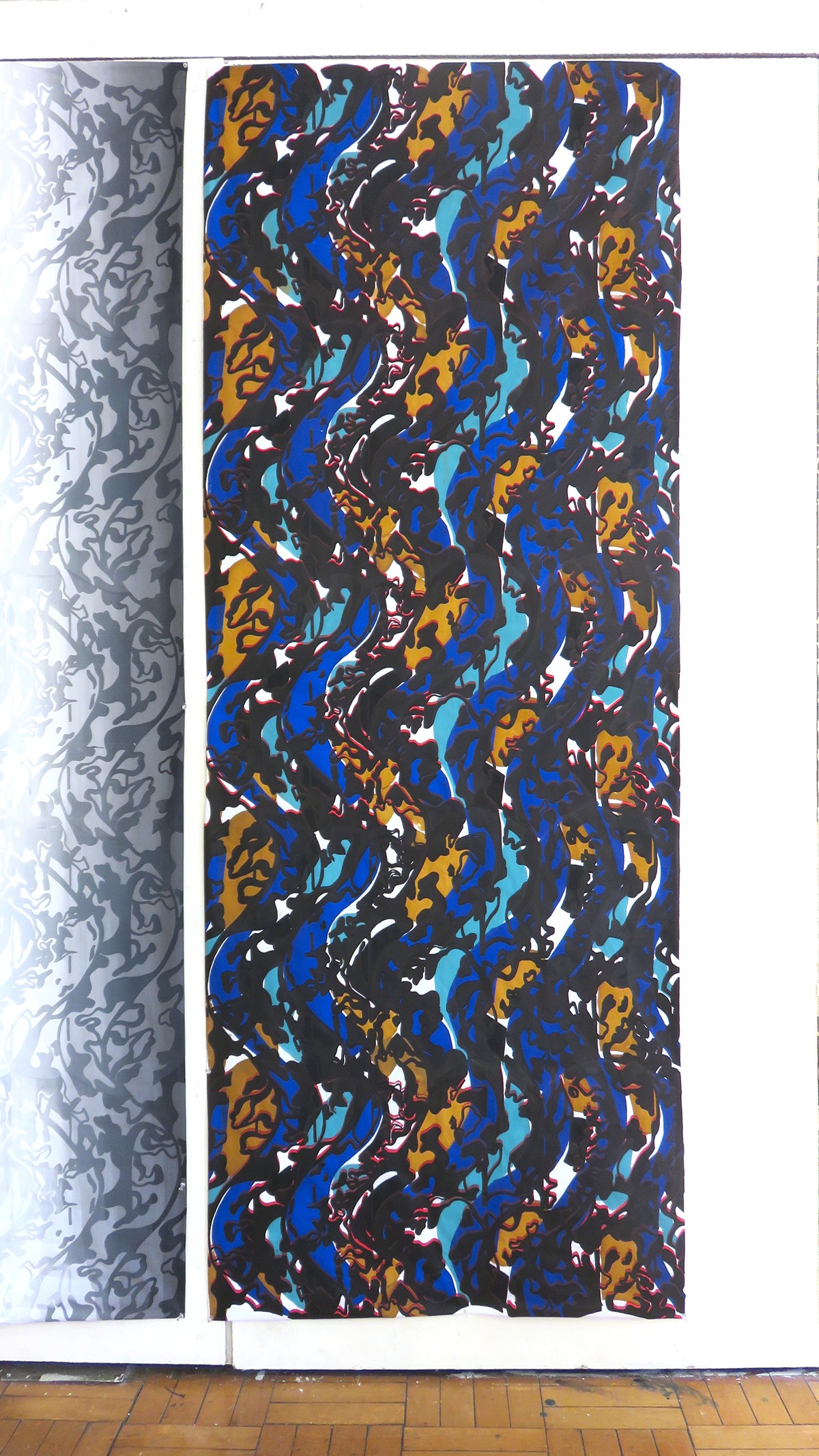
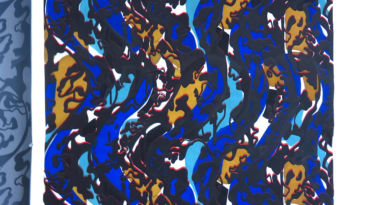
The third piece(middle) is a composition of 7 layers of different printing process including 4 layers of printing that used stencils to create different colored(water blue, light brown, intense blue, and black) shapes in the background and 3 layers (black, red then black) of repeating prints.
The first piece(right) is a 3-yard fabric that is dyed with mx dyes and only consists a basic repetition of my print.
The second piece(left) is first applied with a layer of gradating pigment and then printed with ombre that corresponds with the gradation of the background.
The third piece(middle) is a composition of 7 layers of different printing process including 4 layers of printing that used stencils to create different colored(water blue, light brown, intense blue, and black) shapes in the background and 3 layers (black, red then black) of repeating prints.
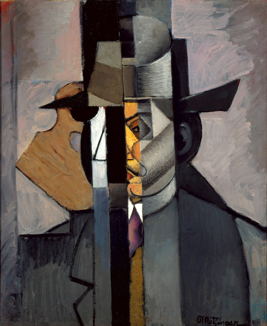
My inspiration for "In Between" first started out from a painting by Jean Metzinger. The painting is characterized by fragmented stripes of abstract shapes of a human figure. I kept the fragmented element of this painting while designing my print.

"In Between" is a series of fabric silkscreen pieces that started out wiht a 3-yard fabric that only consists a basic repeat of prints and two other 3-yard fabrics that incorporated other design elements.
I kept the fragmented element of Jean Metzinger's painting while designing my print. In order to add a sense of flow to the print I also made added wavy lines to the straight stripes that are inspired by the painting. With further research I found out that most of his works focused on human figures and every day objects. Therefore, in composing the elements of my print, I decided to focus on instead of the actual shpe of everyday object, the negative space in between each and every everyday object.
The first piece is a 3-yard fabric that is dyed with mx dyes and only consists a basic repetition of my print.
close up
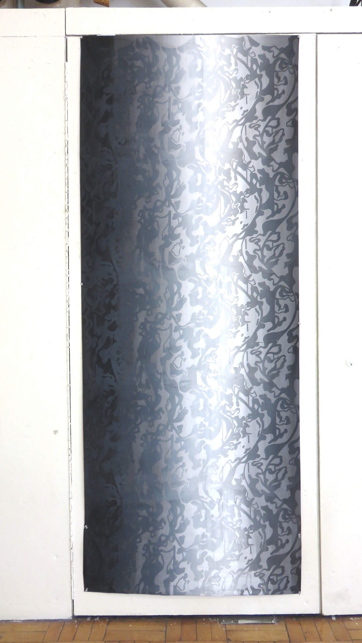
The second piece is first applied with a layer of gradiating pigment and then printed with ombre that corresponds with the gradiation of the background.
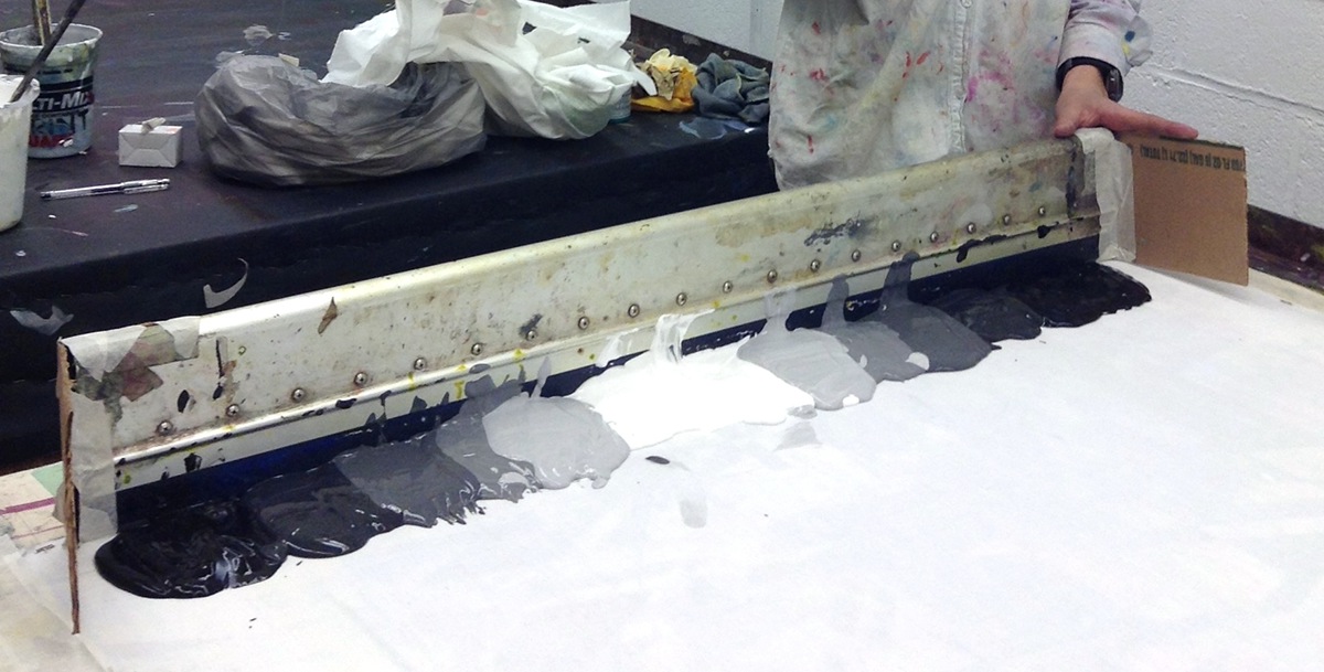
The process of printing the background with different colors of pigment
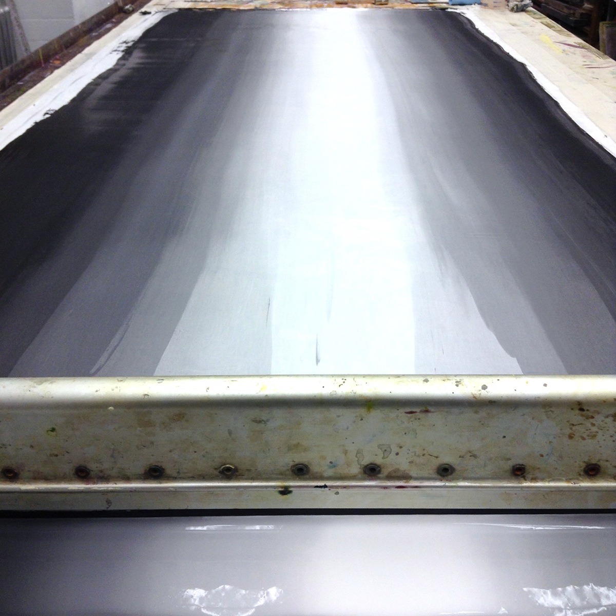
Backgroun after first two passes of pigmented print paste. More passes are applied to make the gradiation smoother.
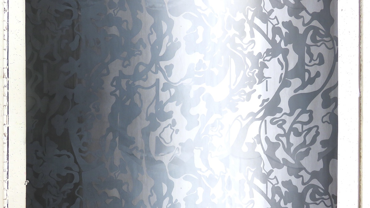
close up
The third piece is a compostition of 7 layers of different printing process including 4 layers of printing that used stencils to create the shapes in the background and 3 layers of repeting prints.

Process: The first two layers of stencil have already been printed (water blue shapes and light brown shapes). The third layer(intense blue) is in the process of printing.
The finished look of three layers (water blue, light brown, intense blue) printed
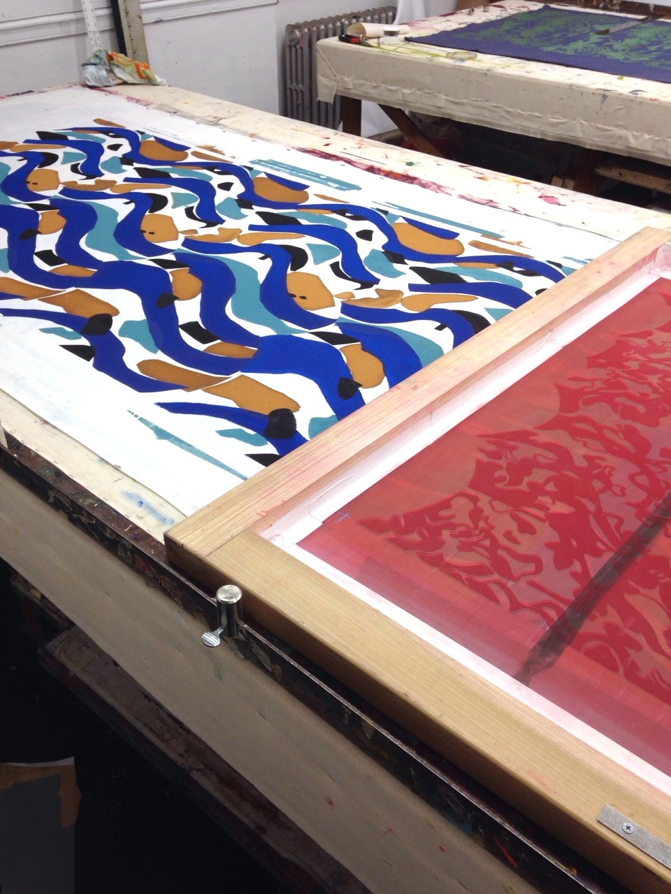
A fourth layer of black shapes are applied to the print.
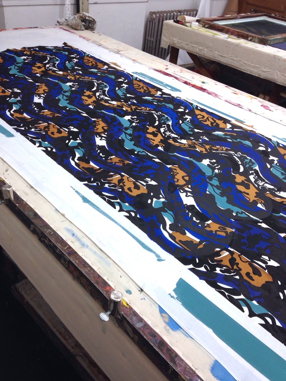
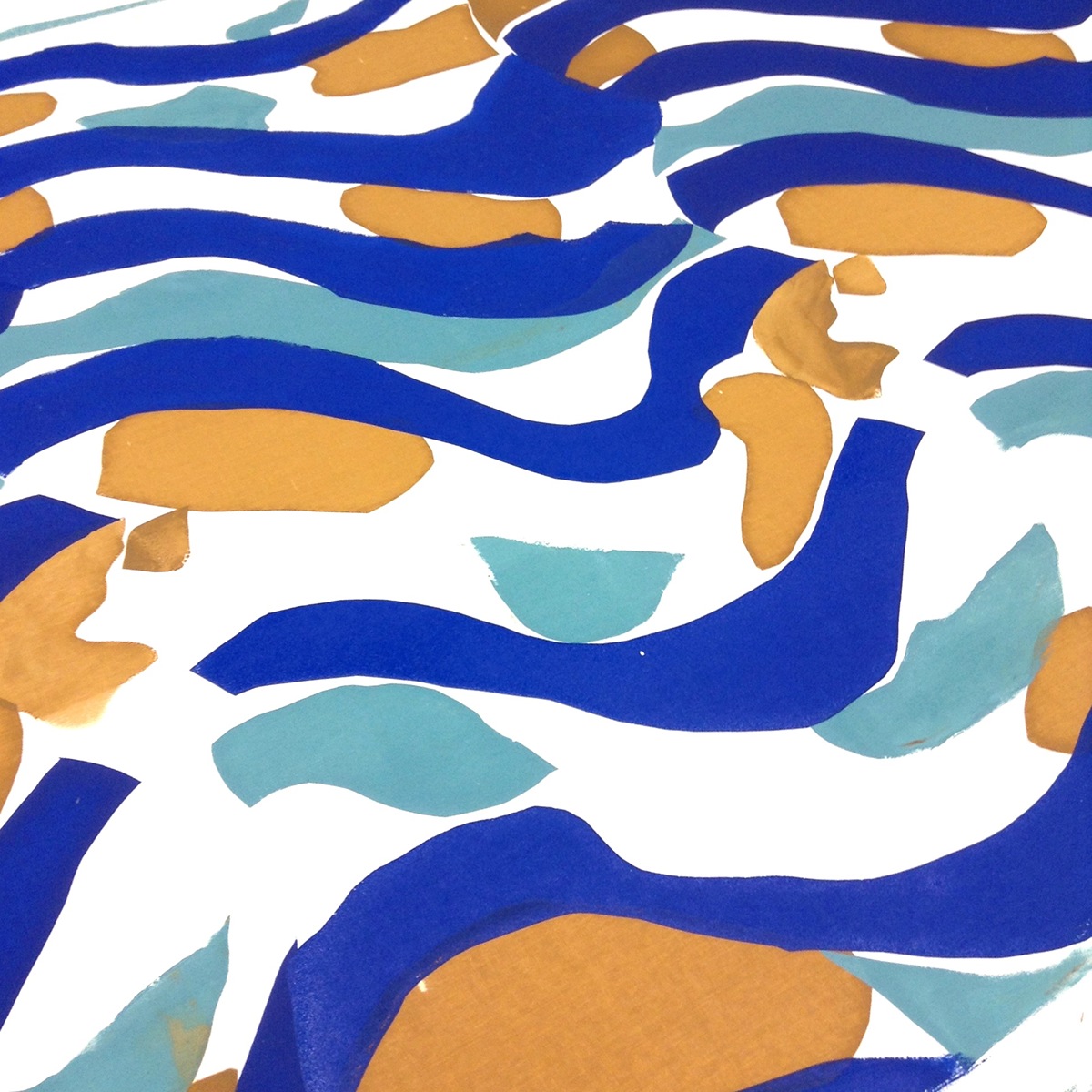
The firts payer of repeting prints printed on the piece. The print later is followed by two other layers of repeting prints which are red and black.
close up
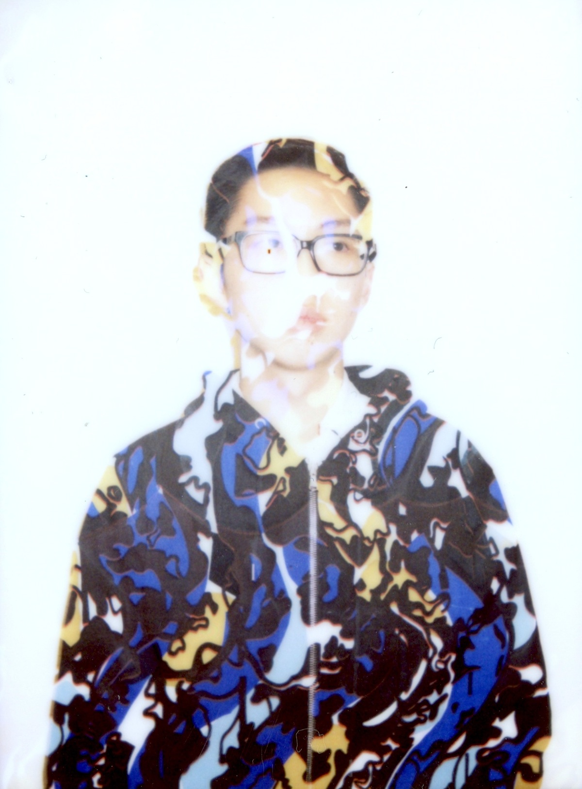
Potential use of this fabric
"In Between" is a series of fabric silkscreen pieces that started out wiht a 3-yard fabric that only consists a basic repeat of prints and two other 3-yard fabrics that incorporated other design elements. My print inspiration for "In Between" first started out from a painting by Jean Metzinger. The painting is characterized by fragmented stripes of abstract shapes of a human figure. I kept the fragmented element of this painting while designing my print. In order to add a sense of flow to the print I also made added wavy lines to the straight stripes that are inspired by the painting. With further research I found out that most of his works focused on human figures and every day objects. Therefore, in composing the elements of my print, I decided to focus on instead of the actual shpe of everyday object, the negative space in between each and every everyday object.
The first piece(right) is a 3-yard fabric that is dyed with mx dyes and only consists a basic repetition of my print.
The second piece(left) is first applied with a layer of gradating pigment and then printed with ombre that corresponds with the gradation of the background.
The third piece(middle) is a composition of 7 layers of different printing process including 4 layers of printing that used stencils to create different colored(water blue, light brown, intense blue, and black) shapes in the background and 3 layers (black, red then black) of repeating prints.


