
Architecture Design
This project is a proposal for the Providence train station which I created as a 2nd year in architecture, based on the carbon emission of this station. The shape was denoted in order to make the building more environmentally friendly , as well as in the hopes of redesigning the skyline of the city.
When given the challenge to redesign the Providence train station , we were told to pick an element, that we studied after the analysis of the station, and use that to create a matrix. For me my element was " carbon footprint". So in order to measure the foot print , I layered down a simple plan map of the station within the city, and used sticks to define the border of the station, tracks and the parking lot. Once that was complete with the help of statistics I was able to understand, that the station itself had the largest footprint because of carbon emissions due to electrical usage, which I highlighted using the red string. The second highest was the car-park depicted through the color green and thirdly were the tracks itself which I represented using yellow string.
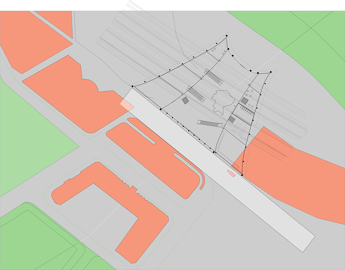
The train station now redesigned, was shaped like a cornucopia : a symbol of abundance. Providence being a city with a high amount of commuters required a station that well represented this city, and its grandeur as well as helped redefine Providence's skyline.
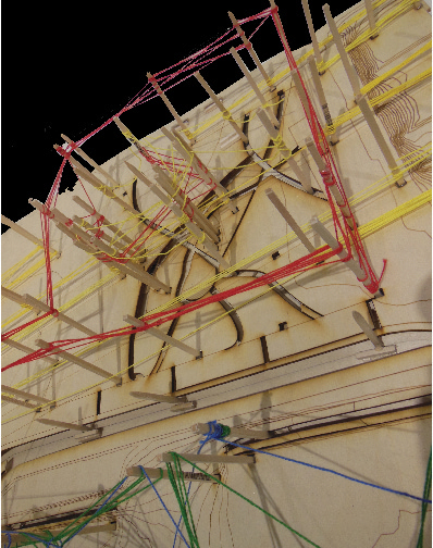
So in order to measure the foot print , I layered down a simple plan map of the station within the city, and used sticks to define the border of the station,tracks and the parking lot,and using string I was able to define the hierarchy of carbon emission.
Red: Highest ( generated by electricity) Green:Medium ( generated by the carbon emitted by cars) Yellow:Lowest ( generated by the trains themselves)
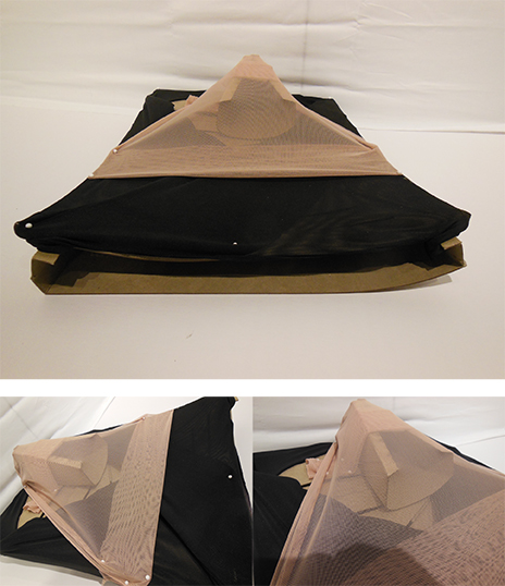
After my study, I understood that the carbon footprint seemed to a have a sweeping effect. So in order to capture this movement I used fabric, and formed an initial shape for my new station that would use less energy and be more environmentally friendly .

I continued to work with fabric , and incorporated chipboard to create this cornucopia shape for my station, that was stretching down, allowing light to penetrate the space in the best possible way , as well as provide great views of the city.
The ground floor plan contained a model of the city in the center, this space acted as the main transit space for all passengers as it was close to both elevators and the staircases on either side of the building. Allowing the two sides of the cornucopia to contain programmatic elements such as restaurants , ticketing booths, bathrooms and a gift shop.
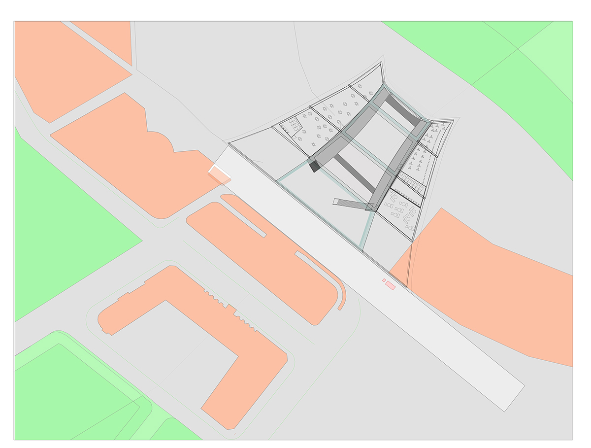
The program for the upper floor of the building included a viewing deck and more formal restaurants, and acted as an entertainment space for passengers who were waiting . There were sky decks created to provide walkways between the two sides.


Sections.


The train station now redesigned, was shaped like a cornucopia : a symbol of abundance. Providence being a city witha high amount of commuters required a station that well represented this city and its grandeur and history, as well as helped redefine Providence's skyline.

