Small newsprint booklet exploring domestic and international comparison statistics of Brazil in 2014 before the country hosted the World Cup. (icons from the Noun Project)
The first spread illustrates Brazil's varied landscape with an emphasis on the Amazon Rainforest. The pie charts show the Amazon Basin's landmass breakdown between Brazil and its neighbors, as well as the rainforest's species count in comparison to that of the world at large.
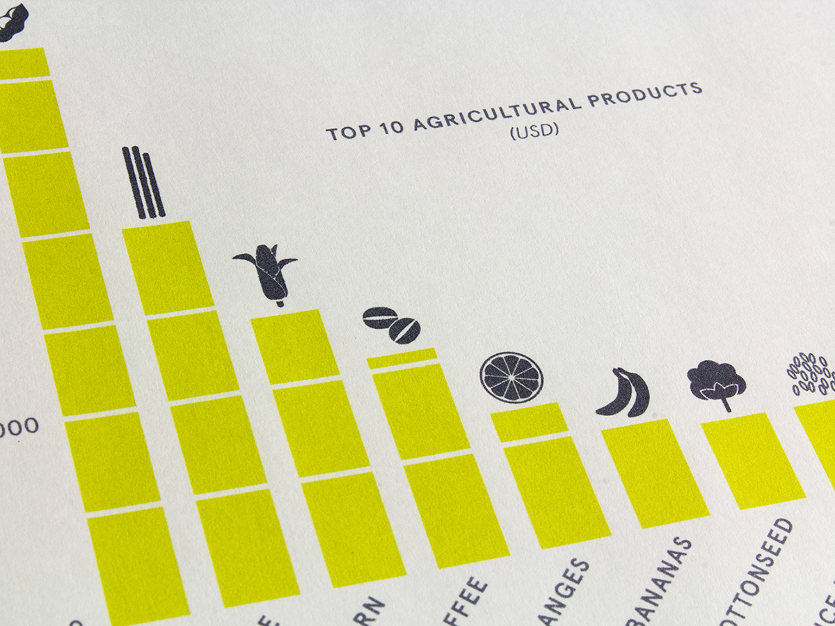
The second spread looks at population figures within the country and South America. Population density, in particular, is seen through a lens of comparison with Bangladesh, a highly dense country.
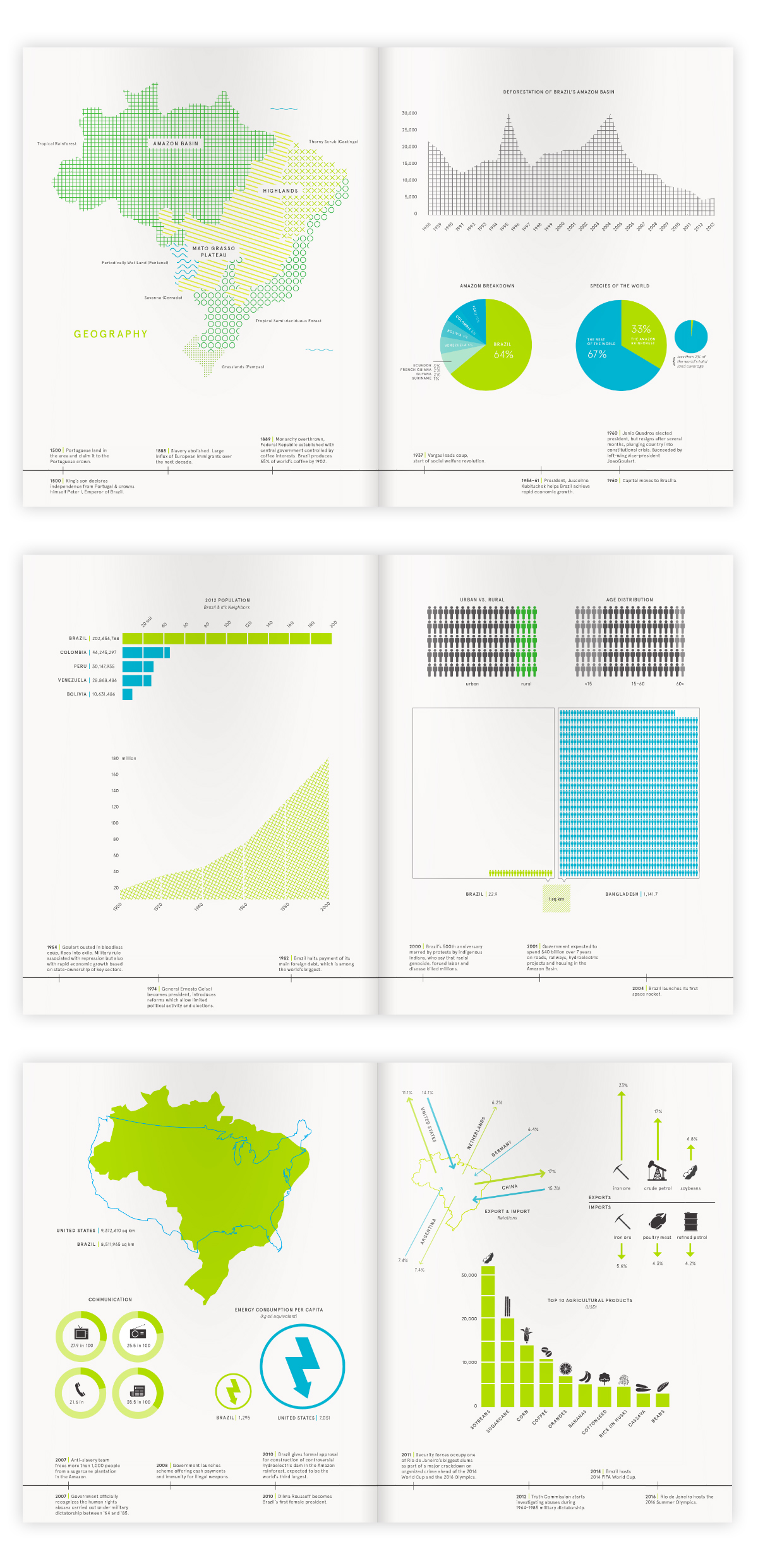
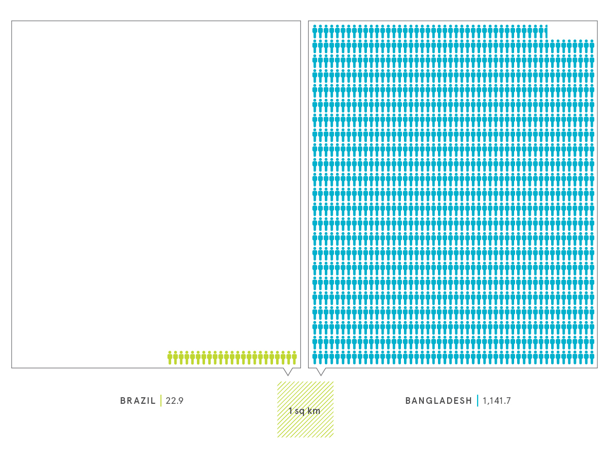
The last spread focuses on imports and exports and energy consumption. Standing out at the end and highlighted in blue, is America's extremely high energy consumption.
Created for Information Mapping with Doug Scott, RISD 2014