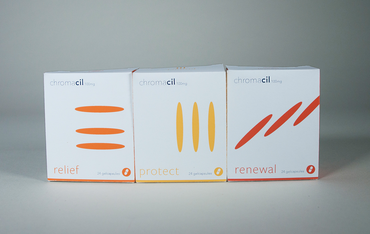
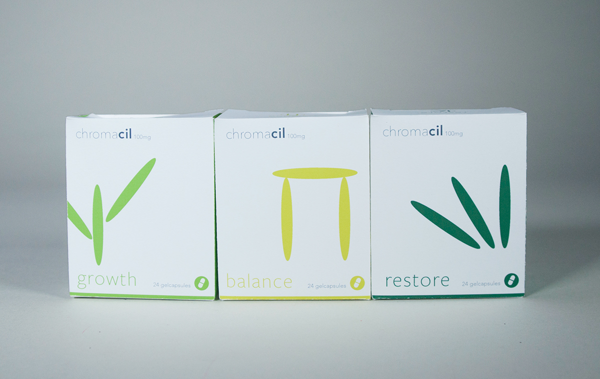
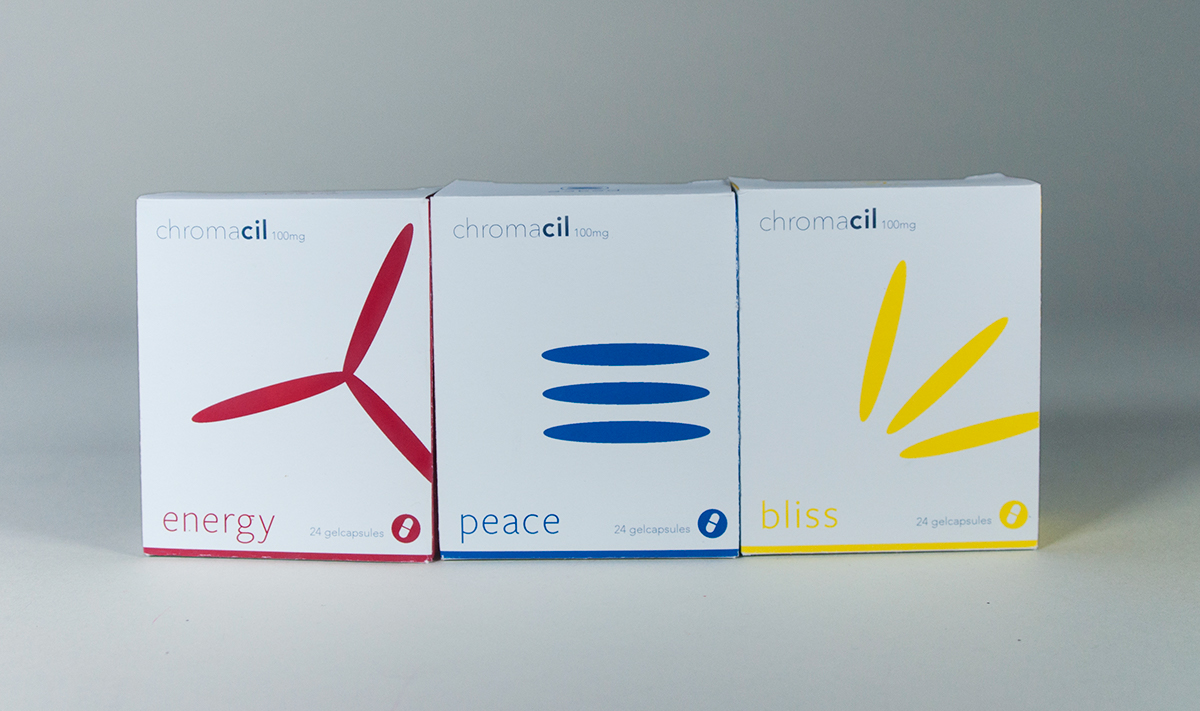
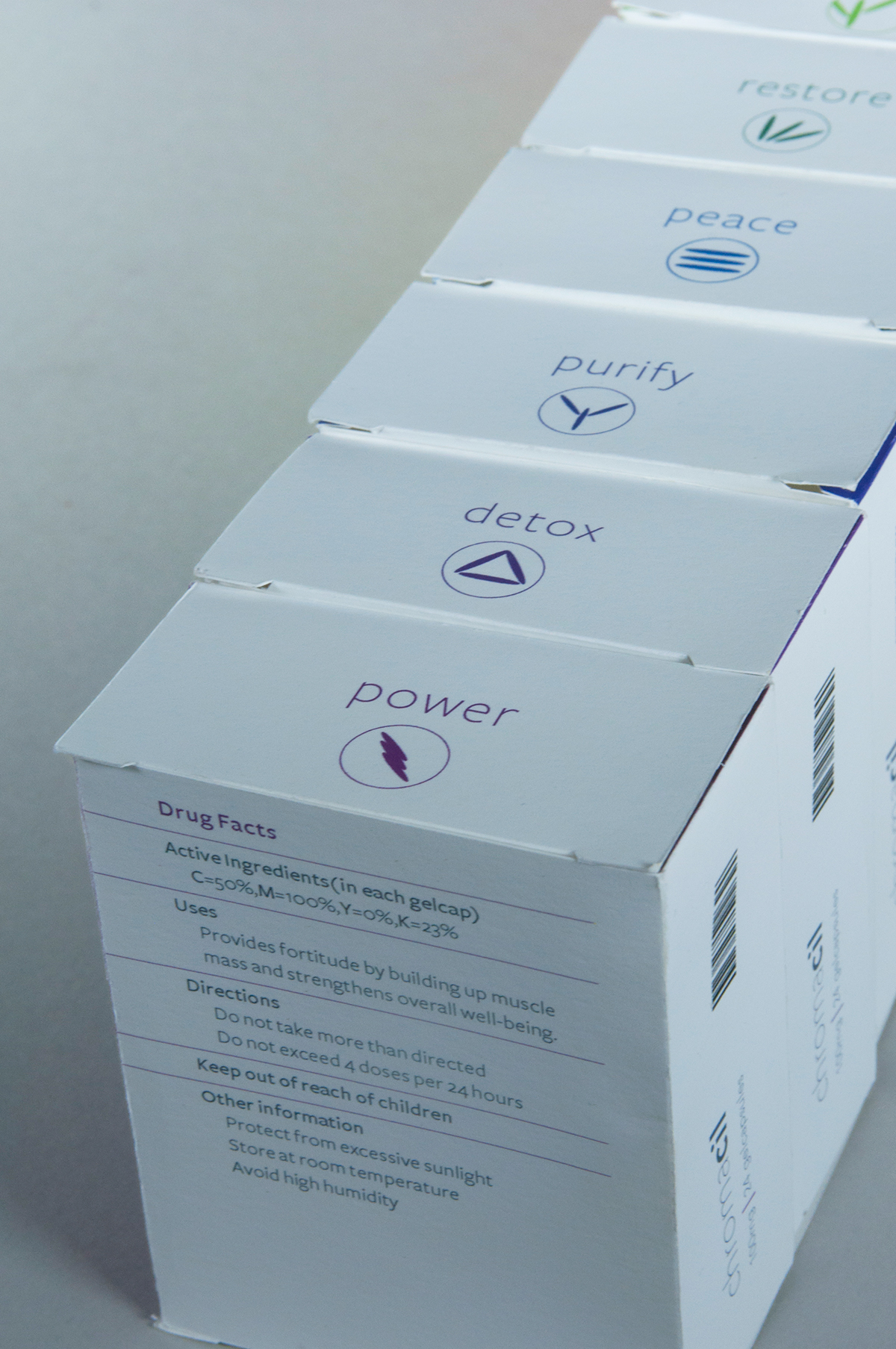
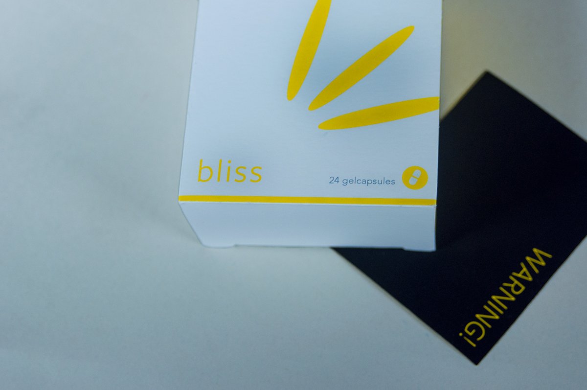
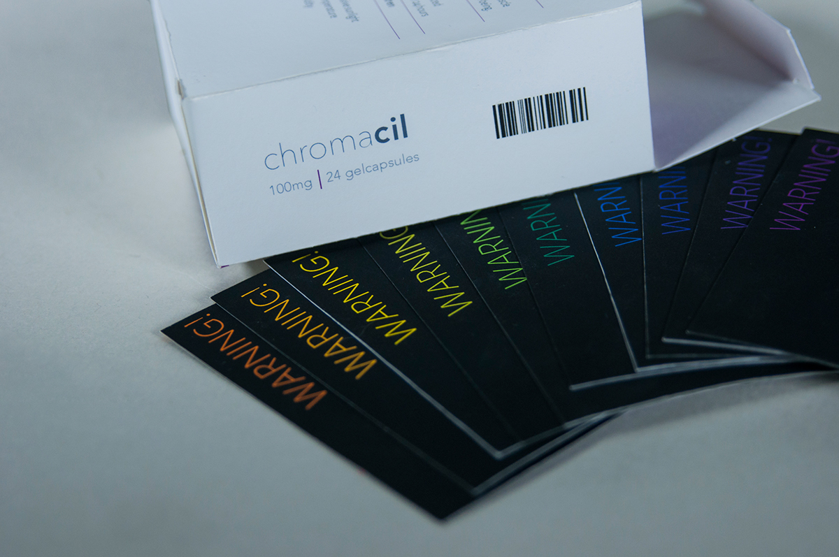
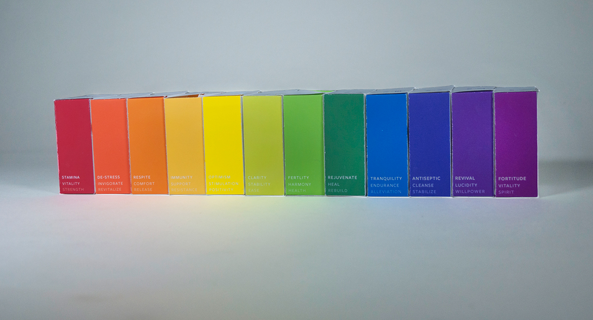
Colors have positive and negative connotations that are associated with them. In this project, I accentuated this polarity by applying the concept to a pharmaceutical drug. Pharmaceutical drugs have positive uses as a treatment and inevitable negative side effects. I created packaging for a fictitious homeopathic drug named Chromacil, using each of the 12 colors of the color wheel as sub brands of the Chromacil umbrella brand. Each color has a distinctive healing purpose which draws from its positive symbolic assocation, while the black warning inserts placed inside each package declare the side effects and by extension the negative connotations of the color.
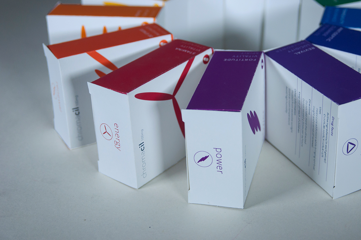
To provide cohesion to the identity, I used the same module in varying configurations to highlight each colors value. For example red in western culture symbolizes a primal life source and thus Chromacil's red themed sub brand is named Energy.