I was tasked with designing the logo and brochure for a luxury hotel spa in India named Neela, which in sanskrit and hindi means 'blue colored.' The client brief was to create a unique brand identity for the spa, independent from the look and feel of the hotel. Inspired by the origin of the word neela and its association with the ocean, I wanted to capture a feeling of tranquility in the logotype by introducing symmetry into its form.
route 1

route 2

Removing the stem of the 'a' provided more cohesion to the logo, and also highlighted the similarity in the forms of 'e' and 'a.'

Final Logo

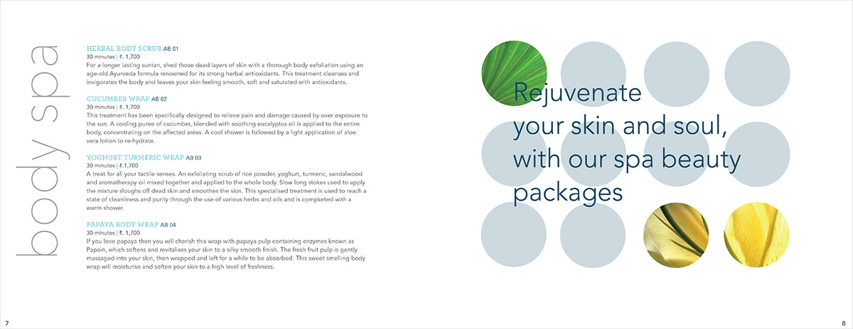
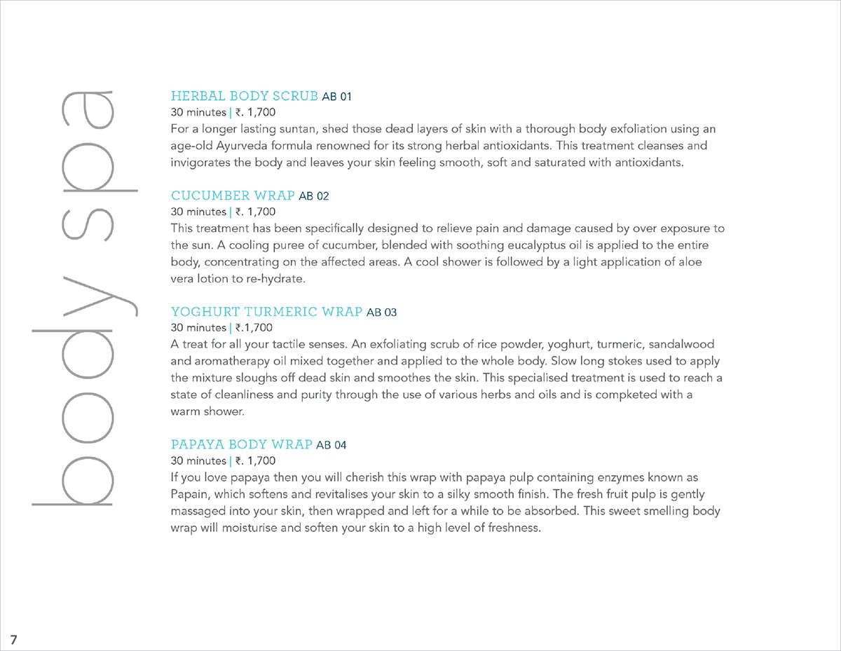
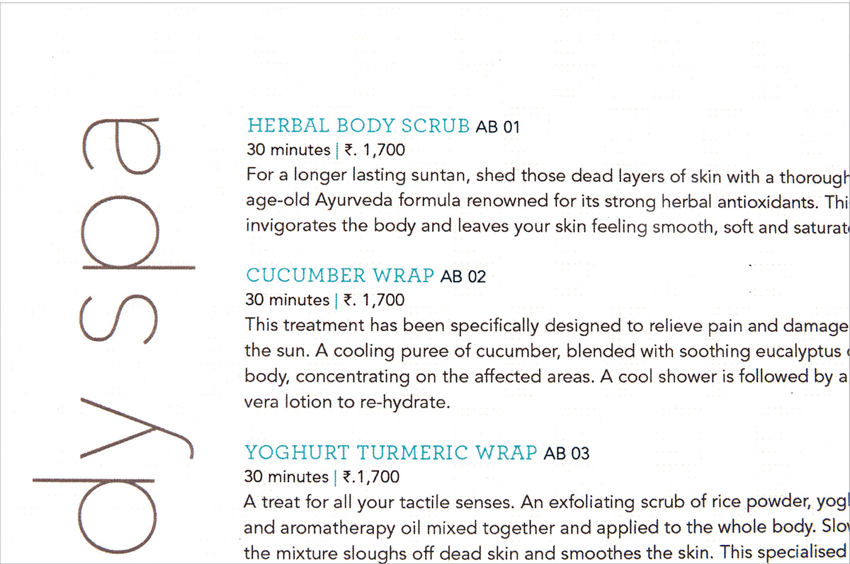
Brochure look and feel, set in Serifa and Avenir