Mongilardi's Cantucci Biscuit Packaging Design
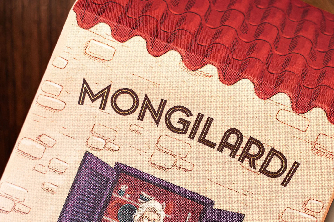
The challenge was to transform the tradition and flavor of Mongilardi's Cantucci biscuits into a unique and memorable visual experience. The solution was a packaging design that evokes warmth, familiarity, and sophistication, conveying the essence of the brand irresistibly. Inspired by Tuscany, the house-shaped box symbolizes coziness and invites consumers to connect with the brand's story. Details like golden hot stamping add exclusivity and elegance, enhancing the brand and product's perceived value. The packaging stands out on the shelf, capturing consumers' attention at first sight, boosting brand visibility. A warm color palette of brown, cream, and yellow arouses the desire to taste the delicious Cantucci biscuits, while violet, a tribute to the founders' grandmother's surname Viola, honors Mongilardi's tradition and legacy. Each package is a unique work of art thanks to hand-drawn illustrations, making the product even more special and desirable. The new Cantucci Mongilardi biscuit box is more than just packaging; it's a complete sensory experience celebrating the tradition, flavor, and exclusivity of the brand.
[Português] O desafio foi transformar a tradição e o sabor dos biscoitos Cantucci da Mongilardi em uma experiência visual única e memorável. A solução foi um design de embalagem que evoca familiaridade e sofisticação, transmitindo a essência da marca de forma irresistível. Inspirado na Toscana, a caixa em formato de casa simboliza aconchego e convida os consumidores a se conectar com a história da marca. Detalhes como o hot stamping dourado no logotipo adicionam exclusividade e elegância, aumentando o valor percebido da marca e do produto. A embalagem se destaca na prateleira, capturando a atenção dos consumidores à primeira vista, impulsionando as vendas e a visibilidade da marca. Uma paleta de cores quentes, composta por tons de marrom, creme e amarelo, desperta o desejo de experimentar os deliciosos biscoitos Cantucci, enquanto o violeta, em homenagem ao sobrenome Viola da avó das fundadoras, homenageia a tradição e o legado da Mongilardi. Cada embalagem é uma obra de arte única e exclusiva, graças a ilustração manual, tornando o produto ainda mais especial. A nova caixa de biscoitos Cantucci Mongilardi é mais do que apenas uma embalagem; é uma experiência sensorial completa que celebra a tradição, o sabor e a exclusividade da marca.