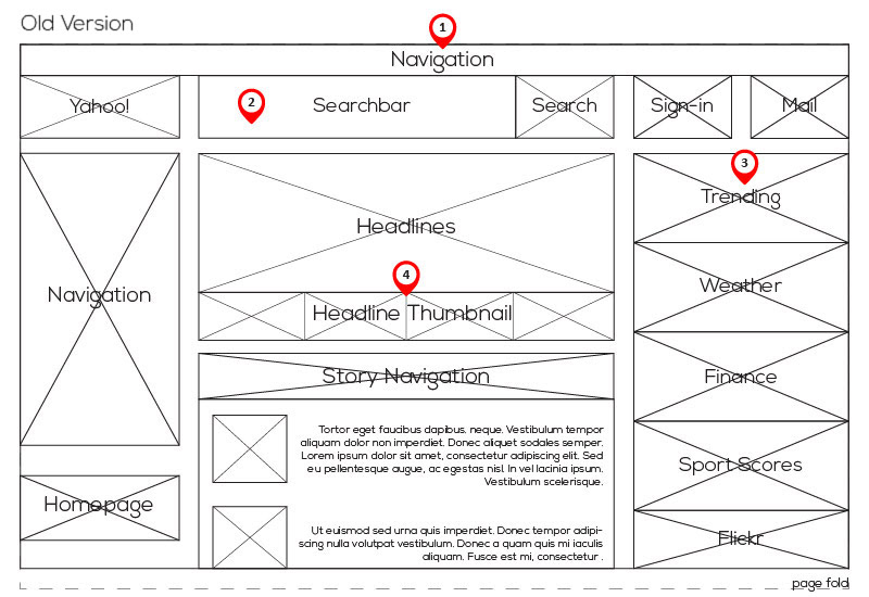
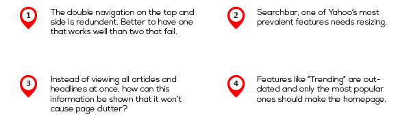
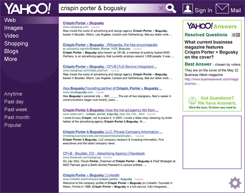
Before Yahoo! went through a massive redesign in 2014, their website was the definition of information heavy. Wonderful applications were so close together that they were losing traffic in the confusion. My redesign was a design test for CP+B and sought to fix their homepage and company image.
Yahoo! is a portal domain which means it is a comprehensive start page for the internet browser. It offers a multitude of services to visitors including a search engine, email, financial reports, and news articles.
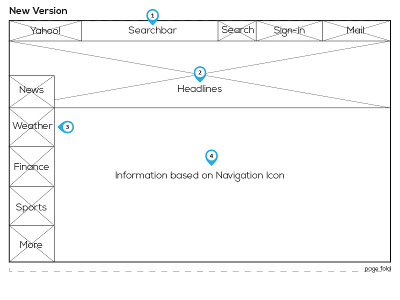
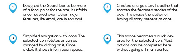
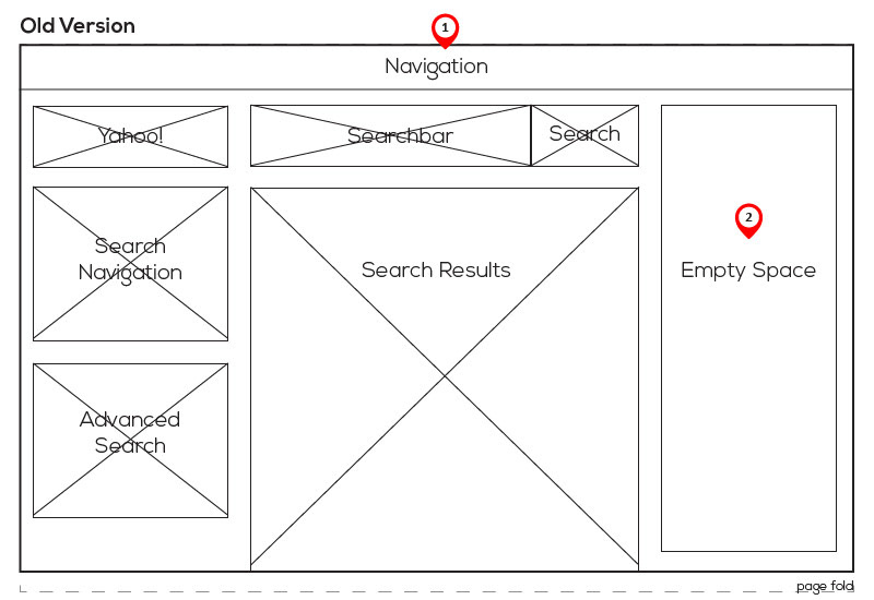
I wanted to capitalize on Yahoo’s multidimensionality but in a way that doesn’t overcrowd each page. In its current state, the site is cluttered. Visitors take too long sorting through information. It could use understandable toolbars and icons that create a theme to help navigate throughout the interface.
I wanted to capitalize on Yahoo’s multidimensionality but in a way that doesn’t overcrowd each page. In its current state, the site is cluttered. Visitors take too long sorting through information. It could use understandable toolbars and icons that create a theme to help navigate throughout the interface.