Briljant Brewing: Label design
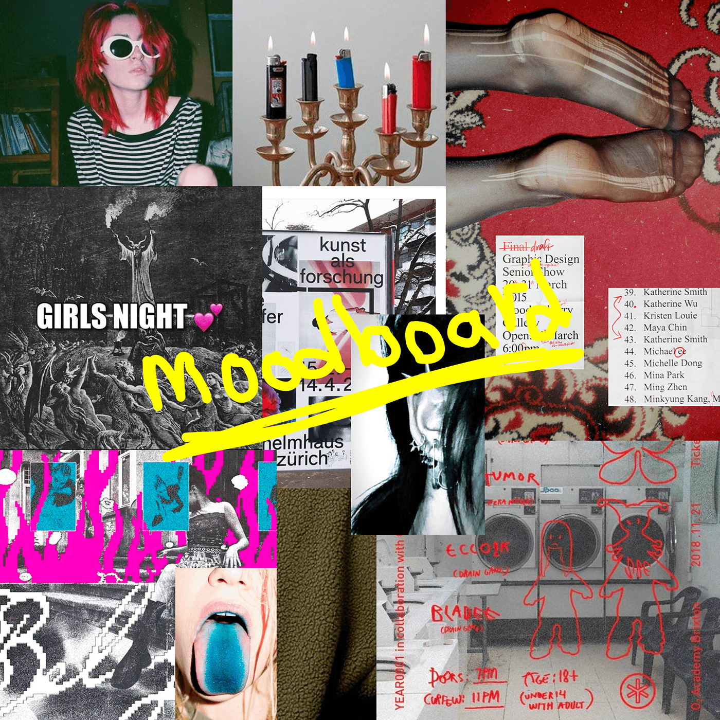
An altruistic project I've been working on for my friends who brew their own beer. Within beers as a product category, it's almost impossible nowadays to stand out and make something unique when it comes to design. Although, at least here in Sweden, there are no well-known beer brands positioning themselves into alternative subcultures such as punk, grunge and similar. As a result of that – and since Brilant Brewing is an underdog – I decided to take a lot of inspiration from grunge- and punk aesthetics.
I've been deliberately working with elements that in the traditional sense are considered ugly within the design field – such as roses, flames, stretched letters, Times New Roman and Impact. And then mixing them up with more "beautiful" typefaces and elements – to create a unique combo which hasn't been seen on the beer shelf yet.