Eourm Identity Development
2023
EOURM은 사라져가는 한국 고유의 전통주와 얽힌 이야기들을 재조명하고 싶은 마음으로 출발하였습니다. 한국의 문화 콘텐츠들이 세계에 널리 알려지고 있지만, 우리 고유의 주류문화에 대한 인식은 저조한 현실에서 누구나 쉽고 즐겁게 경험할 수 있는 전통주를 활용한 믹솔로지 키트를 제작합니다. 하나의 칵테일을 만들기 위해 주류와 재료를 혼합하는 과정을 일컫는 믹솔로지의 과정이 단순한 만남이 아닌, 만남을 넘어선 새로운 무언가를 창조하는 행위라는 생각을 바탕으로 칵테일을 넘어 삶의 전반을 아우를 수 있는 EOURM의 본질을 재정의하고, 이를 일관된 가치로 전달할 브랜드 아이덴티티 정립을 위해 본 프로젝트를 기획하게 되었습니다.
EOURM started with the desire to shed new light on the stories of Korea's unique traditional liquor. Although Korean cultural contents are becoming widely known around the world, awareness of our unique liquor culture is low. We plan to produce a mixology kit using traditional liquor that anyone can experience easily and happily. Based on the idea that the process of mixology,is not not a just blending and mixing, but an act of creating something new beyond it. This project was planned to redefine the essence of EOURM and establish a brand identity that will convey this as consistent value.
Project Goal
EOURM은 바에서만 즐길 수 있었던 전문적인 영역인 칵테일과 믹솔로지의 과정을 누구나 쉽게 직접 즐길 수 있도록 대중적 영역의 전통주 믹솔로지 키트로 제작합니다. 이러한 업의 성질을 바탕으로 사람들의 삶 속 EOURM의 존재 이유를 찾아갑니다.
EOURM produces traditional liquor mixology kits for the public so anyone can easily enjoy the process of creating cocktails, previously thought of as a specialized activity that could only be enjoyed in bars. Based on these characteristics of the profession, we found the reason for EOURM's existence : To make an easy and joyful mixolofy experience.
Brand Essence
EOURM은 믹솔로지가 단순히 술과 재료가 만나는 것이 아닌, 만남을 넘어 어우러져 새로운 하나의 칵테일이 된다는 것을 라이프 스타일 관점에서 해석하였습니다. 사람들이 단순한 만남이 아닌, ‘어우러짐'을 통해 일상을 다채롭게 채워나가기를 바라는 것이 EOURM의 존재 이유이자 본질이며 이는 곧 소비자들이 우리 브랜드를 찾는 이유입니다.
EOURM interprets Mixology from a lifestyle perspective: That mixology is not simply the blending of alcohol and ingredients, but a creation of something more than that, a harmony. EOURM hopes that people will fill their daily lives colorfully through harmonizing. rather than simply “Blending”.

Brand Core Value & Design Principle
‘어우러짐'의 가치를 실현시키기 위해 우리는 누구나 쉽고 다채롭게 즐길 수 있는 제품과 서비스를 구축하며 결과보다는 여정에서의 즐거움에 집중합니다. 술을 단순한 주류가 아닌 이야기와 만나는 하나의 언어임을 규정합니다. 이러한 핵심가치들을 바탕으로 소비자들이 브랜드를 경험하는 접점에서의 디자인 원칙들을 설정합니다.
To ‘harmonize’, we build products and services that anyone can enjoy easily and in a variety of ways, and focus on the journey rather than the result. We define alcohol as a language that connects stories. Based on these core values, we set design principles at the point of contact where consumers experience the brand.

Brand Name
브랜드 네임은 한국적이면서도 글로벌 시장에서도 발음이 용이한 네이밍을 모색했습니다. 서로 다른 가치들이 섞이며 어우러짐의 가치를 가장 잘 표방하는 ‘어우름(EORUM)’ 이라는 브랜드명을 개발했습니다.
We sought naming that is both Korean and easy to pronounce in the global market. We developed the brand name "EOURM," which best represents the value of mixing different values.

Brand Slogan
EOURM은 사람들의 한 잔을 다채롭게 채울 뿐 아니라, 사람들의 삶을 더욱 다채롭게 채운다는 의미를 담은 슬로건을 개발하였습니다.
EOURM ‘s slogan implies that we not only fill people's cups, but also fills people's lives with joyful variety.
Brand Logo
어우름의 브랜드 로고는 전통과 현대의 어우러짐의 가치를 표현합니다. 브랜드 지향 가치를 표현하기 위해 세련된 세미세리프 로고 타입에 한글 획의 삐침을 적용하여 세련되면서도 한국적인 멋이 나타나는 로고를 개발했습니다.
Eourum's brand logo expresses the value of combining tradition and modernity. Stylish semi-serif to express brand-oriented values by applying the Korean strokes to the logo type, we developed a logo that was sophisticated with Korean typography at base.


Brand KeyVisual
키비주얼은 모디파이어와 술이 만나 퍼지는 단계를 시각화했습니다. 아무것도 넣지않는 술의 상태를 1단계로 잡고, 모디파이어가 들어간 옅게 펴지는 2단계, 풀어지는 3단계, 짙게 어우러진 4단계로 정리했으며, ‘어우러짐’의 상태를 가장 잘 표현하는 3단계를 메인 키비주얼로 사용합니다.
The key visual represents the stages of blending of modifiers and alcohol. The state of pure alcohol without anything is set as level 1. Stage 2 represents the initialization of the blending of the modifier and alcohol with light spreading. The state of the harmony deepens in stage 3, and Stage 4 represents the finished harmonization.

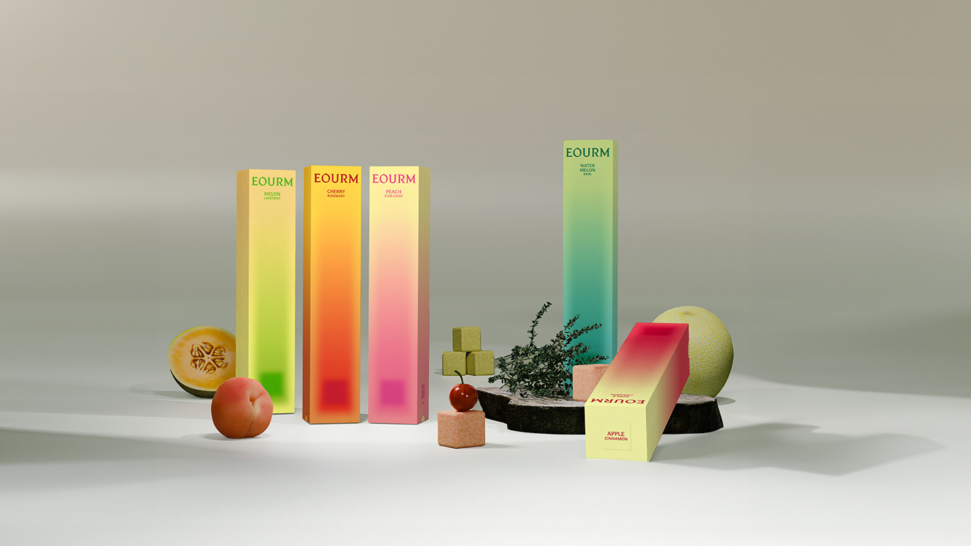
Brand Color
어우러짐의 체계화된 단계는 브랜드 색상에서도 재료가 가진 성격을 나타내는 어우름 그라데이션으로 확장하였습니다. 브랜드의 메인 컬러는 쌀이가진 무채색의 블랙과 화이트틀 사용하며, 각 제품의 컬러는 모디파이어의 원재료의 색상에서 추출한 요소들을 그라데이션으로 활용하였습니다.
The systematic steps of harmony have been expanded to the brand color as well, with a gradation that represents the characteristics of the materials. The main color uses the achromatic black and white tones of rice, and the color of each product is derived from elements extracted from the color of the modifier's raw materials.

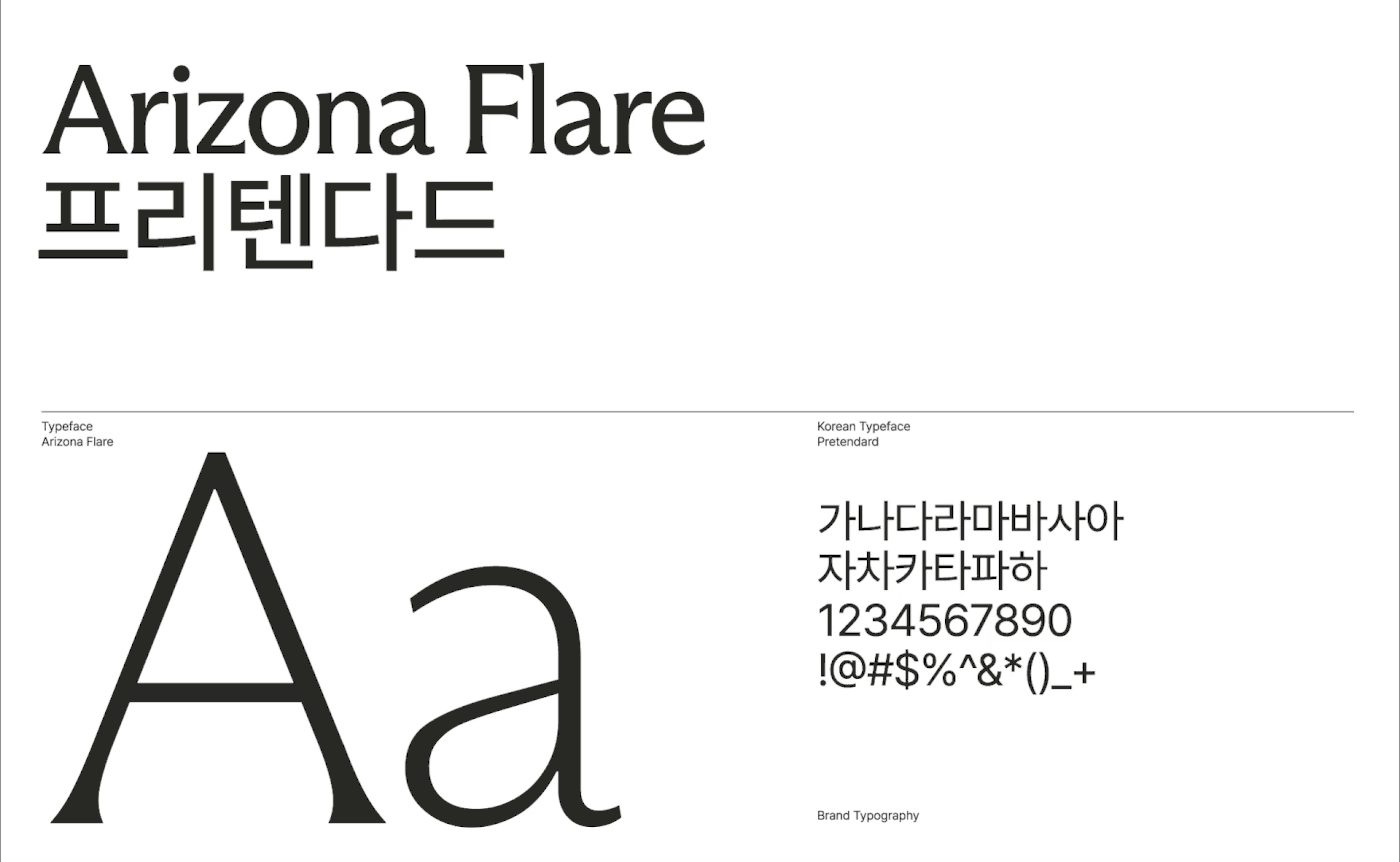
Brand Typography / Iconography
어우름의 서체는 세리프와 산세리프가 적절히 조화된 세미 세리프의 애리조나 플레어 서체와 모던하며 가독성이 좋은 프리텐다드 서체로 시각적인 조화를 이룹니다. 픽토그램은 로고가 가진 한글 명조 획의 핵심적 특징을 반영하여 어우름의 픽토그램을 디자인 하였습니다.
Eourm's fonts are Arizona Flare, which is a proper combination of serif and sans serif, and the modern, easy-to-read Pretendard. The pictogram reflects the core characteristics of the Korean Myeongjo strokes of the logo.


User Experience
Eourm의 Web service는 광고 베너, 제조 과정, 상품, 오프라인 스토어 등 고객의 경험 흐름에 맞춰 전반적으로 구성하였습니다. 어우름의 브랜드 무드를 웹 전반에 녹여냈고 이미지 또한 최소 여백, 구도, 배경색을 규정하여 브랜드의 일관된 무드가 느껴질 수 있도록 구성하였습니다.
Eourm's web service provides an overall service tailored for a consistent customer experience, including advertising banners, manufacturing processes, products, and offline stores. Eourm's brand mood has been incorporated throughout the web, and the image is also designed to define the brand’s image throughout the margin, composition, background color and etc.