-
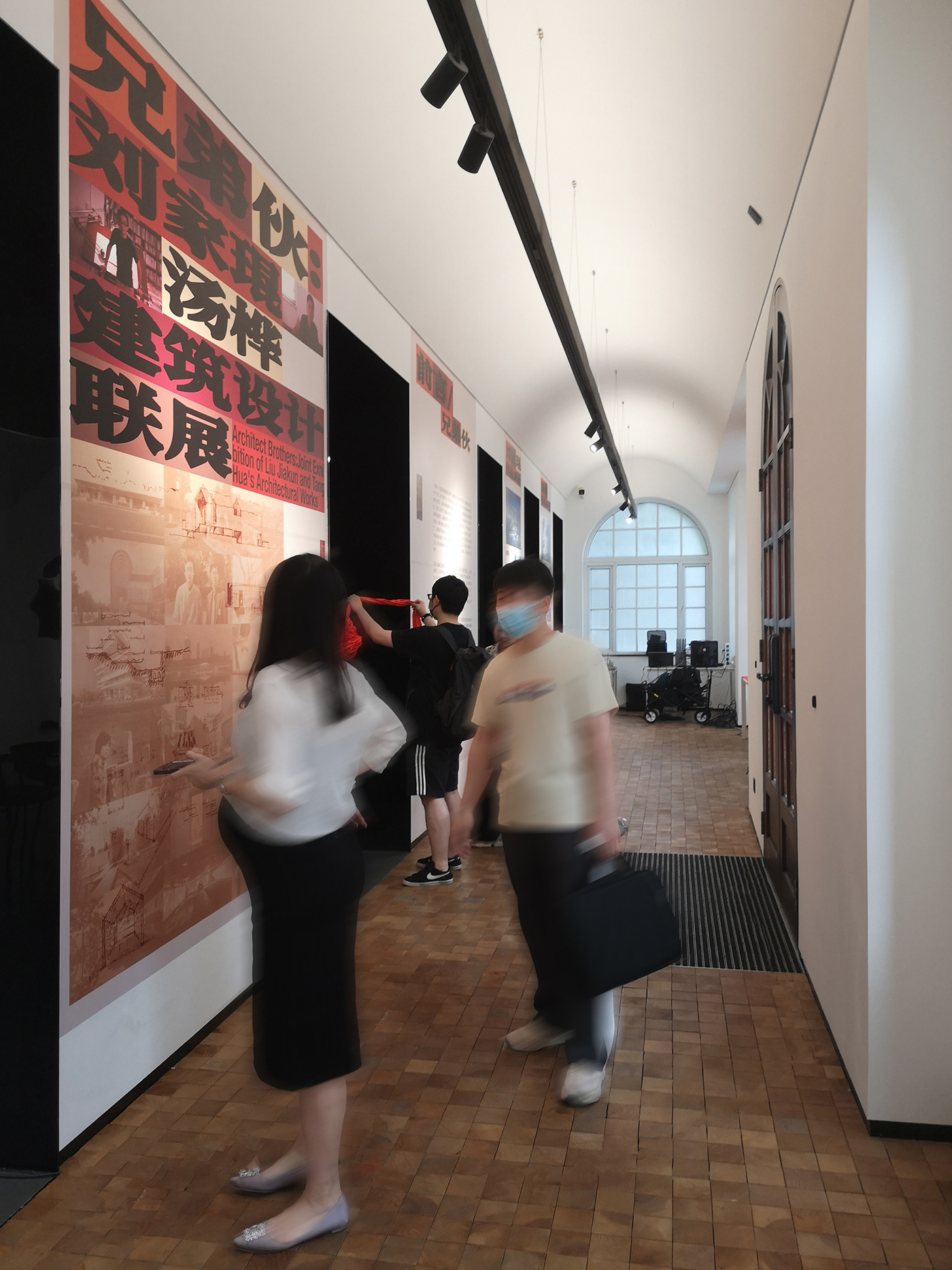
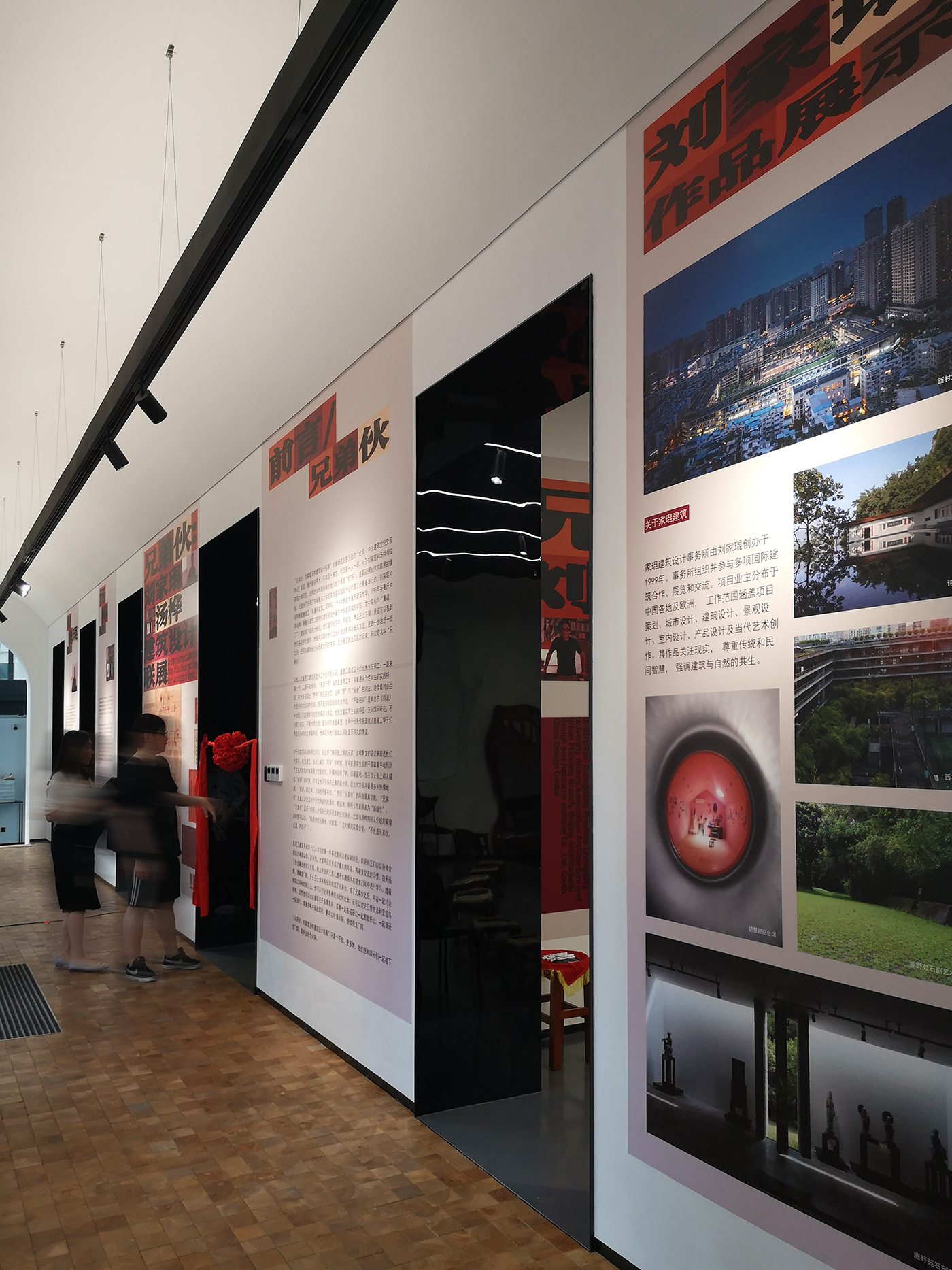
《兄弟伙:刘家琨汤桦建筑设计联展》由朱晔博士策展,于2023 年 5 月 21 日在广州合筑·中法建筑文化交流中心开幕,展期四周。“这次展览可以看到刘家琨、汤桦两位建筑大师的代表作,大致可以看到他们之间的彼此影响与长久友谊,更进一步地想一想之后,还可以看到他们与母校之间的关联。因为展览的这几层的诉求,所以取名叫“兄弟伙”。”——策展人,朱晔
-
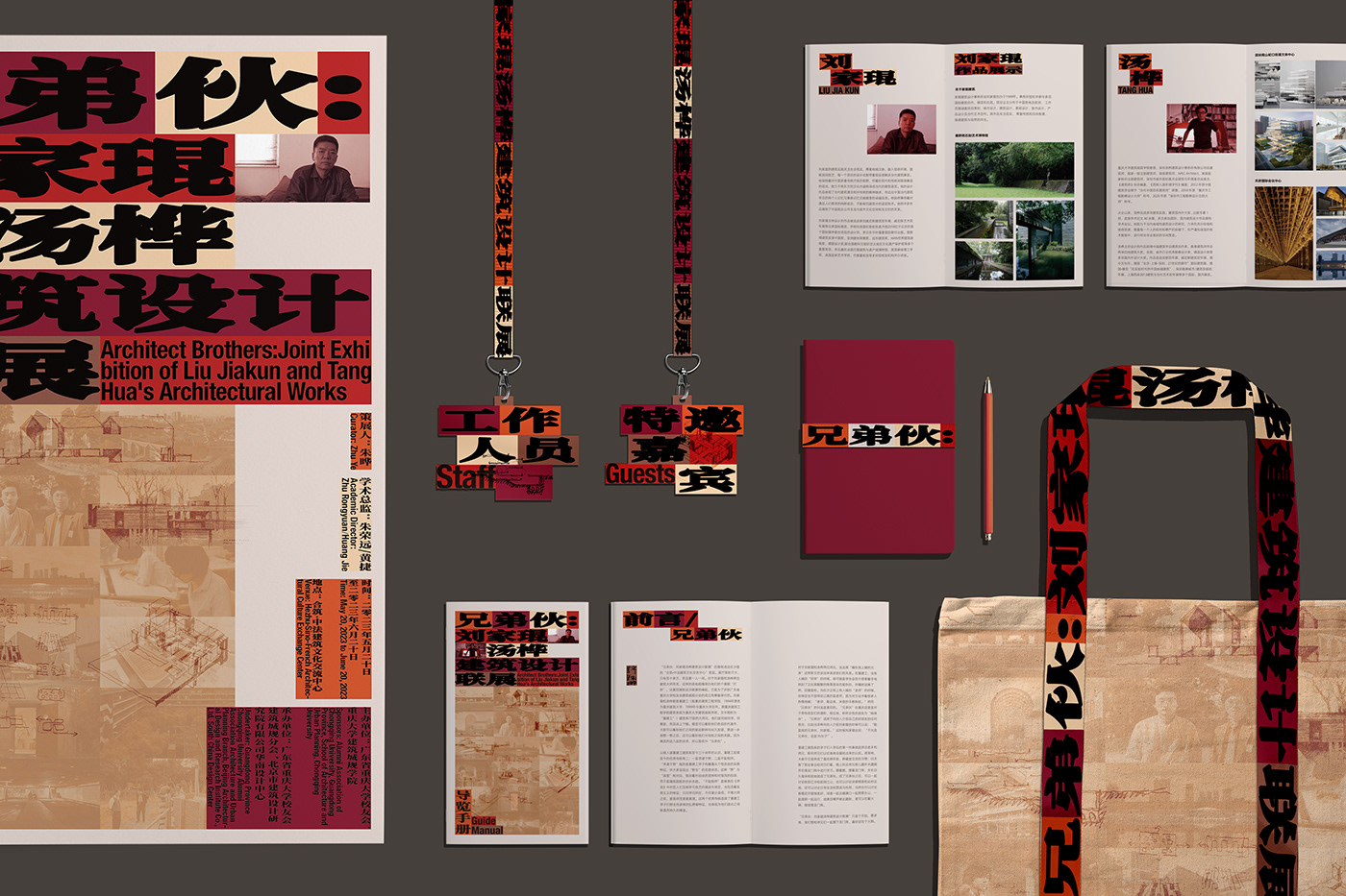
SURE Design承担了《兄弟伙》展览中的整体视觉设计工作。
-
“兄弟伙”是重庆方言,大概意思是指“哥们、老铁、伙伴、兄弟”,“伙”在这里的意思是成群结伙。刘家琨和汤桦两位老师是建筑圈很有影响的著名建筑设计师师和前辈,各有诸多相当优秀、影响深远的作品。我们考虑到既然策展人用“兄弟伙”这个充满江湖和民间味道的名字作为展览的主题,可能也不是想老老实实的做一个正襟危坐的建筑学术展览。
-
我们和重建工的诸多前辈、师长、同事、朋友有诸多的交集和合作,又想到重庆这个城市有特属于西南的江湖气息,我们以火锅的红色作为主色、将建筑的框架和体块感,融合加粗的大宋体字体,同时将二位大师的作品照片、作品草图、青年时期的照片作为海报的“配菜”,最后形成强烈、具有冲击力和“火锅味道”的建筑海报。主形象海报试图脱离传统建筑海报以空间、光影、构造、材料等建筑学常规意义上的表达手段,也同时规避了学术、研究展览一贯的严谨、端正和“正统”气息,更多的以混合的地域、市井气息、青春感、学院特质将多年后重聚在一起的建筑大师们重新拉回复合、混杂的青春求学时光。这也许也是一种“回到本源”的方法吧。
-
主持设计师:张烁
项目设计师:吴帆
设计师:吴帆、彭俊聪、张喜燕(实习)
-
内容:展览整体设计、画册、环境图形
主办方:广东省重庆大学校友会、重庆大学建筑城规学院
周期:2022年8月-2022年9月
-
‘Architect Brothers:Joint Exhibition of Liu Jiakun and Tang Hua’s Architectural Works’ was curated by Dr. Zhu Ye and opened on May 21, 2023 at the Sino French Architectural Culture Exchange Center in Guangzhou. The exhibition lasted for four weeks. This exhibition can see the representative works of Liu Jiakun and Tang Hua, two architectural masters, roughly showing their mutual influence and long-term friendship. After further consideration, one can also see their connection with their alma mater. Due to the demands of these layers in the exhibition, they are named "Brothers"—— Curator Dr. Zhu Ye
-
SURE Design undertook the overall visual design work for the exhibition "Architect Brothers:Joint Exhibition of Liu Jiakun and Tang Hua’s Architectural Works".
-
"Brother" refers to Chongqing dialect, which roughly means "buddies, Laotie, partners, brothers", and "gang" here means groups. Liu Jiakun and Tang Hua, two famous architects and predecessors with great influence in the architectural circle, each have many excellent and far-reaching works. We consider that since the curator used the name "Brothers" as the theme of the exhibition, which is full of martial arts and folk flavors, it may not be the intention to honestly create a serious academic exhibition of architecture.
-
We have had many interactions and collaborations with many predecessors, teachers, colleagues, and friends of the reconstruction workers, and we also realized that Chongqing has a unique southwest atmosphere of the world. We used the red color of hotpot as the main color, combined the framework and block sense of the building with bold Song typeface, and used photos of the two masters' works, sketches, and photos from their youth as the "side dishes" of the poster, ultimately forming a strong sense of harmony Architectural poster with impact and "hot pot flavor". The main image poster attempts to break away from traditional architectural posters using conventional means of expression such as space, light and shadow, structure, and materials. At the same time, it also avoids the rigorous, upright, and "orthodox" atmosphere of academia and research exhibitions. Instead, it uses a mixture of regional, urban, youthful, and academic characteristics to bring back the complex and mixed youth of architectural masters who have reunited after many years. This may also be a way of 'returning to the source'.
-
Principal Designer:Zhang Shuo
Project Designer:Wu Fan
Designer:Wu Fan、Peng Juncong、Zhang Xiyan(internship)
-
Content:
Sponsor: Chongqing University Alumni association, Chongqing University School of Architecture and Urban Planning
Period:08.2022-09.2022


