
About the company
No Frame show is a TV show where girls make their dreams come true.
The goal of the TV show is to make them bolder, more self-confident and educated.
The goal of the TV show is to make them bolder, more self-confident and educated.
My task was to create a brand identity that combines boldness and tenderness.
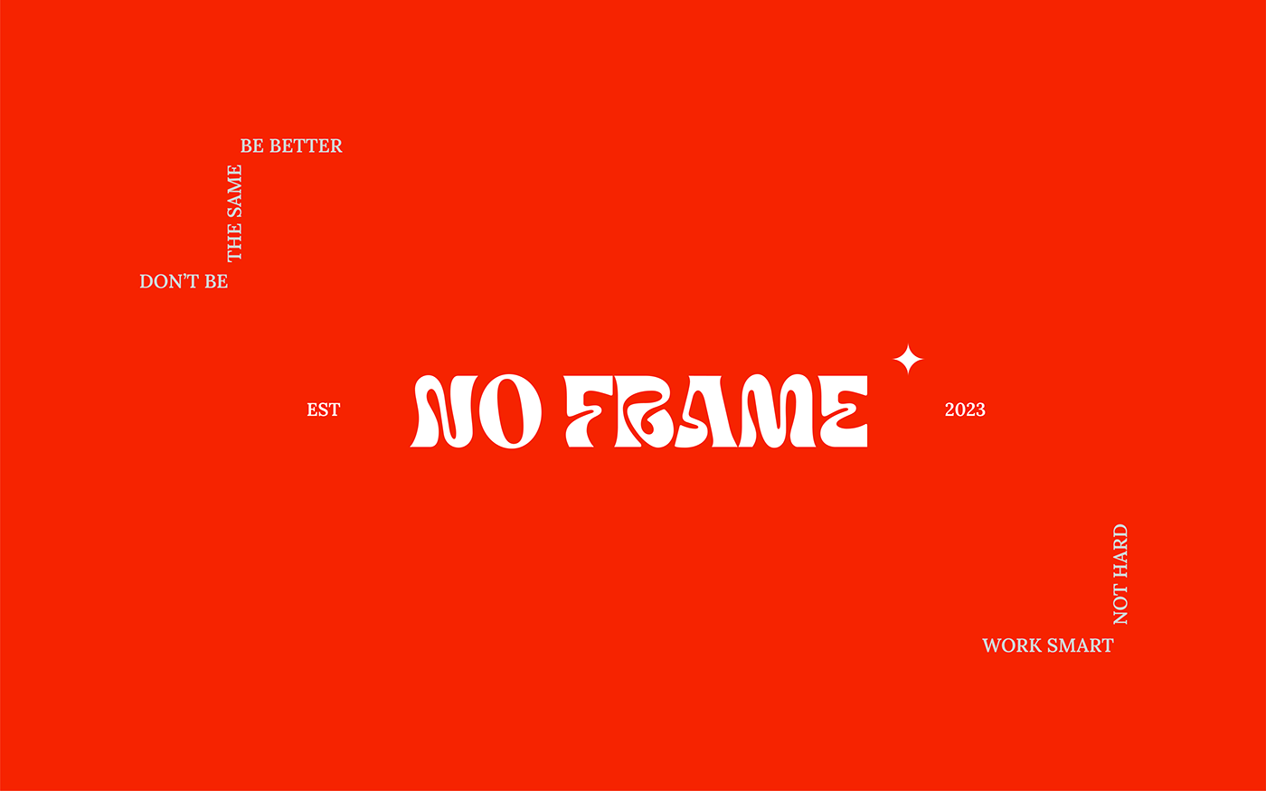
About the logo
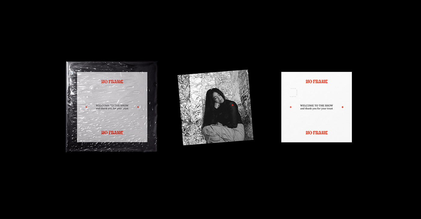
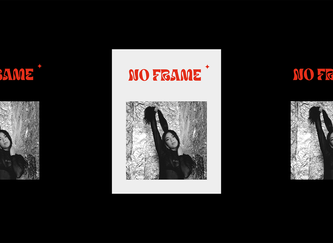
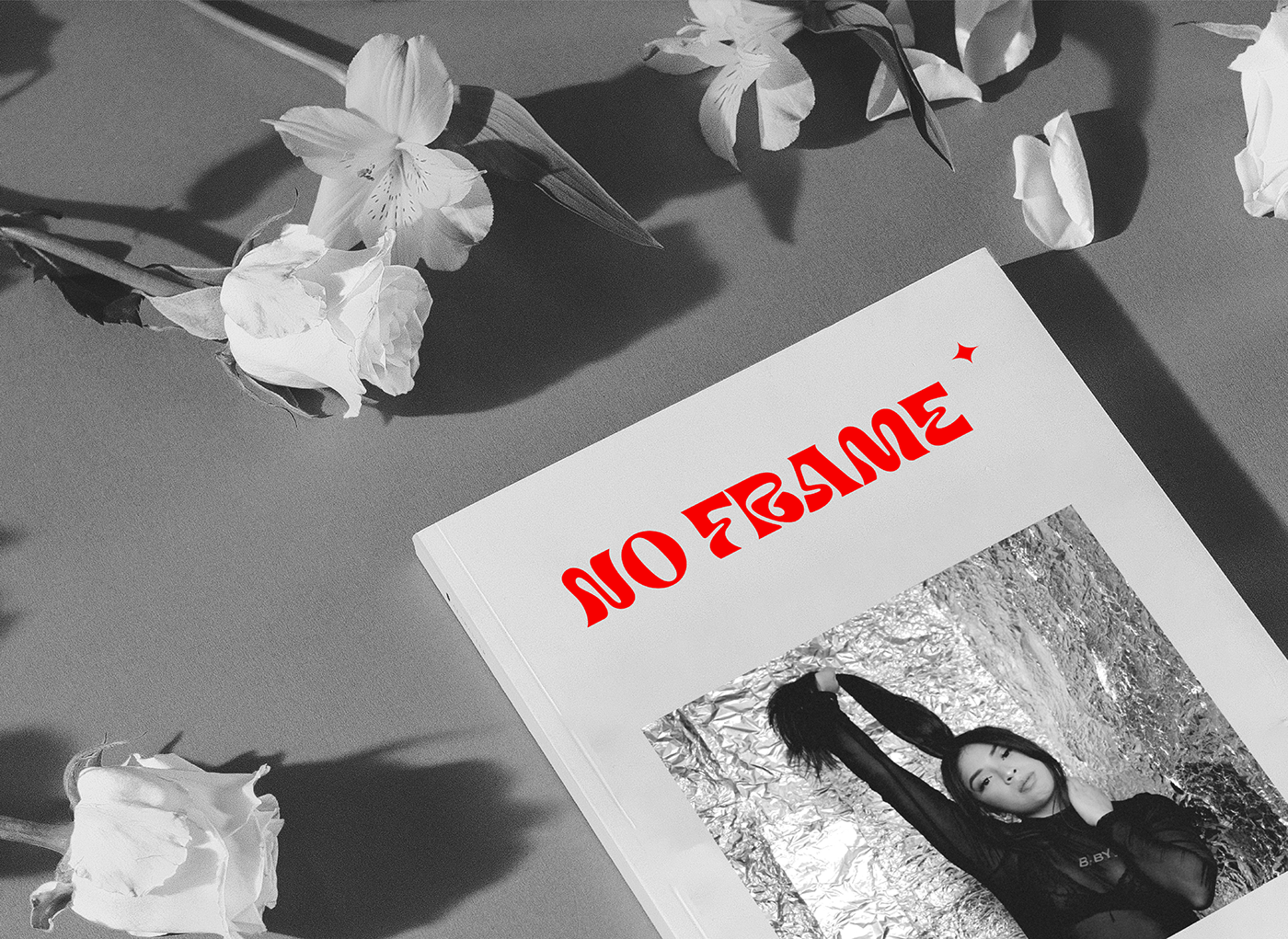
An unusual and accent font was chosen for the logo, emphasizing the uniqueness of each individual.
The star was chosen as a graphic sign as a comparison of the No Frame school with the guiding star for girls.
The star was chosen as a graphic sign as a comparison of the No Frame school with the guiding star for girls.
About the brand identity
Broken sentences were chosen as a signature element of the typography as an expression of the character of girls who go against stereotypes and are ready to change themselves, despite the opinions of others.
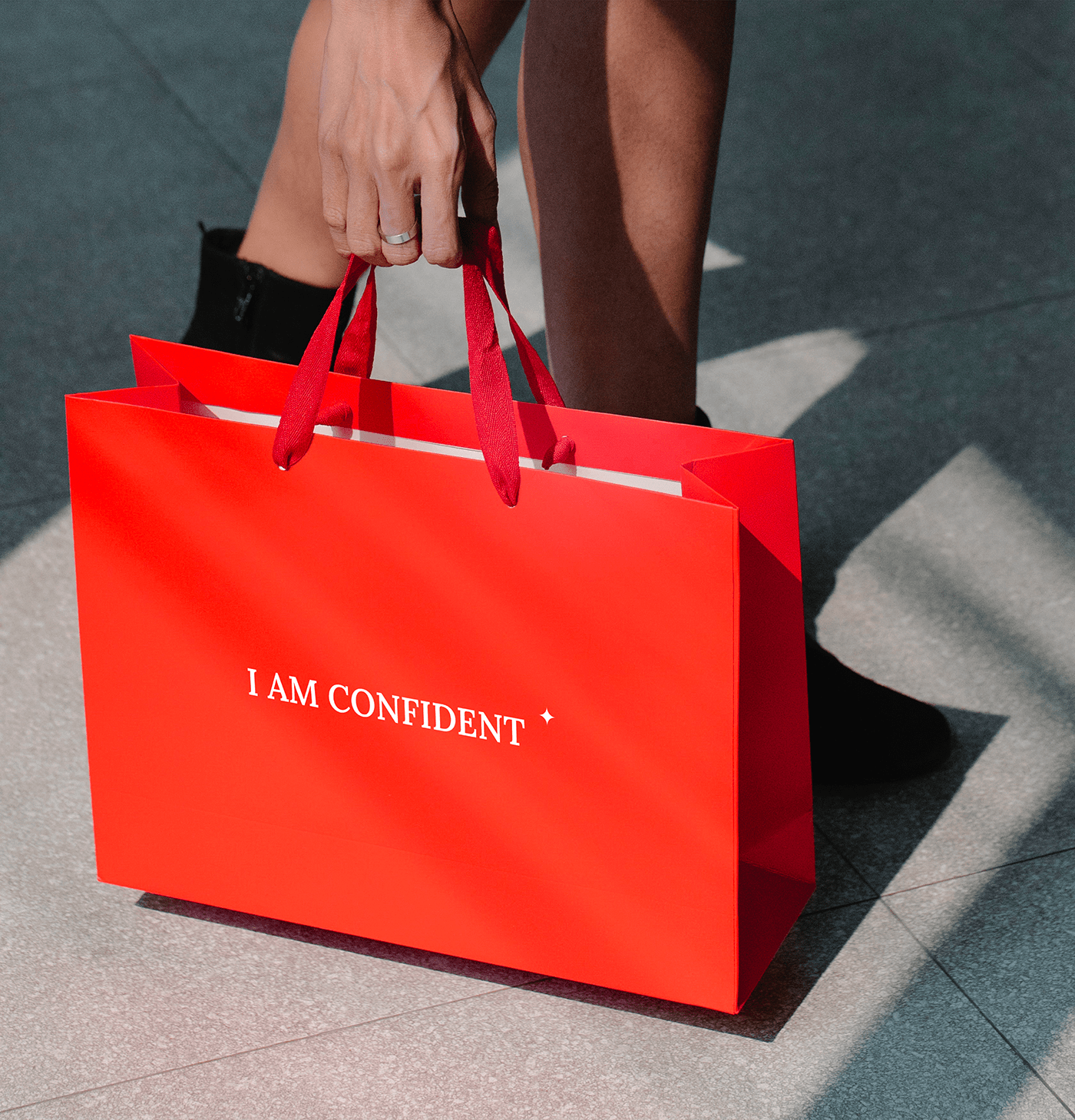
Bright red was chosen as the corporate color. The psychology of it is very multifaceted, just like the characters and stories of the girls. Red color attracts a lot of attention and calls not to be afraid to be seen and heard. Moreover, red increases motivation, work efficiency and is associated with love.