

LEBOL
So that the memorable moments in life shine even brighter
and are etched into our memories with brilliance...
A brand that encompasses all the beauty in the world.
Through LEBOL's jewelry, which seamlessly blends into various spaces of everyday life without being excessive, we focus on enhancing the inherent beauty that naturally complements each individual's unique appearance.


Brand Concept
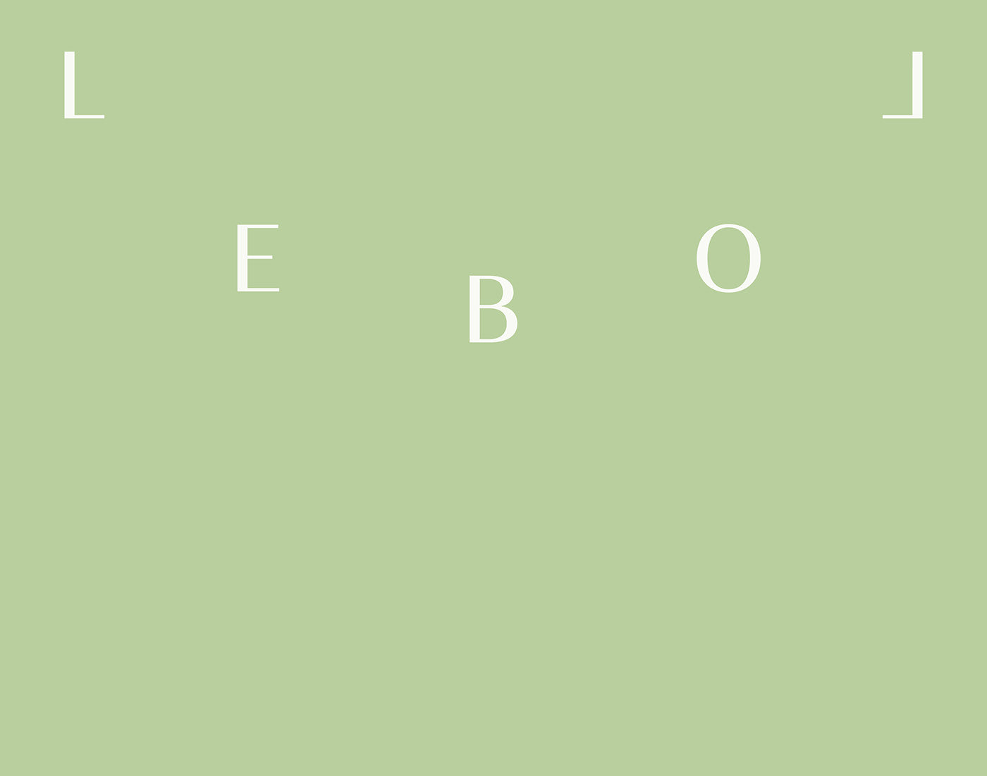
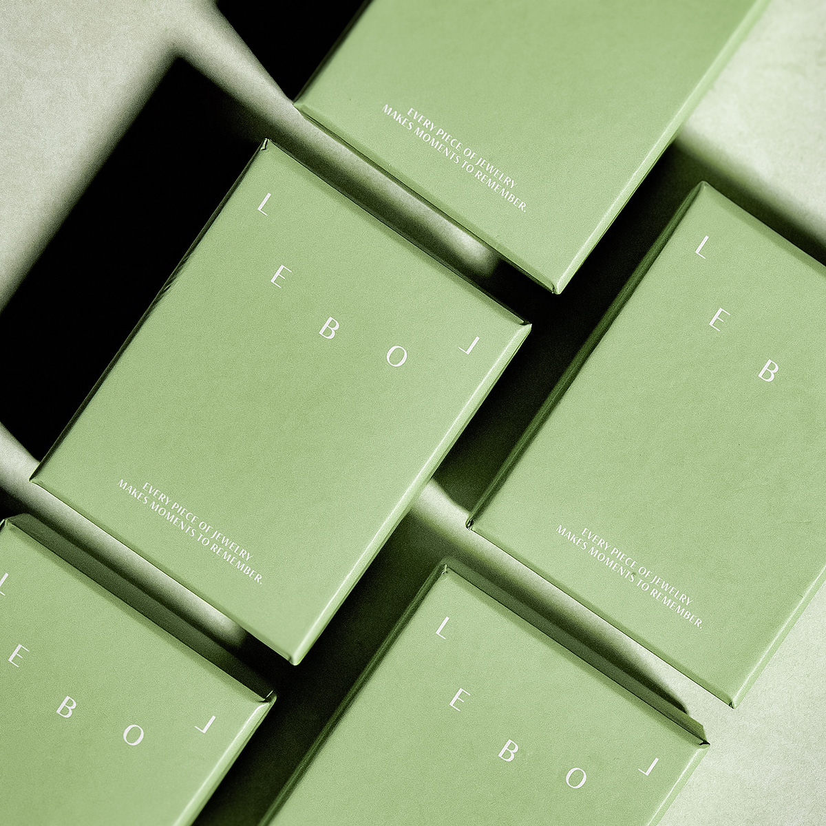
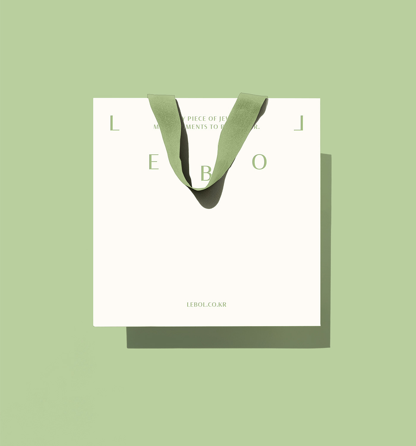
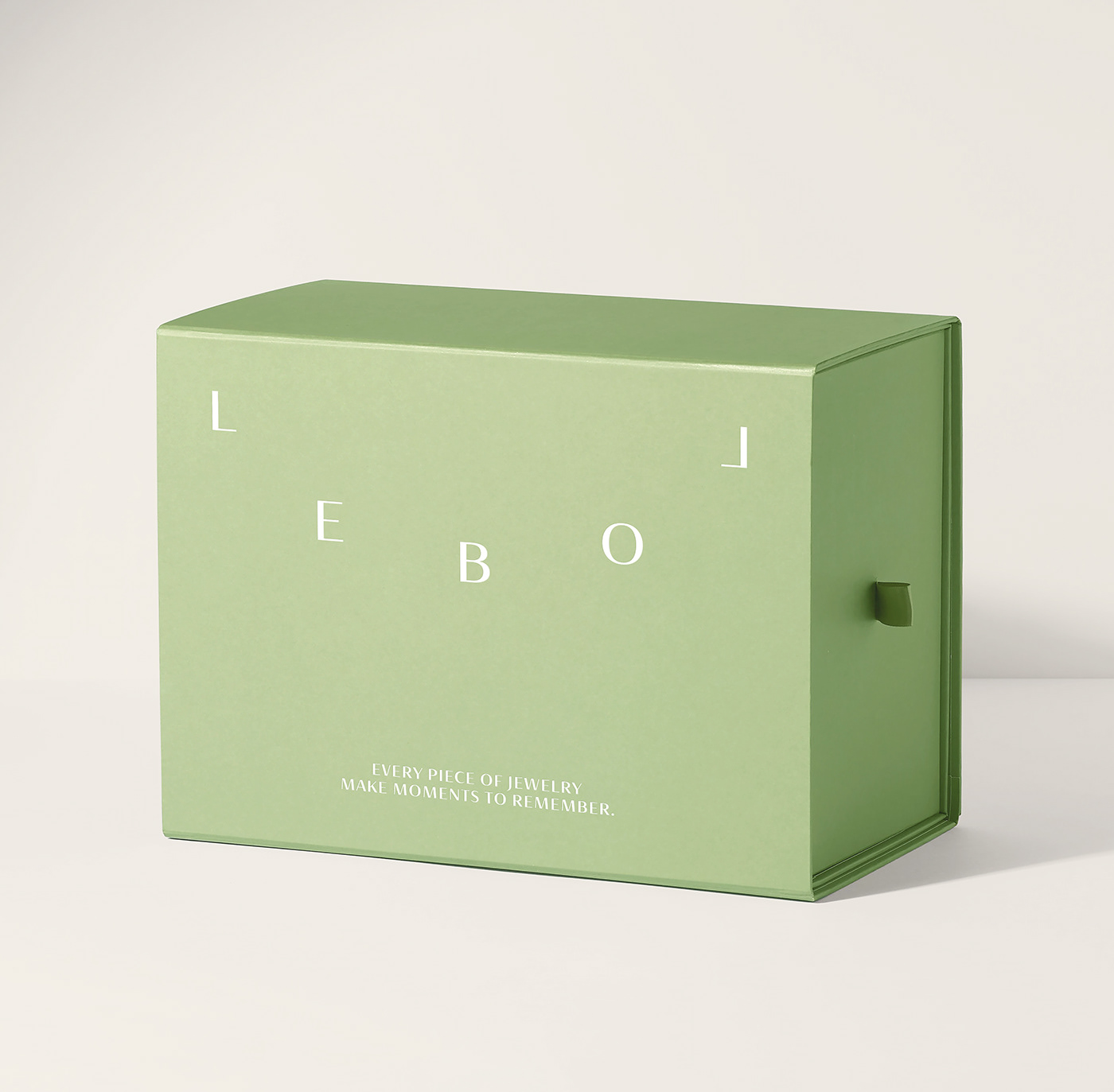
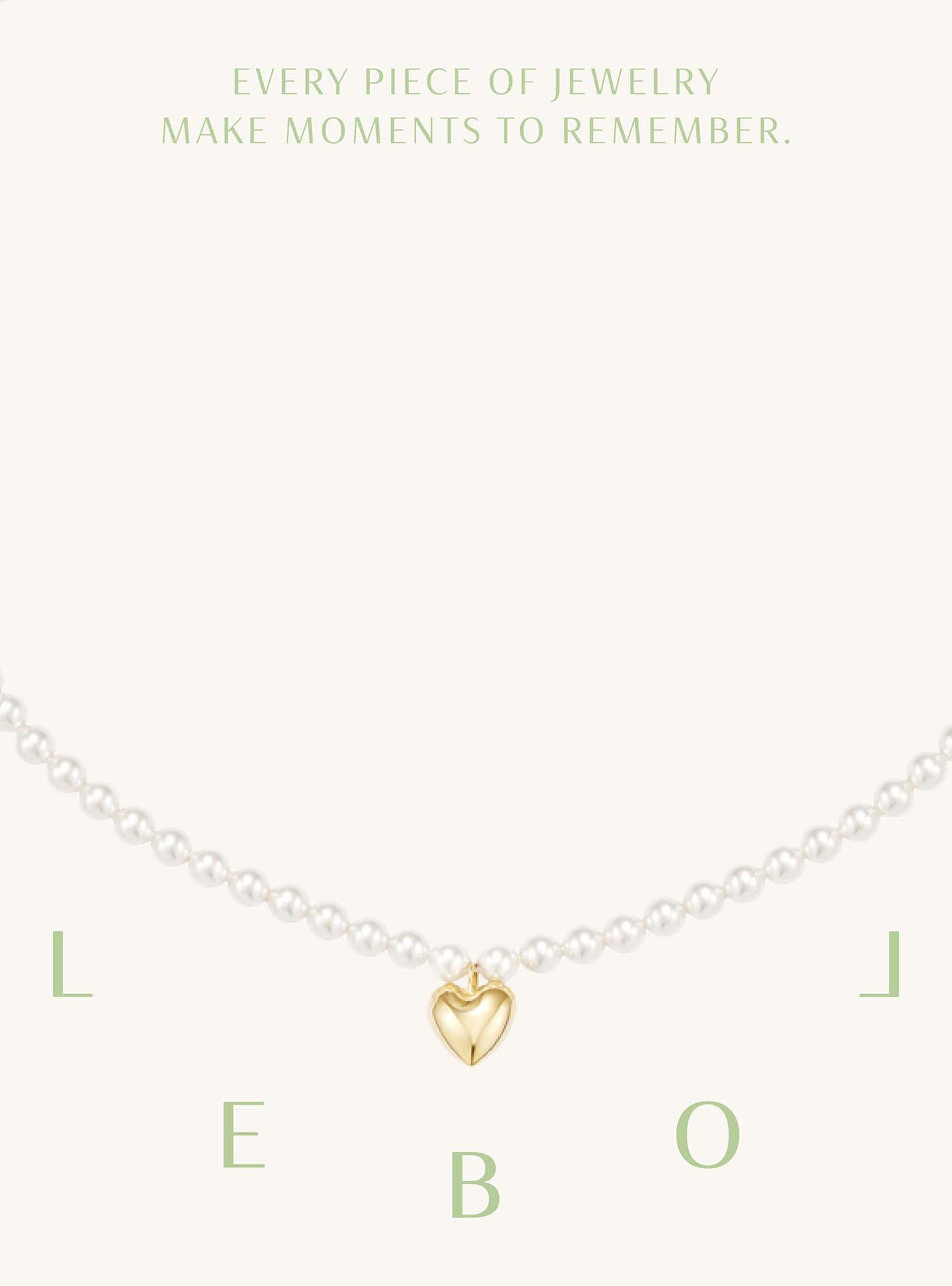
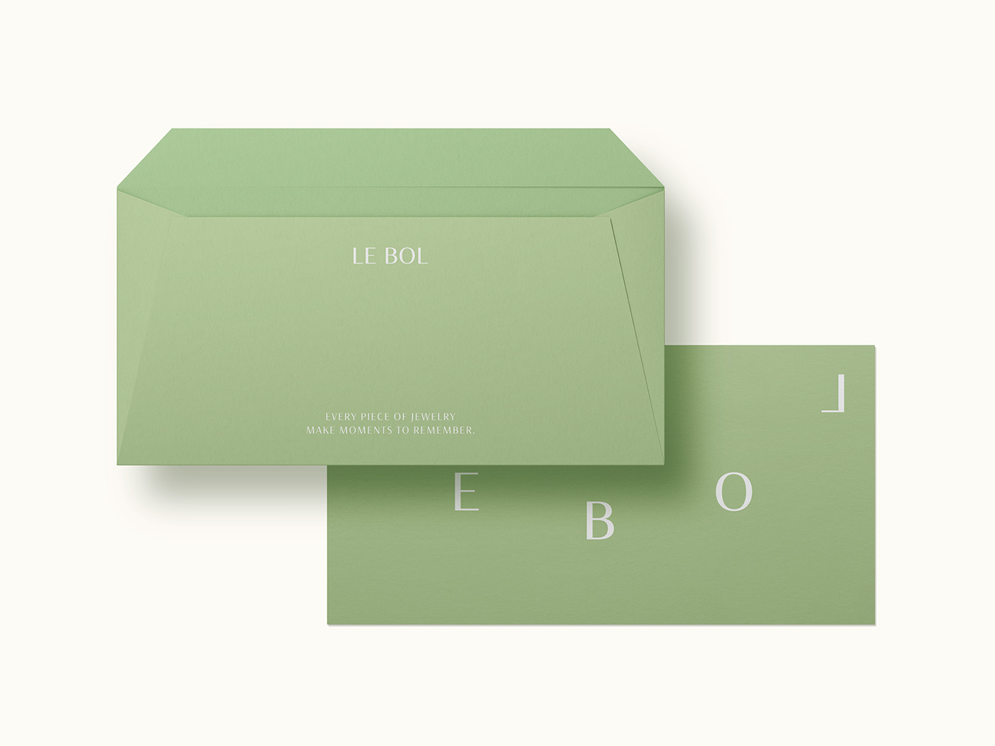
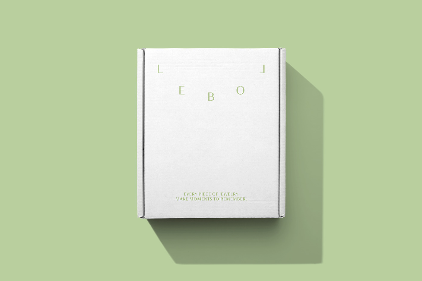
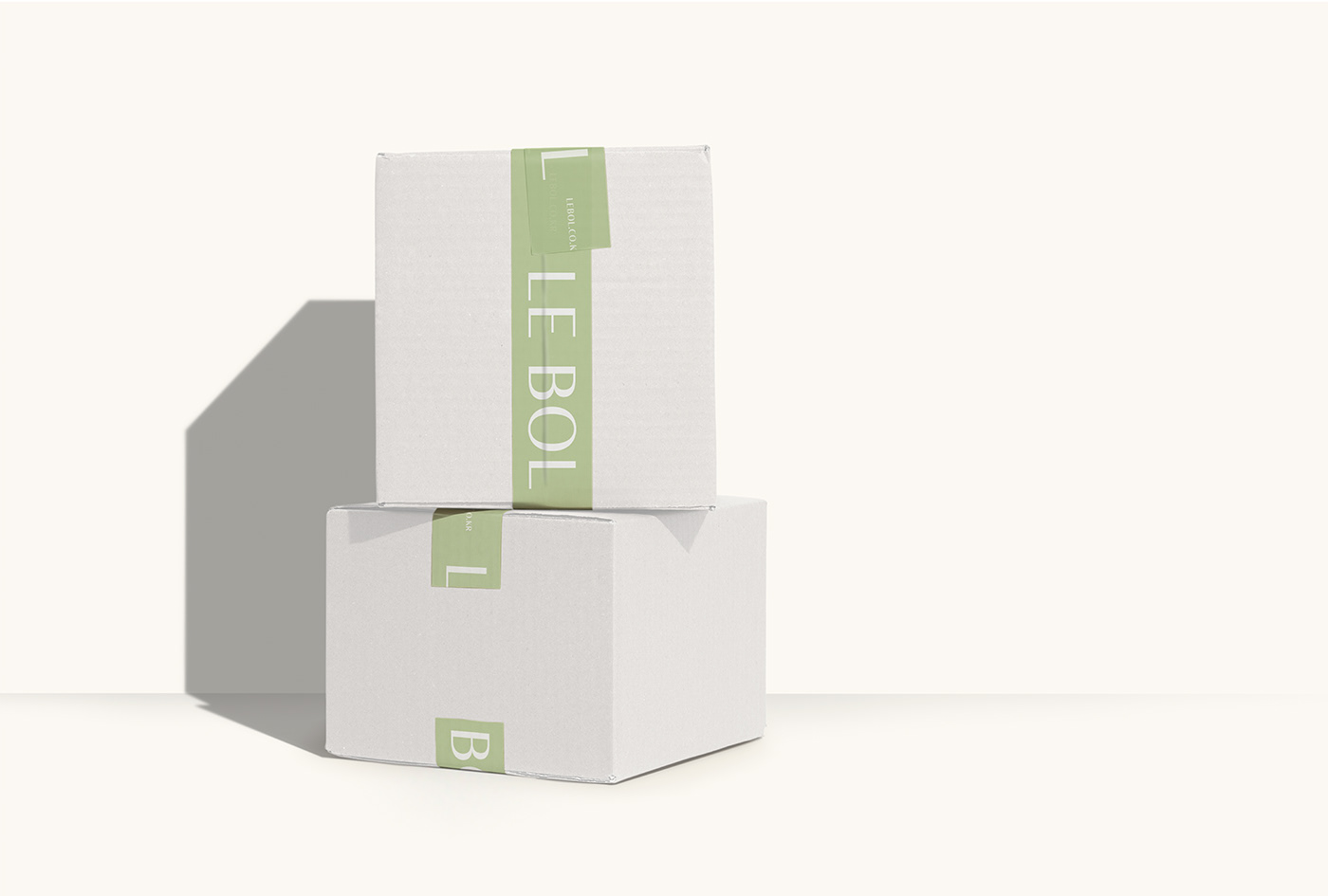
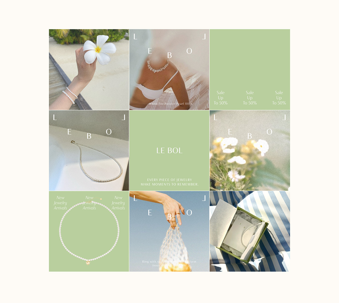
The spelling of LE BOL itself creates the signature form of LEBOL.
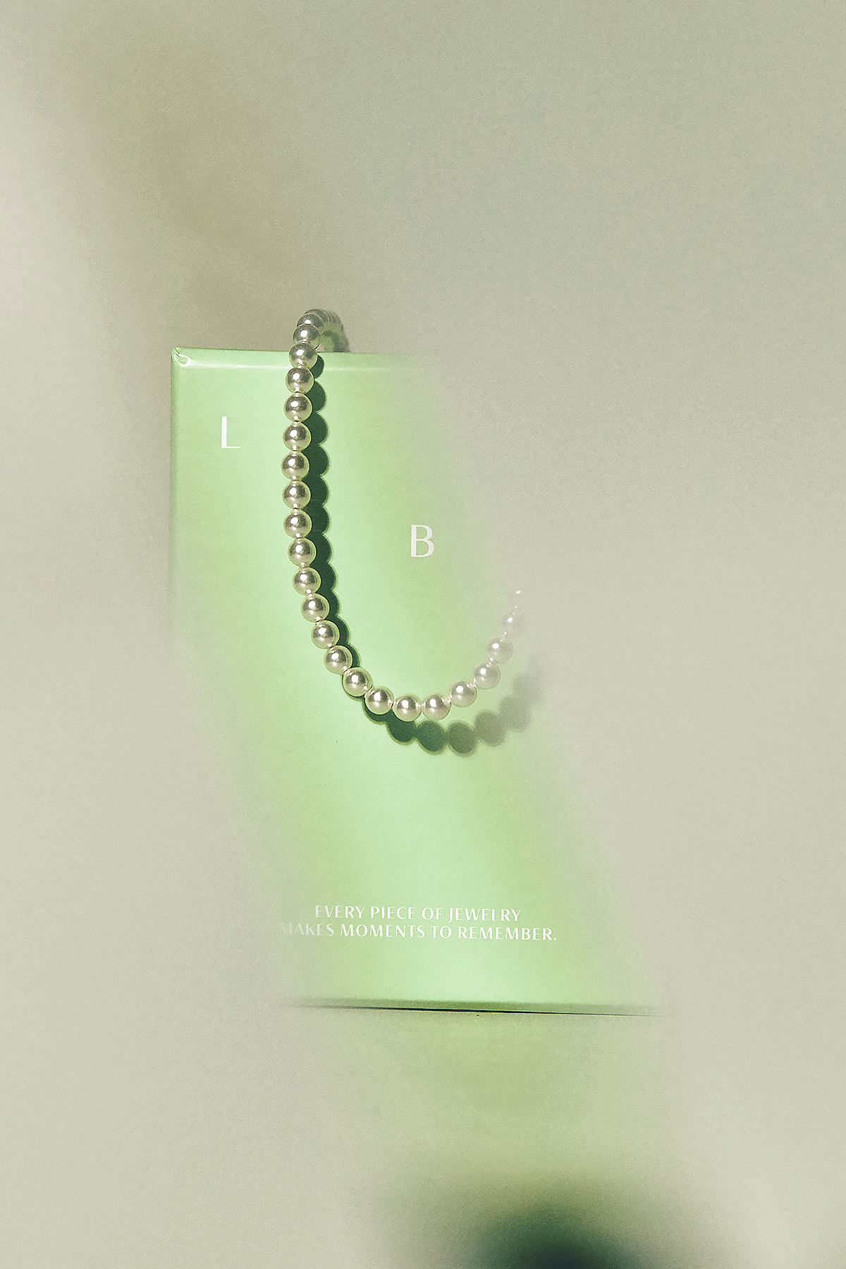
Brand logo of LE BOL encompasses two meanings: the form of a vessel that symbolizes capturing memories and the form of jewelry itself, representing the essence of jewelry.

Brand Typeface
Brand typeface is based on Haboro Contrast, a humanist sans-serif font. It features varying stroke widths between horizontal and vertical strokes, creating a refined and sophisticated style.
Brand Color
The vibrant green color has been chosen as the main color, representing the lively memories captured in enchanting travel destinations.
Additionally, a warm ivory color has been designated as the secondary/sub color, adding a touch of warmth and elegance to the overall brand aesthetic.


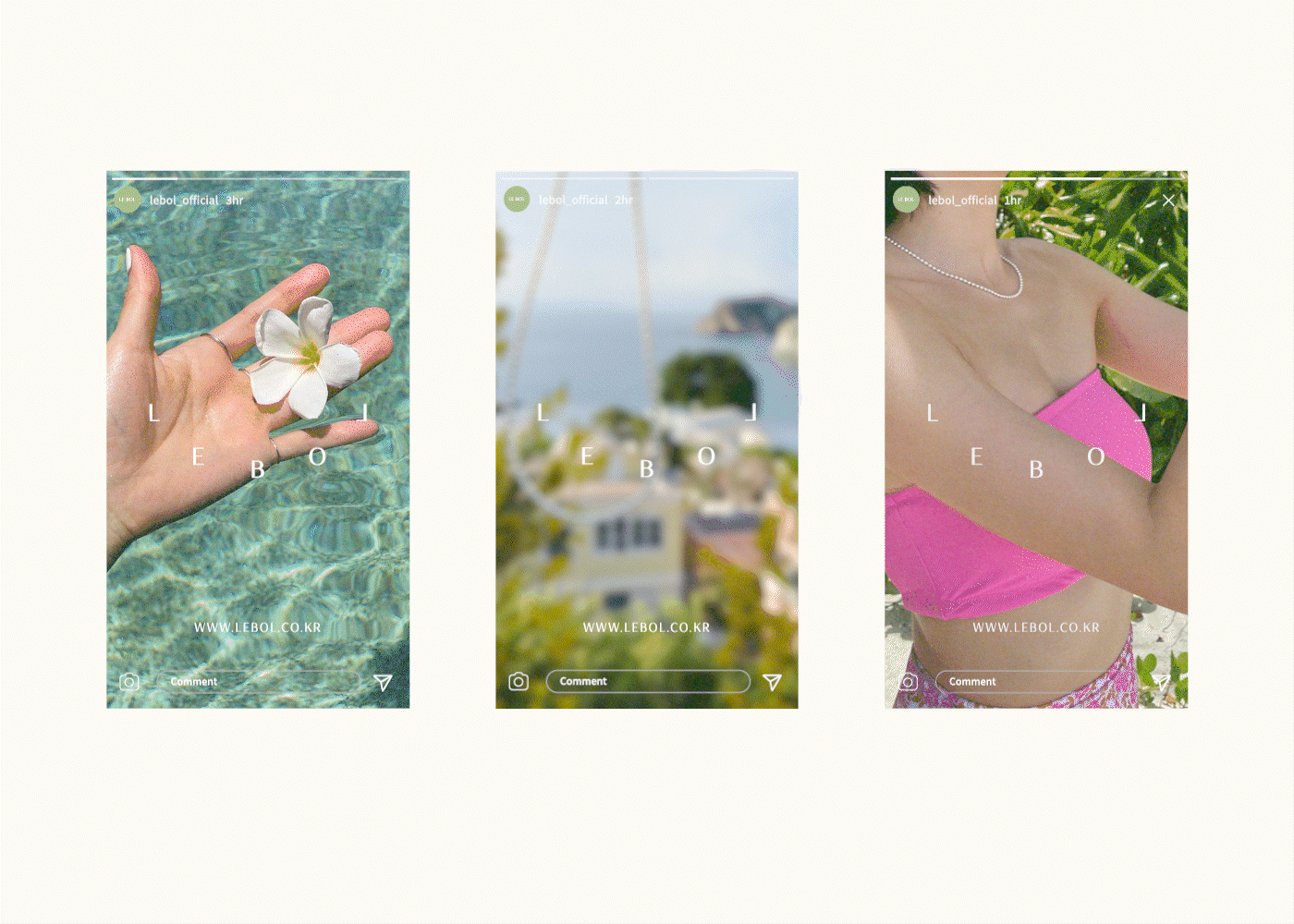
Photography Style
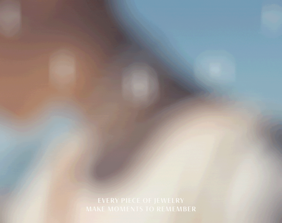
LEBOL's photography style embodies the essence of faded memories in enchanting travel destinations. The blurred photography style represents the deep-rooted memories that reside within our hearts.


Brand KeyVisual
LEBOL's logotype is divided into two forms: Standard and Applied. The necklace-shaped logotype is simultaneously utilized as part of the ㅠbrand key visual, allowing for versatile applications.
The brand's visual identity, also incorporates the concept of fading memories becoming clearer over time. This is reflected through the use of blurred typography and photography styles.


LE BOL Brand Design Identity
©2023
Client : LE BOL
@lebol_official
BE BASED ON BRAND (BBB)
Creative Direction / BX Designer : Kahyun Kim
bebasedonbrand@gmail.com


