DRESSING THE SCREEN
identity design concept
identity design concept
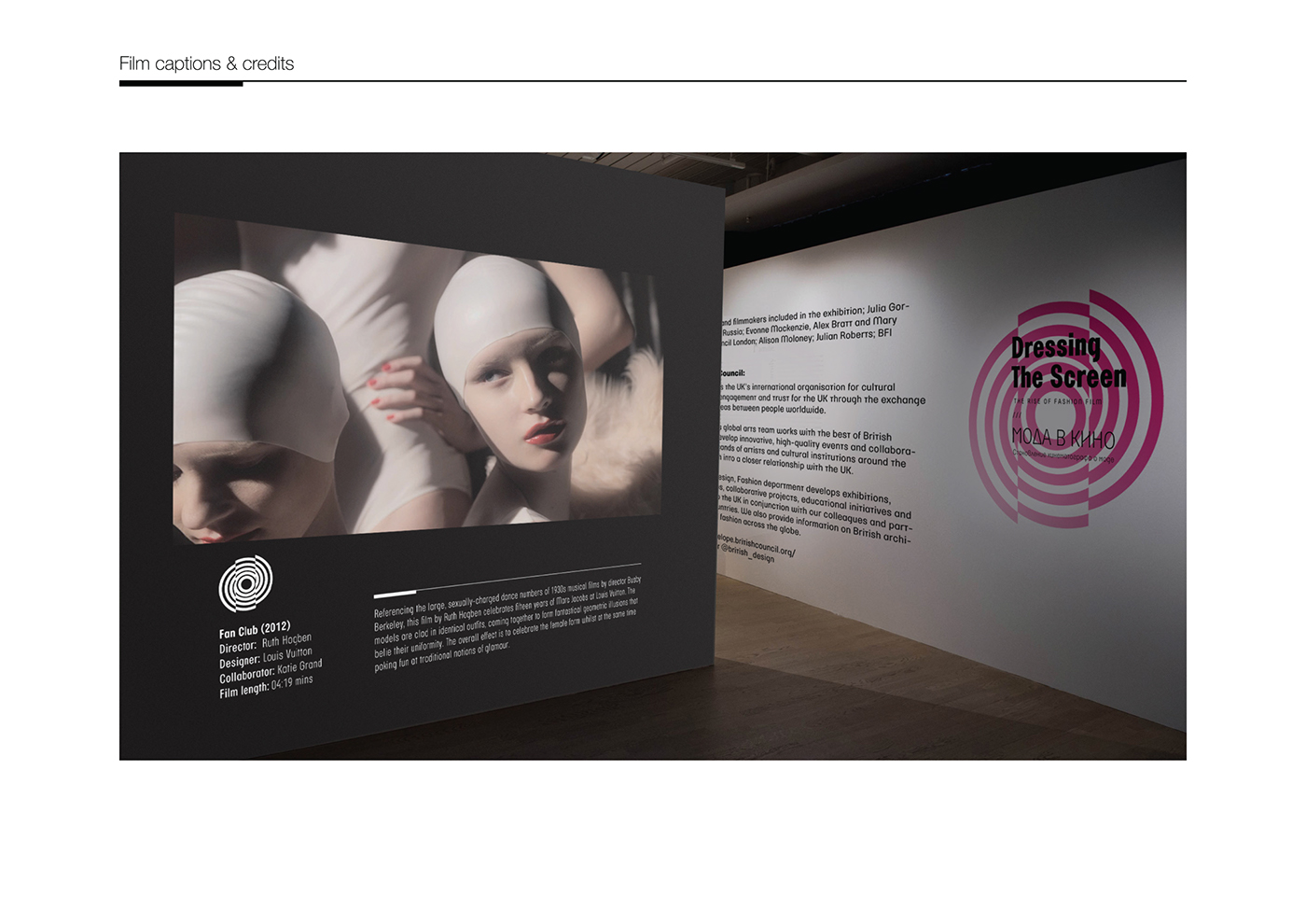
Fashion and cinematography – these are the two key points of the DRESSING THE SCREEN exhibition which I tried to express in my design project. Showing the duality of the exhibition main theme and similarities between fashion and films became the main aim of my design process.
My concept is based on the strict geometry of the sign and the simplicity of the typeface, but both of the elements have a twist inside. The simple circle sign is transformed into the spiral while the sans serif typeface contains circular elements in the construction of the characters which correlate with the sign geometry.
The identity created for the exhibition is flexible but cohesive; it gives many variations of usage of the sign on different elements such as posters, invitations, flyers etc. The colour palette consists of black, white and bright magenta pop of colour which brightens up the elements of design. The concept also allows usage of only
black and white logo variation if necessary, for example in official documents and business cards. At the same time bright colour and contrast lines of sign give much more freedom in design of the other identity elements.
black and white logo variation if necessary, for example in official documents and business cards. At the same time bright colour and contrast lines of sign give much more freedom in design of the other identity elements.
The sign is bilingual so the identity can be adapted to different language pairs. It stands alone from the exhibition and do not distract from the main theme being at the same time elegant, intriguing and clean.