99U Conference Branding 2014
—
—
All of the 99U Conference materials get re-imagined and re-designed by the Behance Team every year, and 2014 was no different.
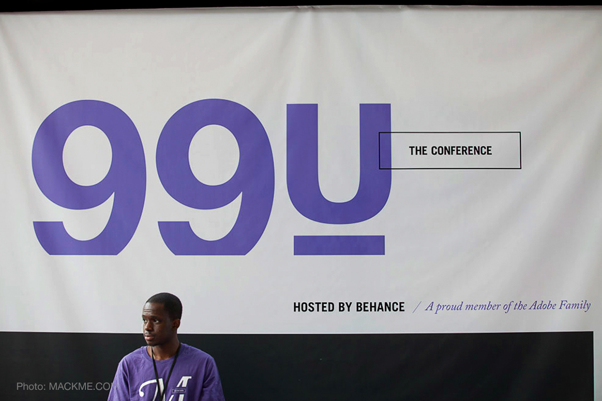
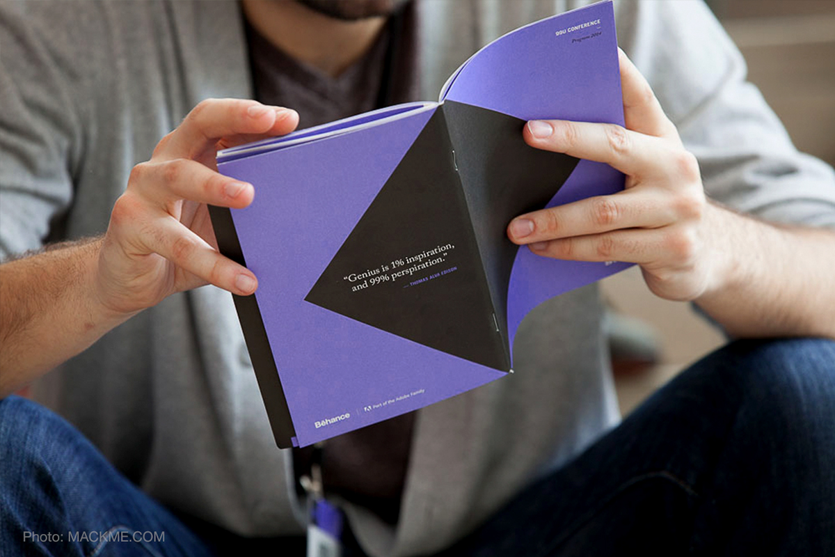
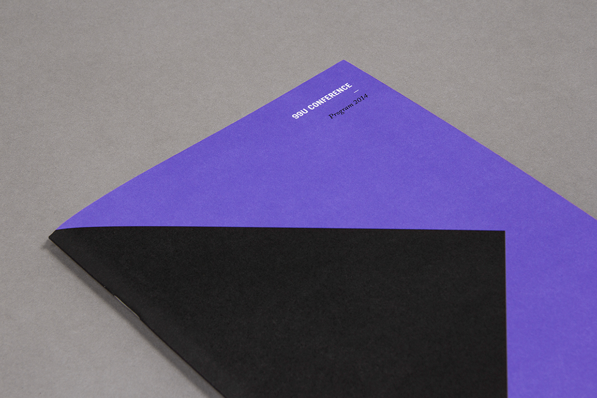
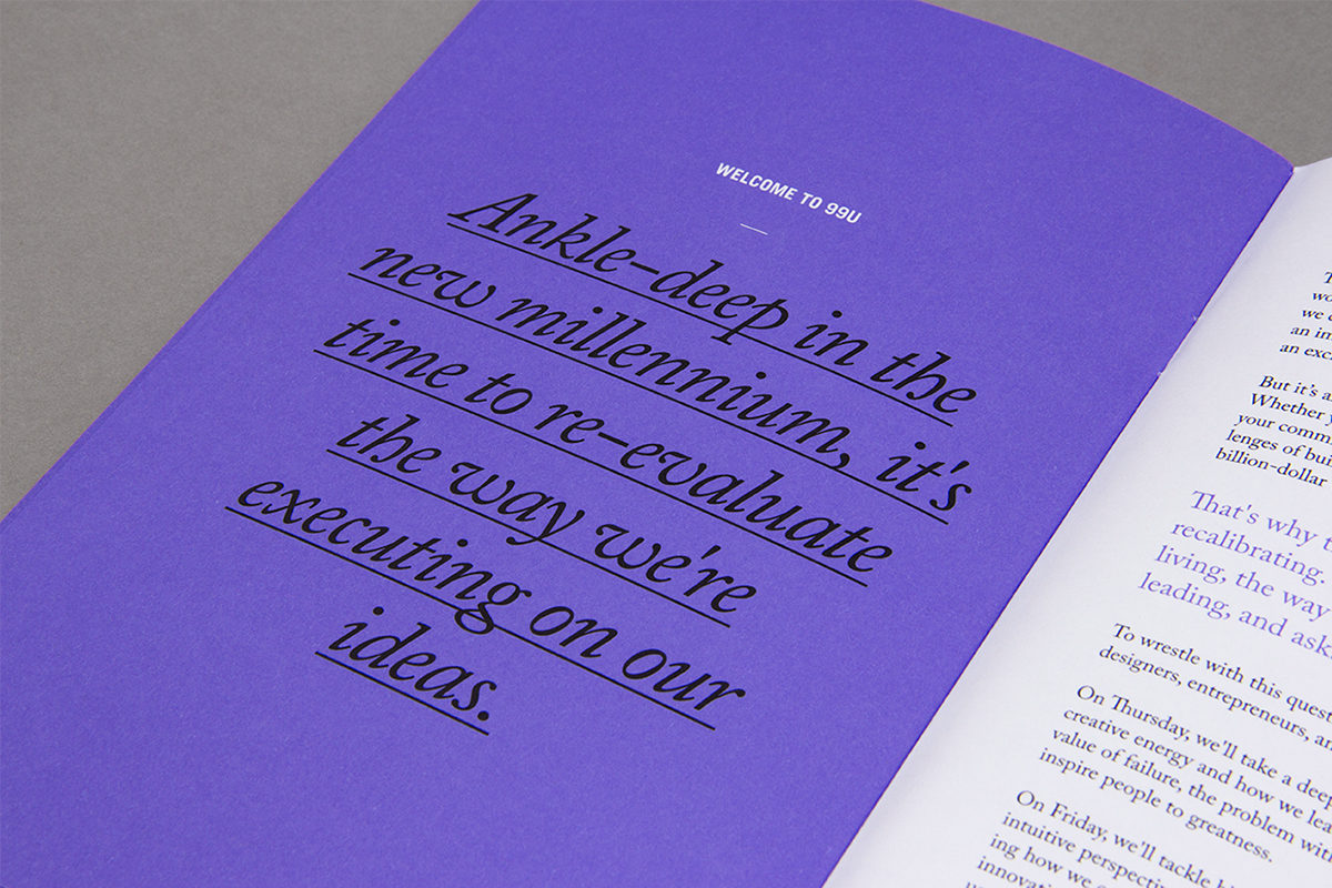
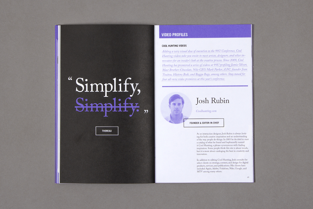
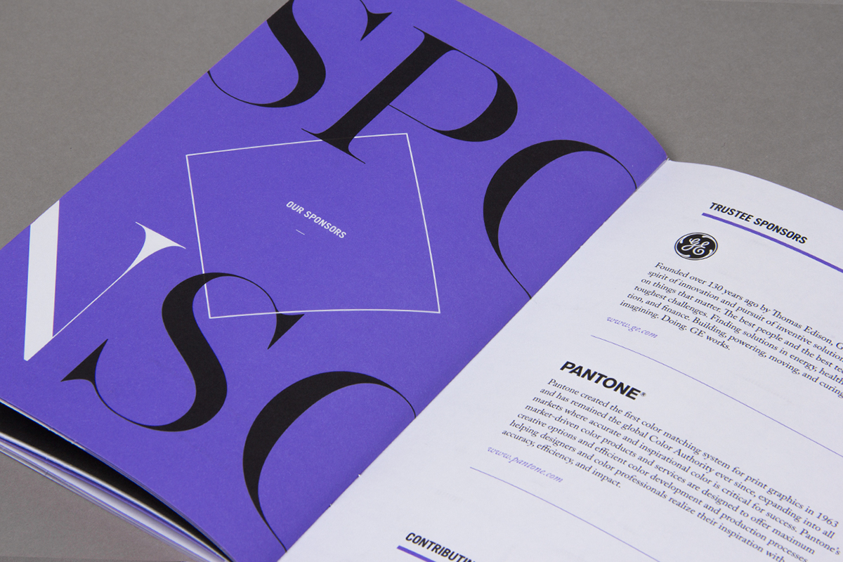
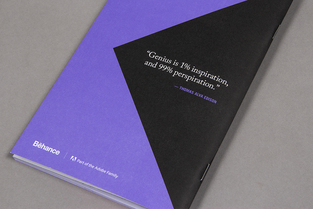
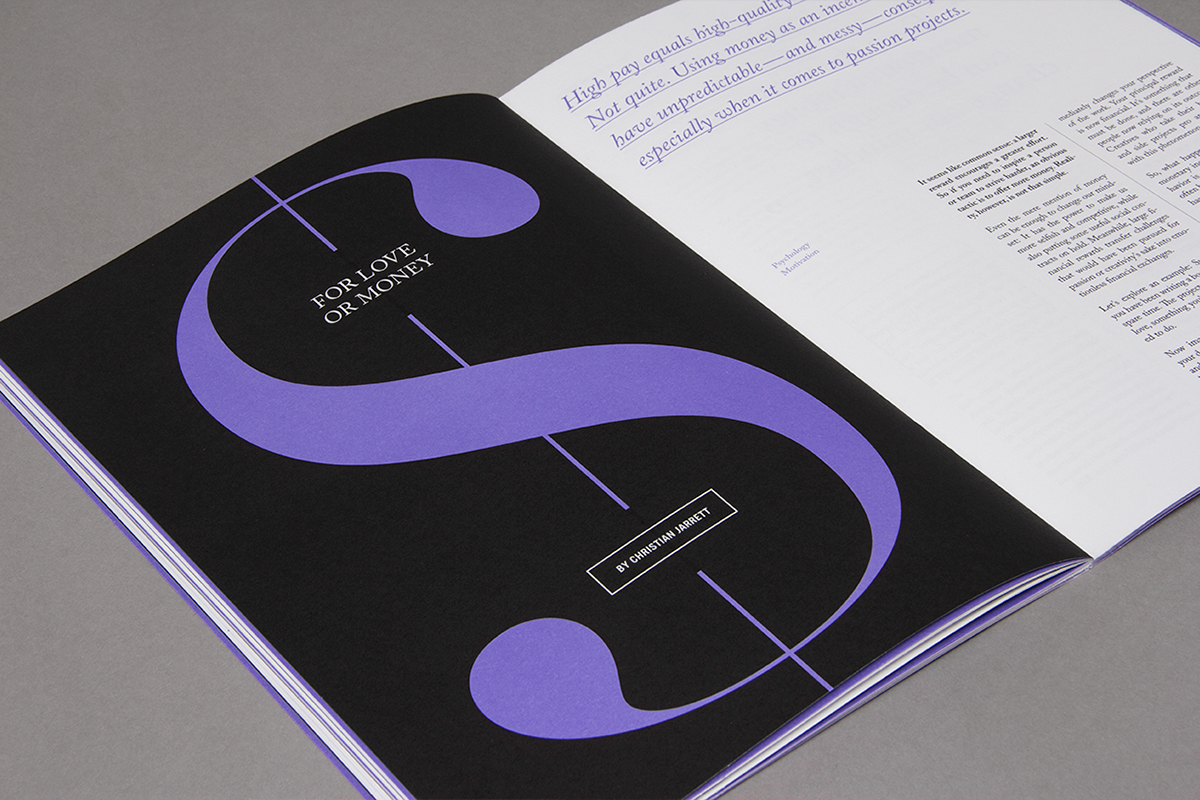
For the conference’s sixth edition, we used the bold combination of black, white, and purple (Pantone 2725 U). We also experimented with new typographic treatments contrasting sans-serif and serif fonts Trade Gothic Bold Cond. 20, Adobe Caslon Pro, with accents of the elegant font AW Conqueror.
Simple, bold, geometric shapes punctuated the materials where we created subtle optical illusions through the manipulation of lines and depth of field.
—
EDITORIAL: Jocelyn K. Glei, Sean Blanda & Sasha VanHoven
/// THE INTRO REEL
—
Using actionable quotes from our speakers, we built this motion graphics piece, which brands the space by playing as attendees enter the Conference auditorium. (Motion by Hugh Gran.)
/// THE BROCHURE
—
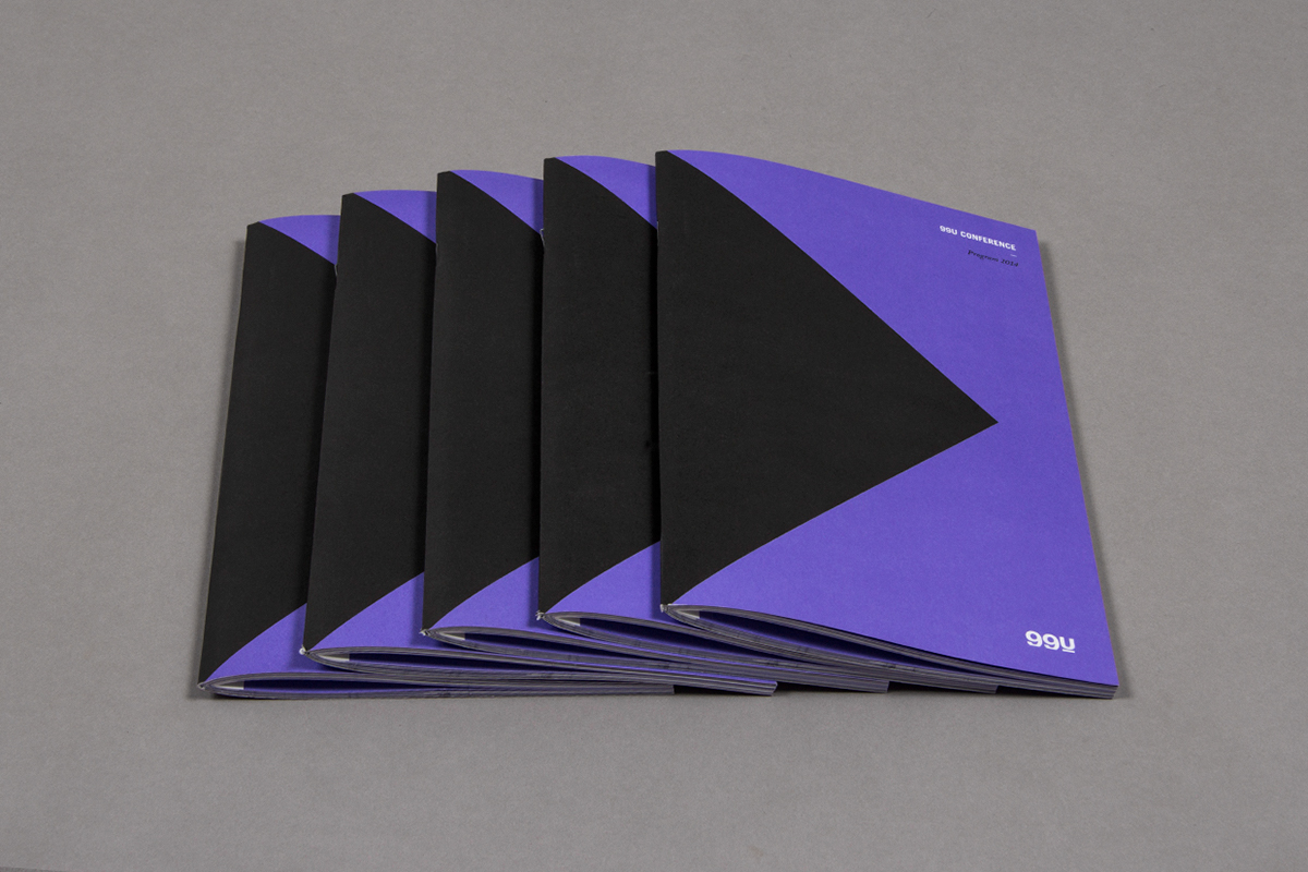
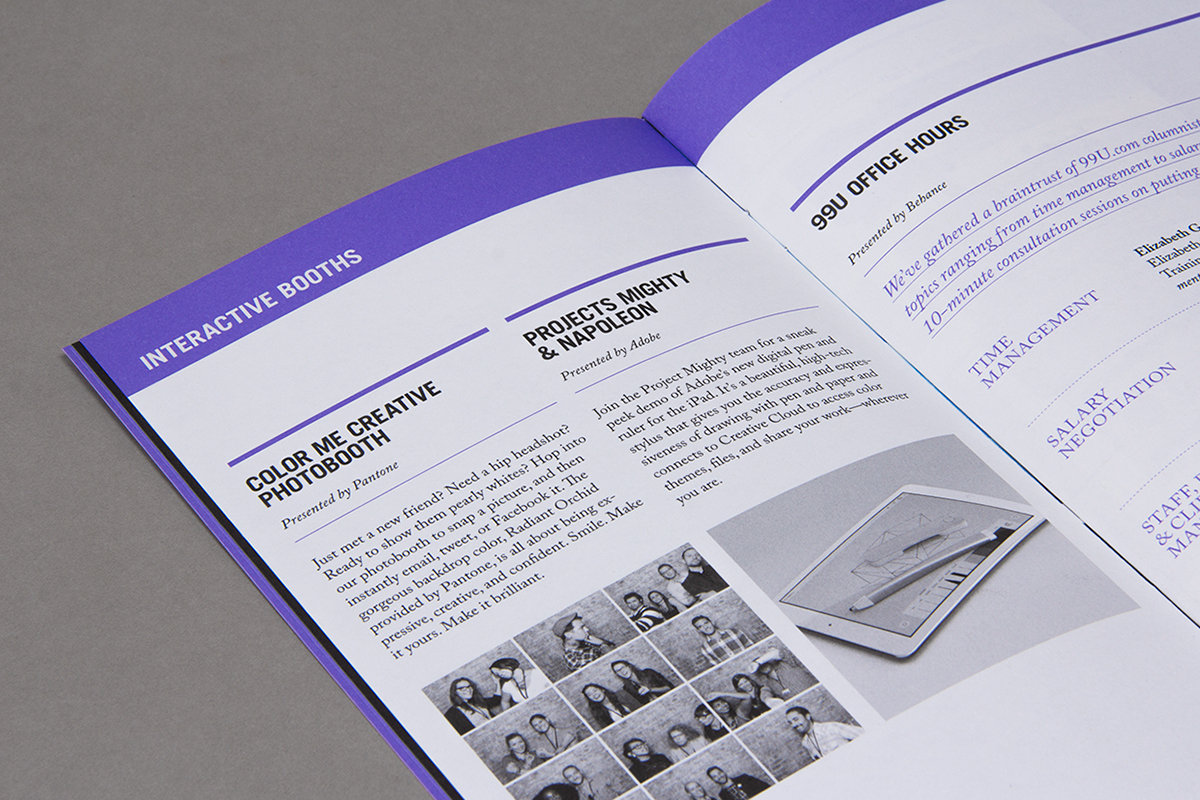
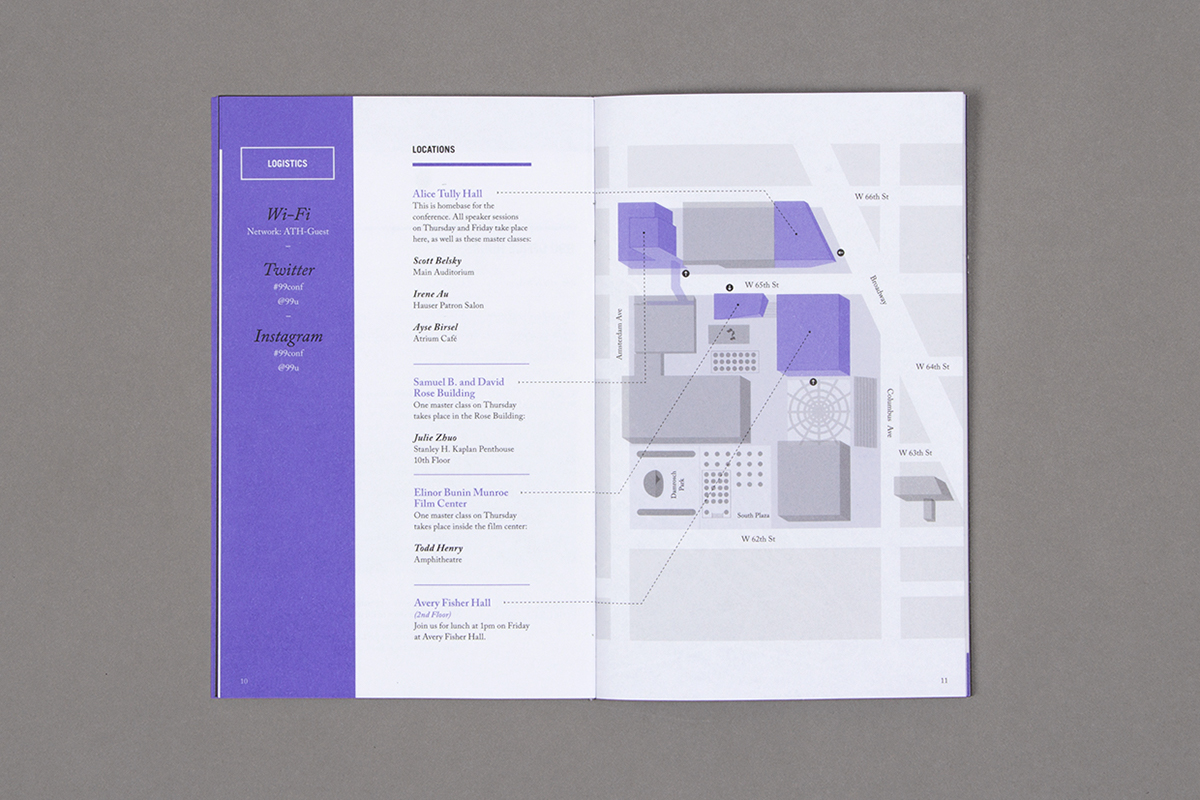
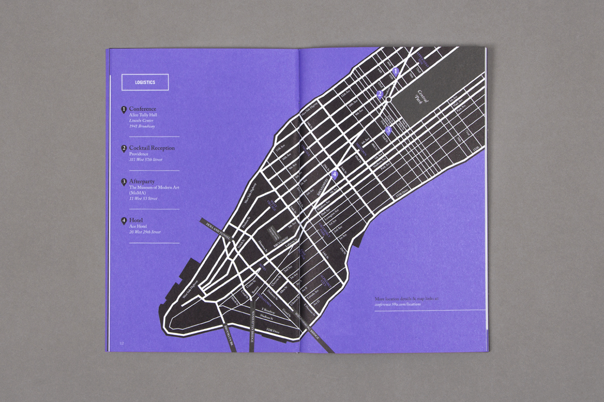
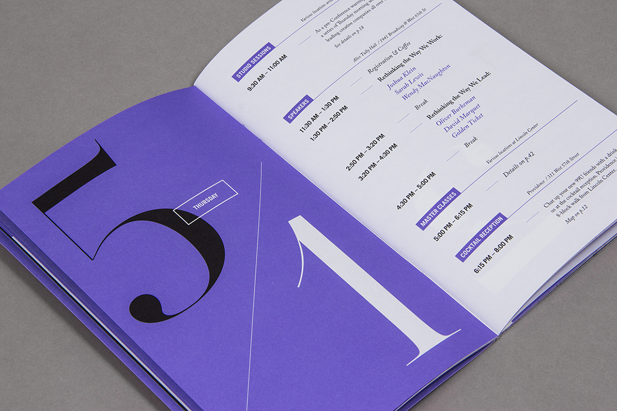
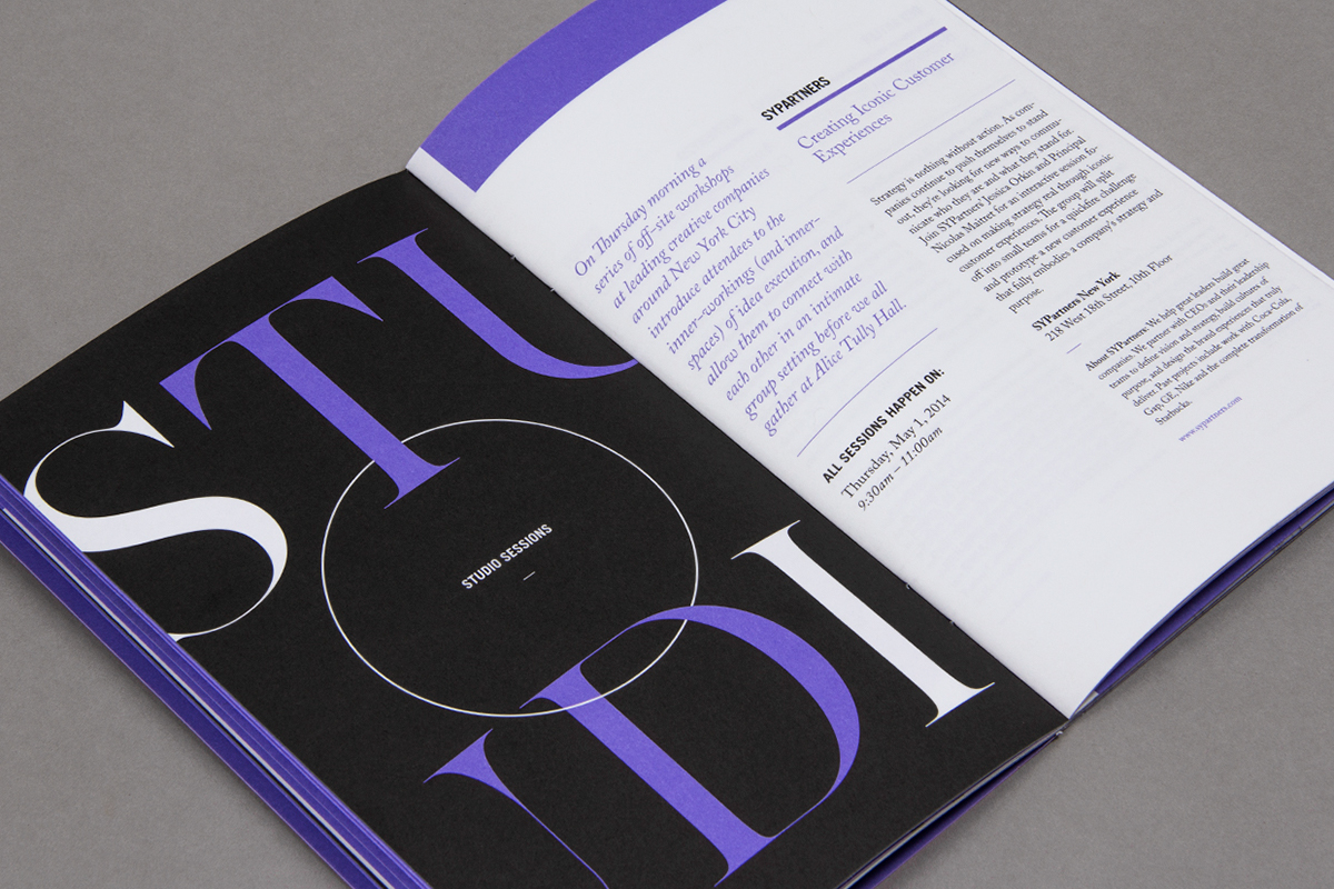
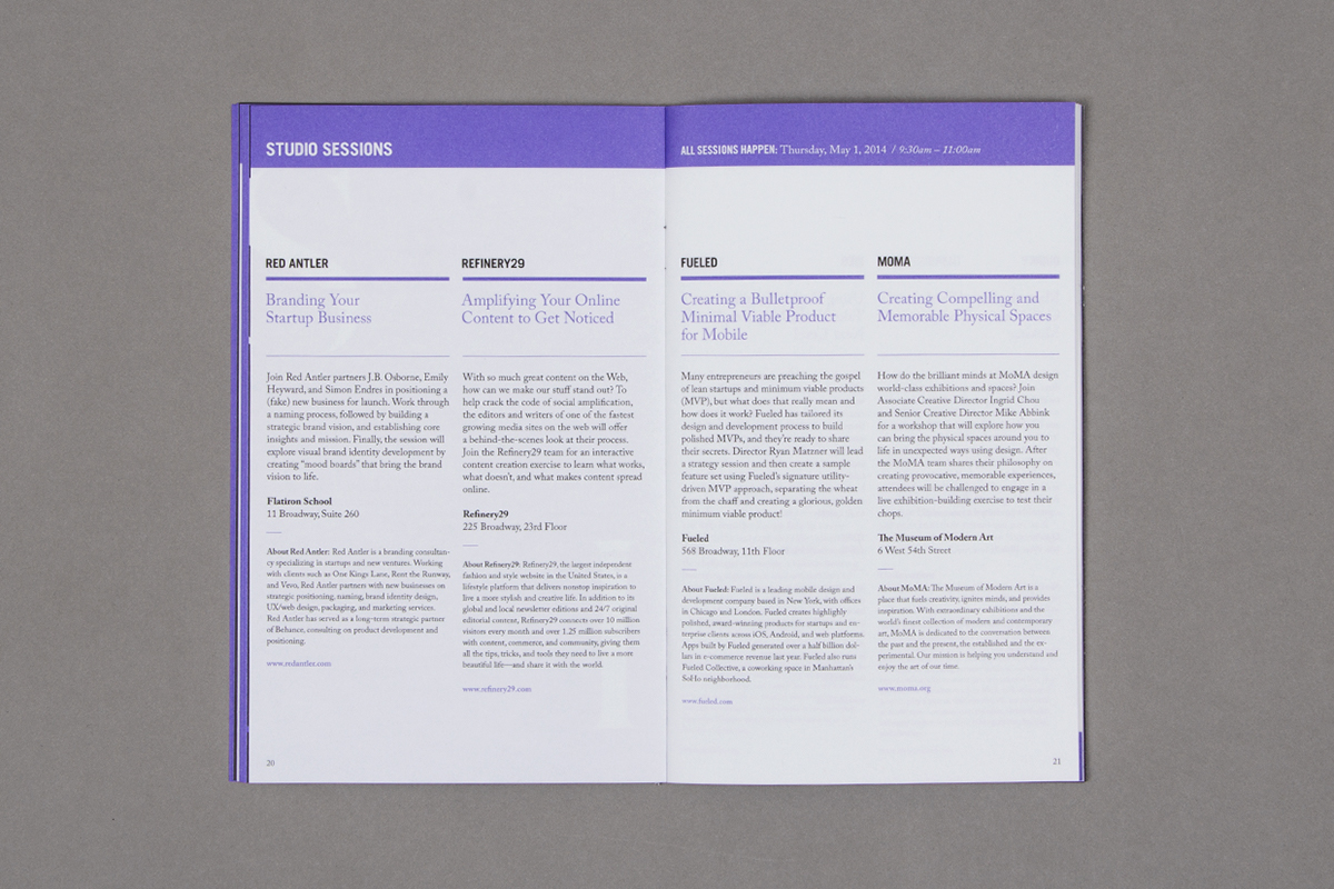
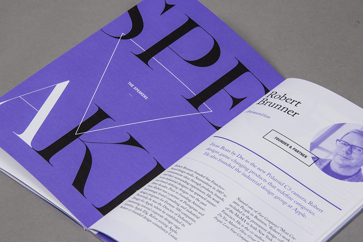
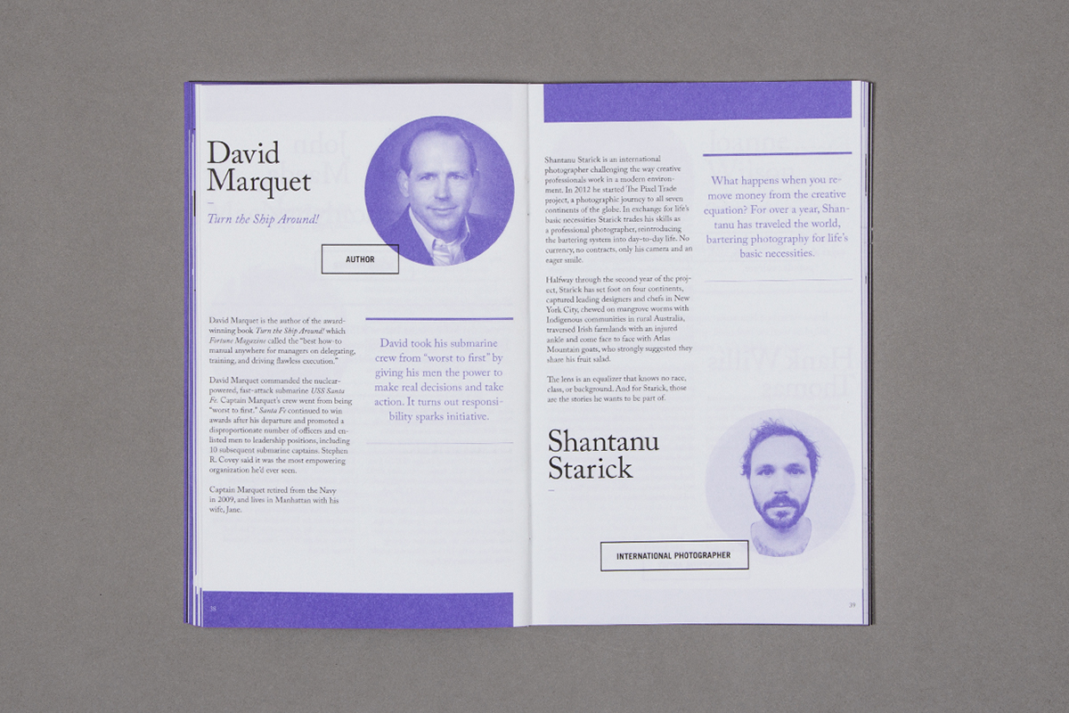
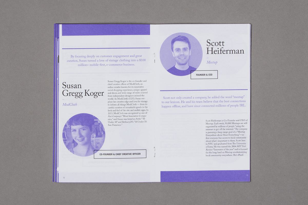
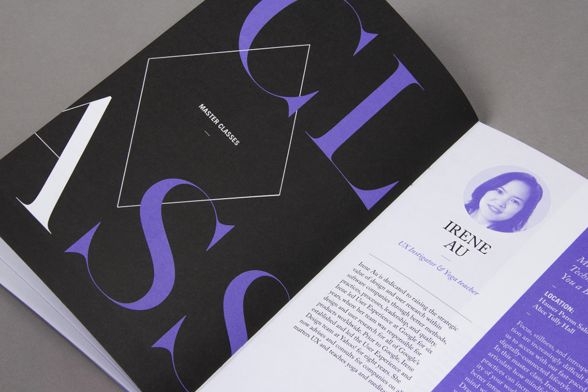
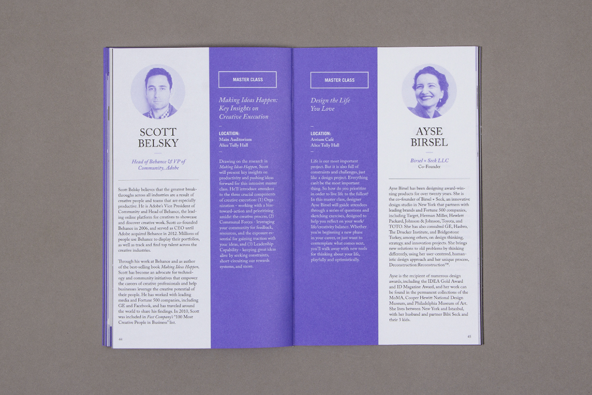
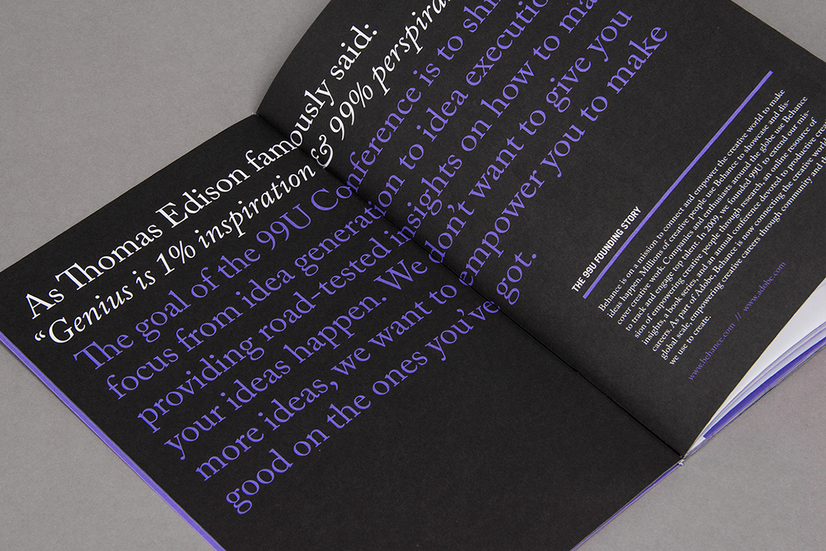
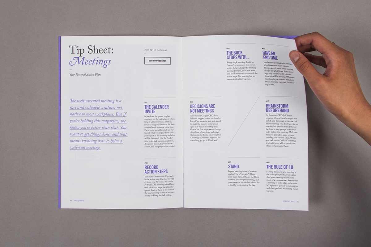
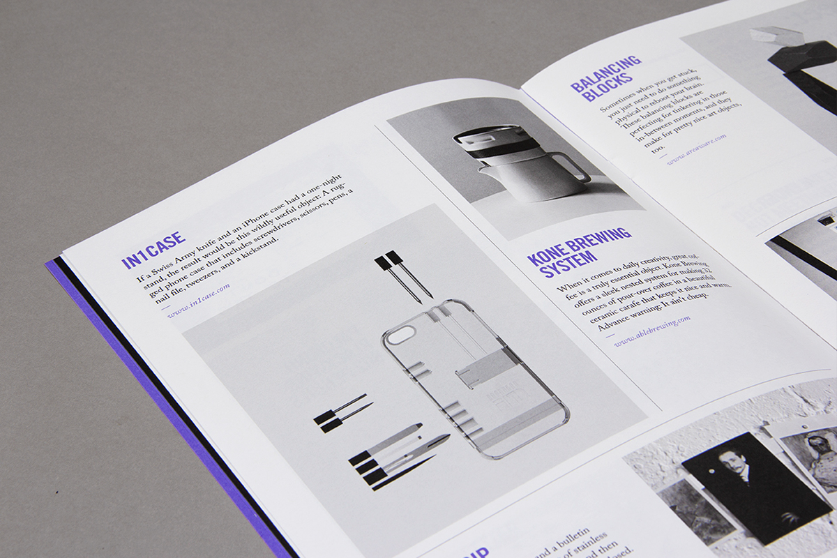
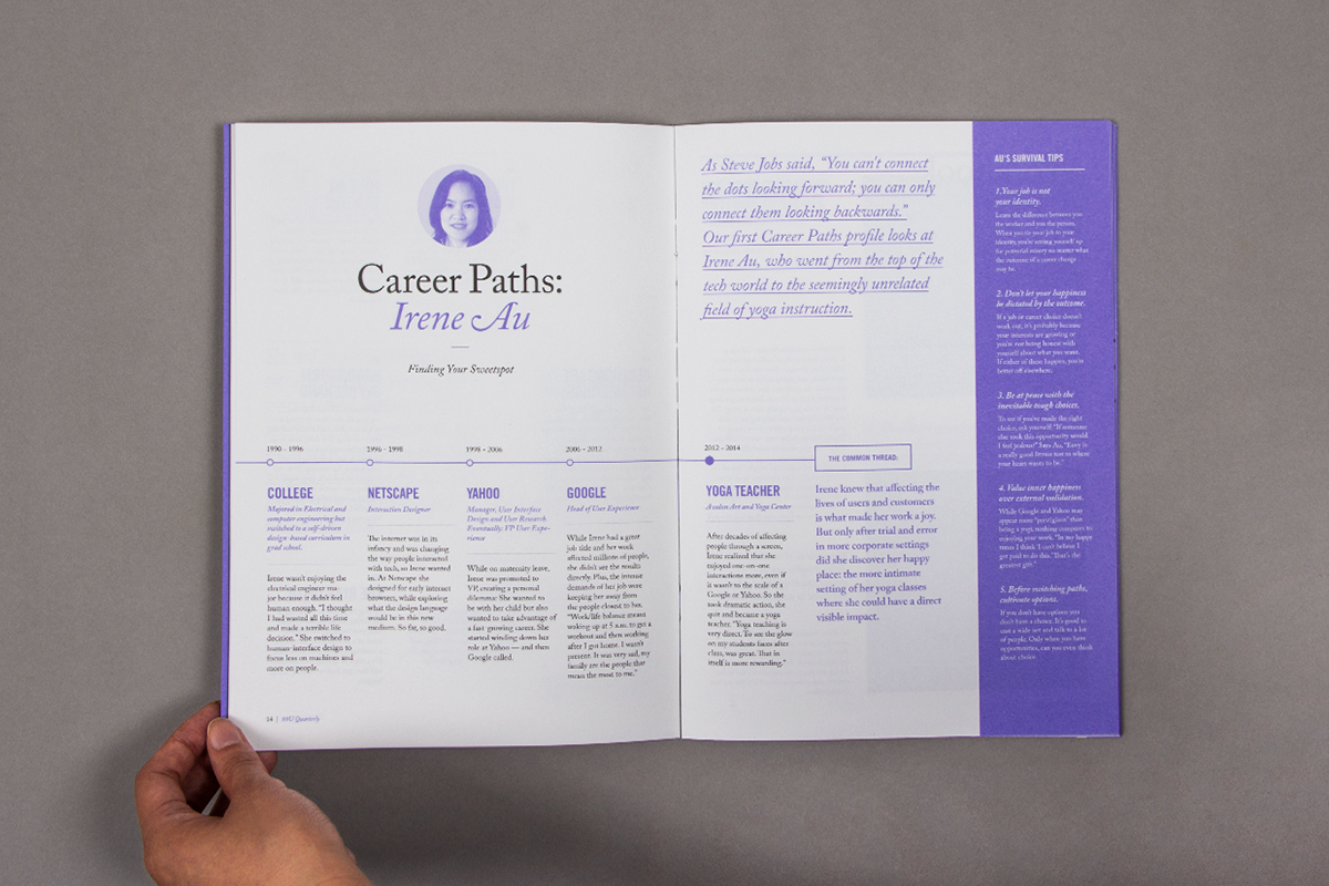
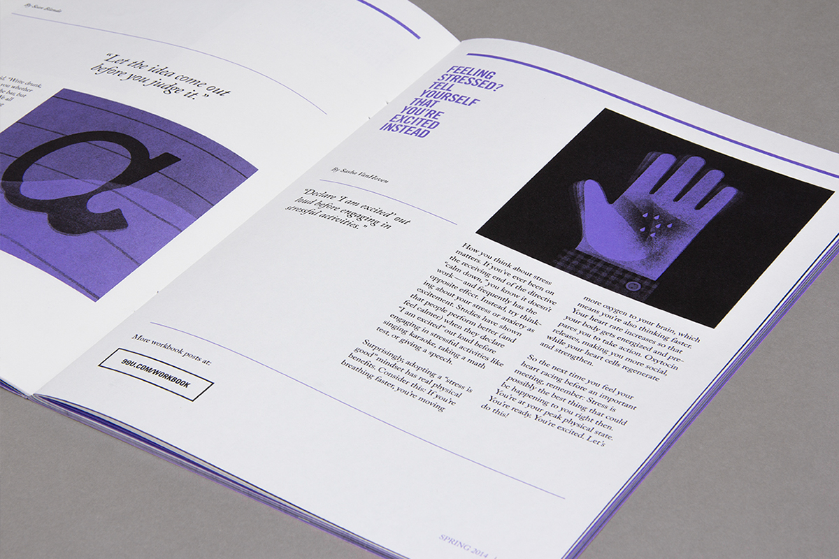
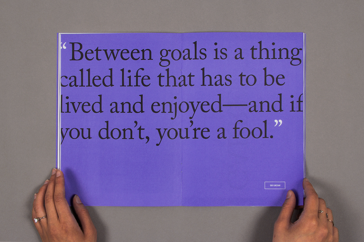
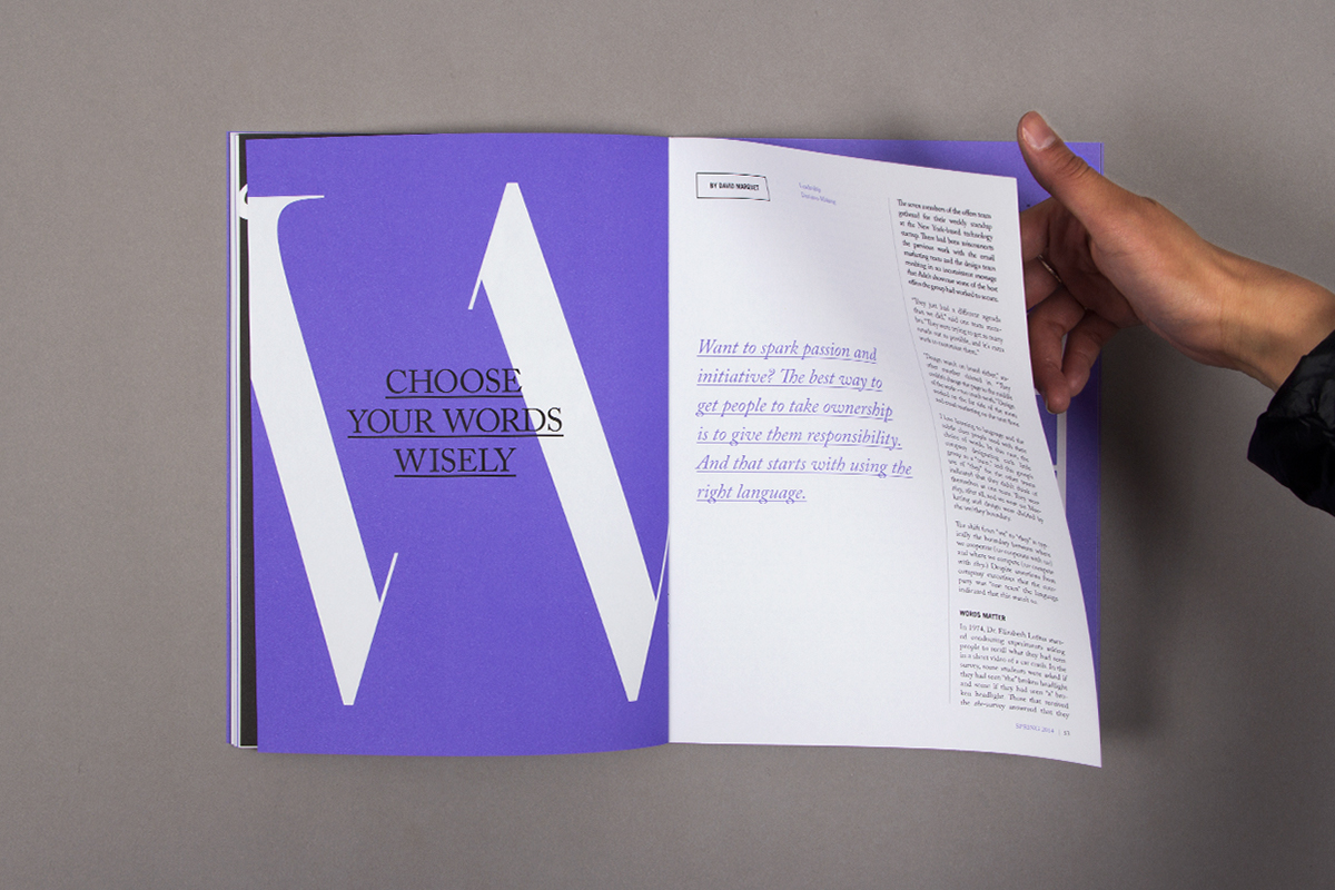
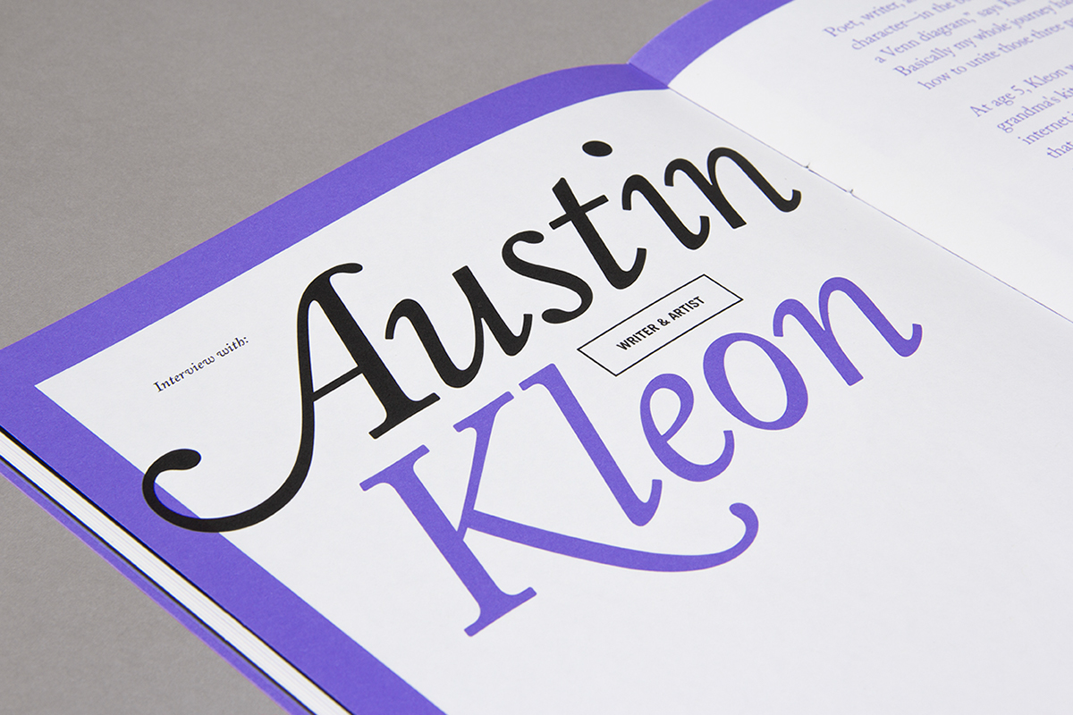
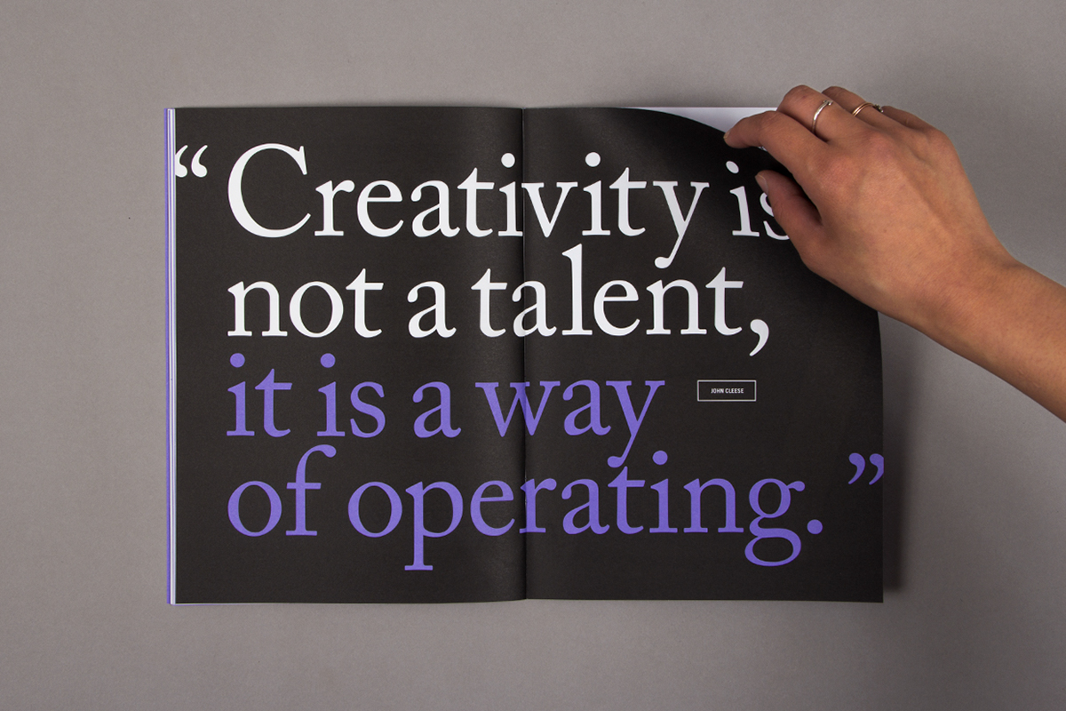
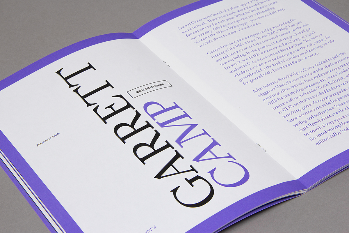
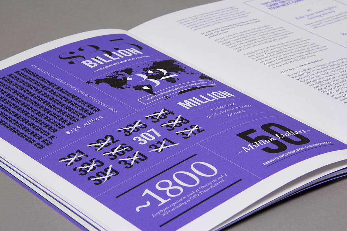
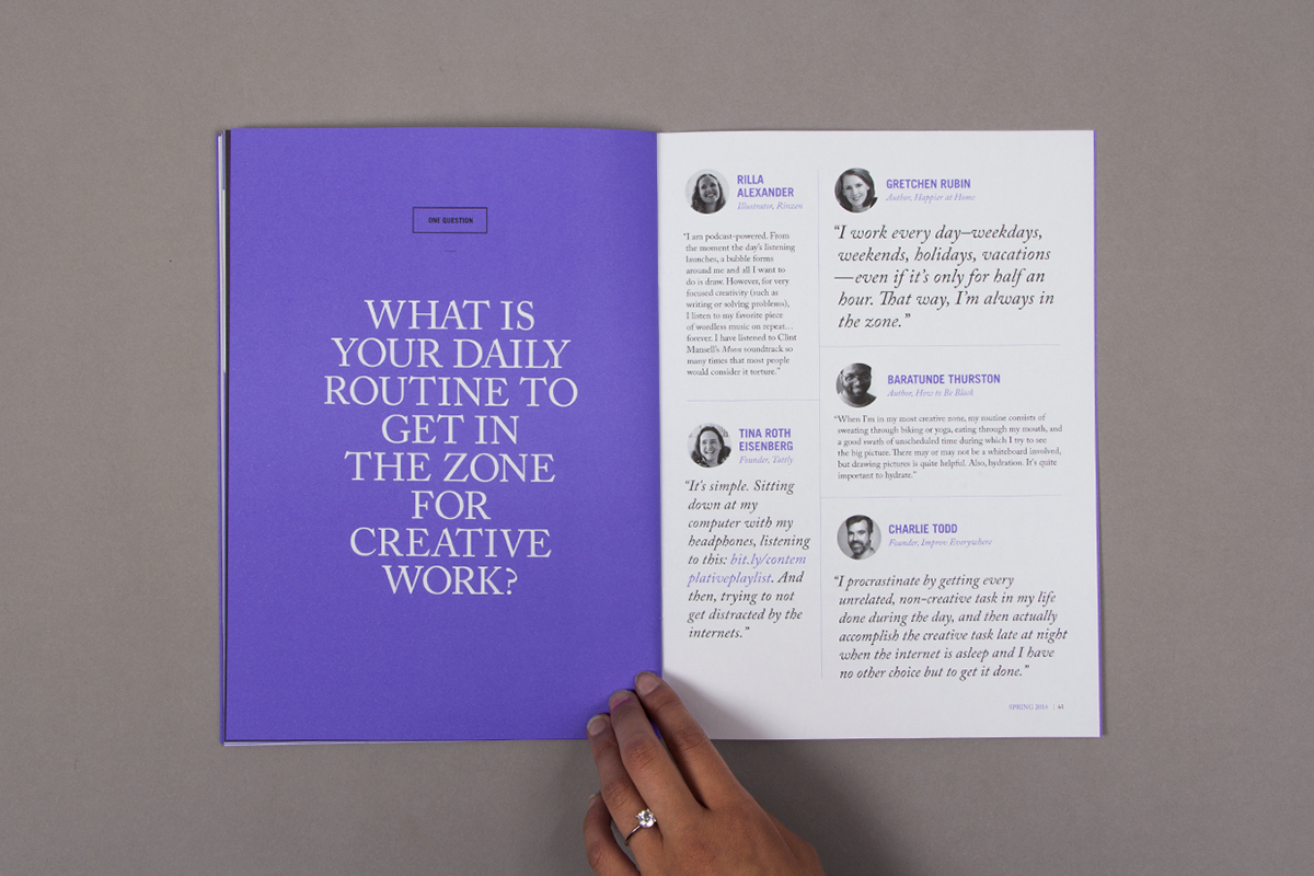
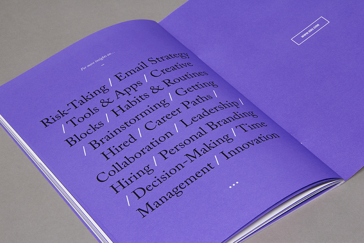
The official 99U Conference brochure gave us ample opportunity to experiment with the design language across 70+ pages, using color and typography to give the piece rhythm and momentum.


/// BITS & PIECES
—
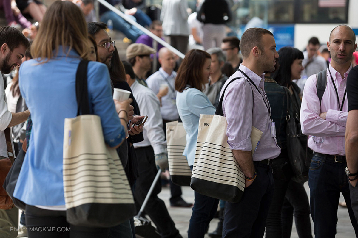
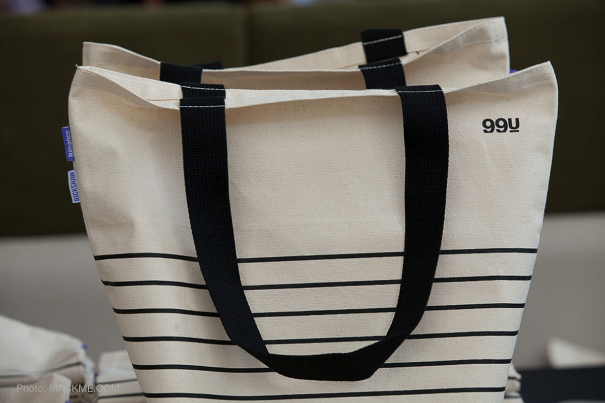
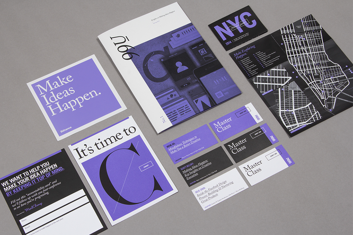
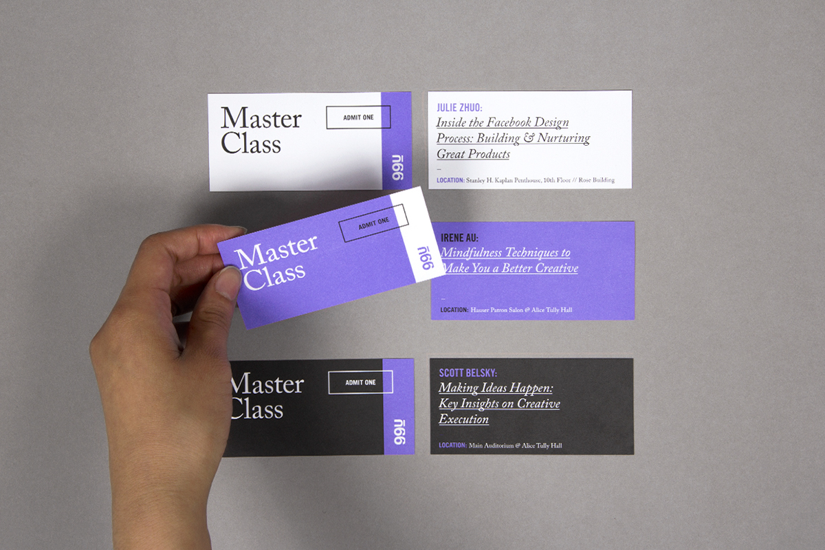
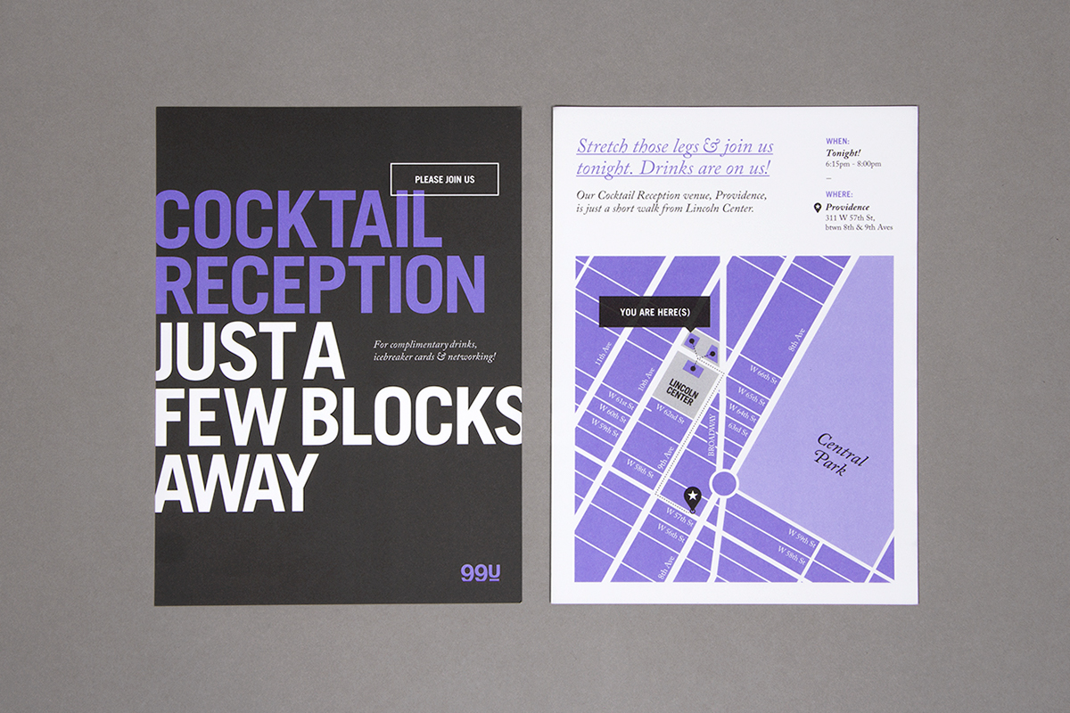
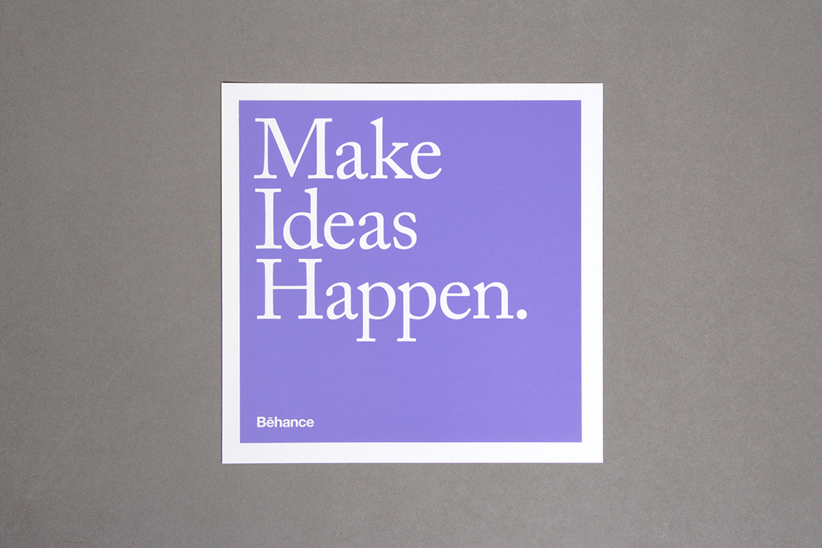
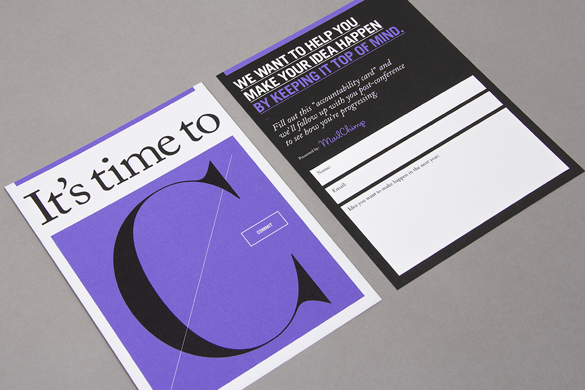
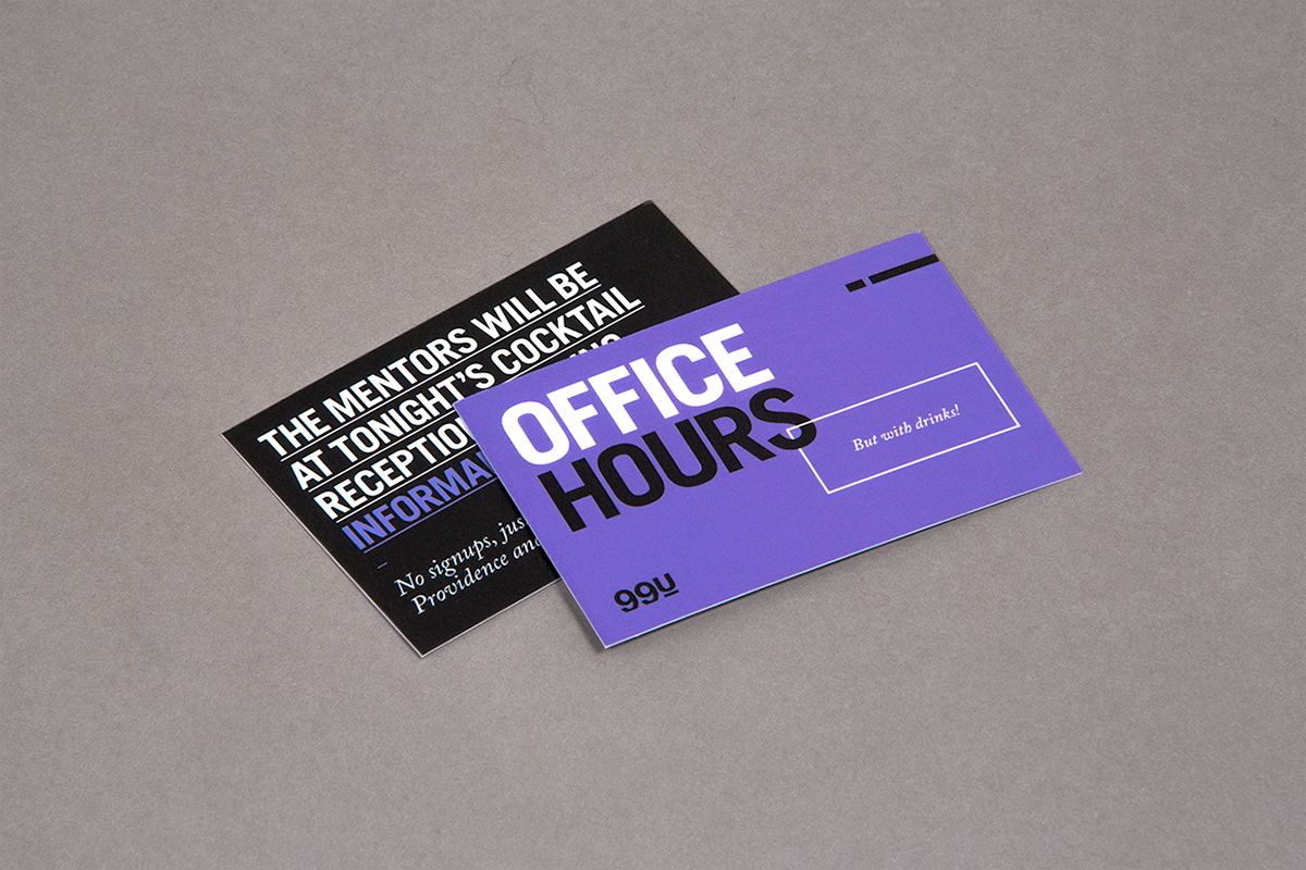
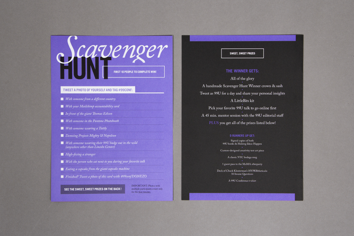
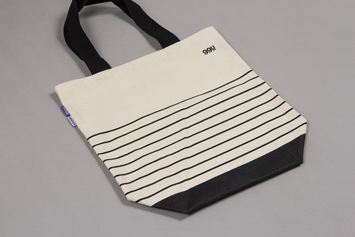
From a custom "make ideas happen" sticker, to master class tickets & a series of cards, many individual pieces make up the conference and go into our very own goodie bag!
/// POCKET GUIDES
—
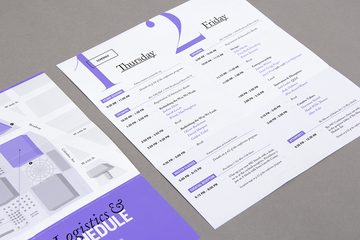
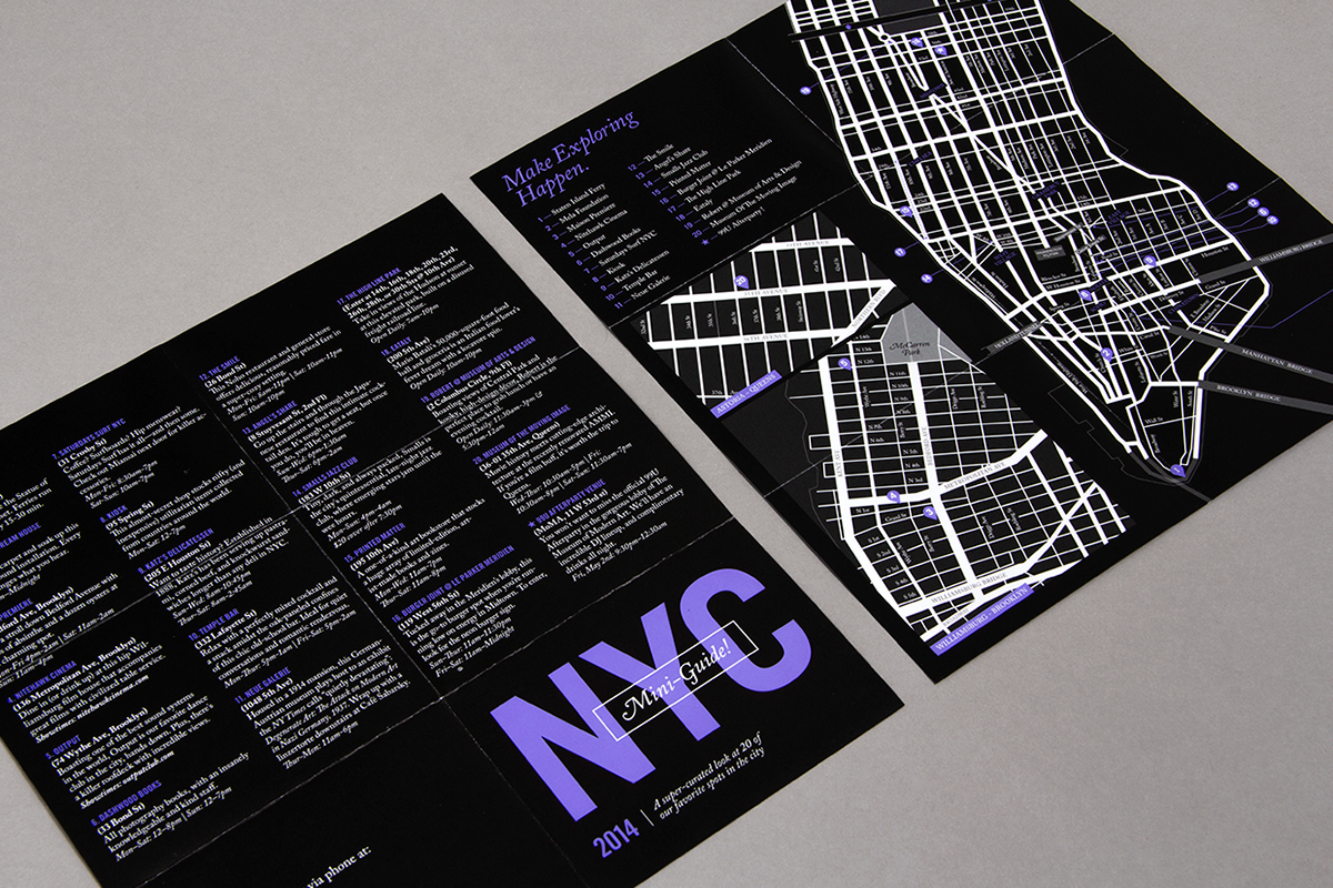
Our pocket guides keep the most essential 99U Conference information handy, including the event basics like a daily schedule & map, as well as a city guide for finding the choicest spots around New York City.


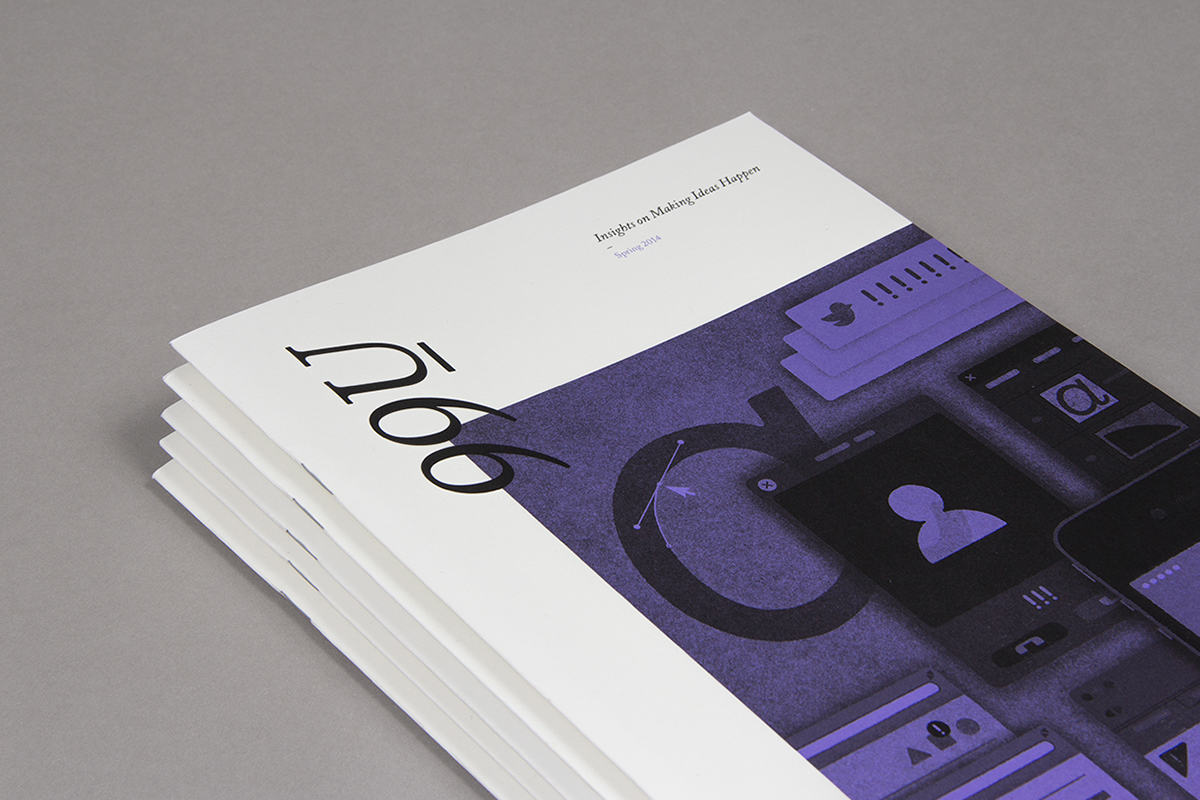
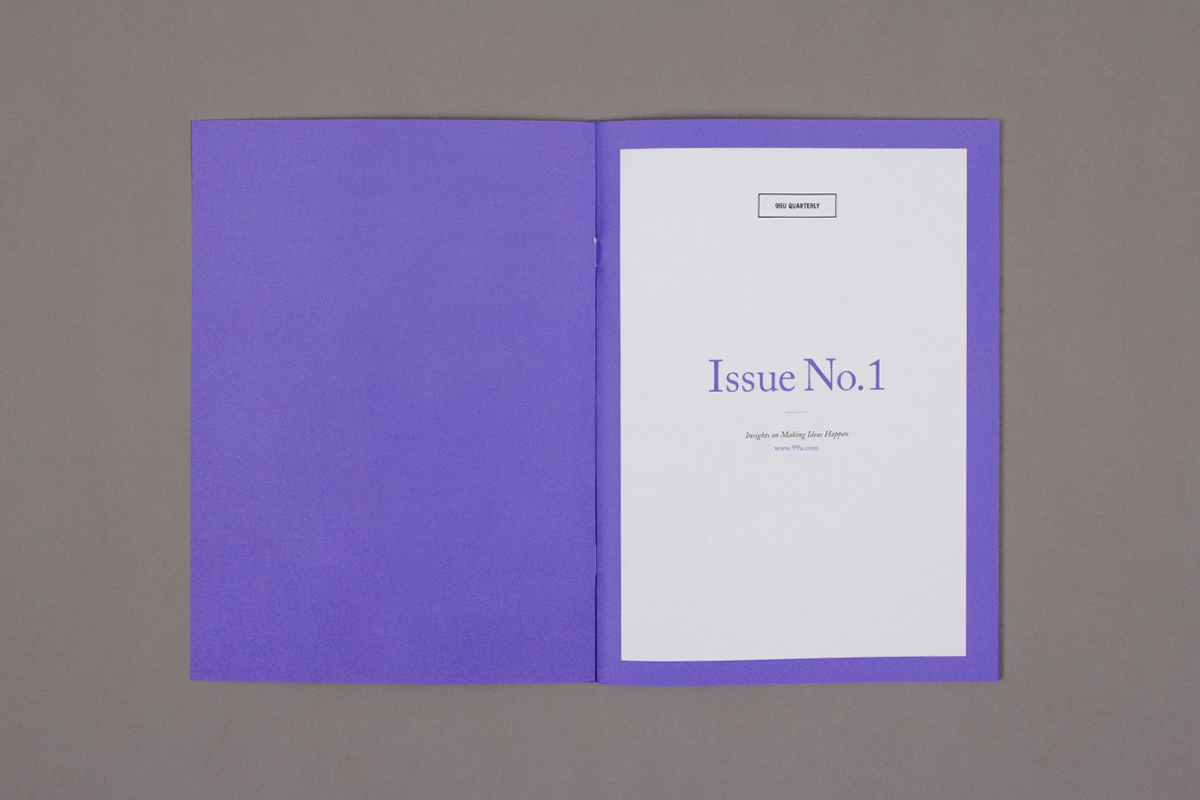
/// THE QUARTERLY MAGAZINE
This year we were happy to introduce the 99U Quarterly, a brand new print publication offering our best creative insights packaged in a beautifully designed pixel-free format.
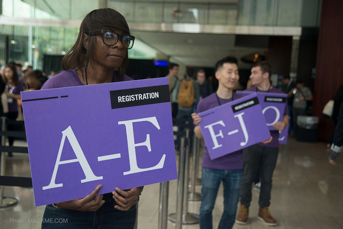
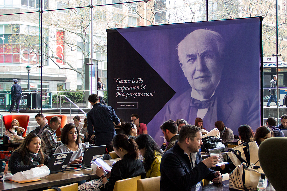
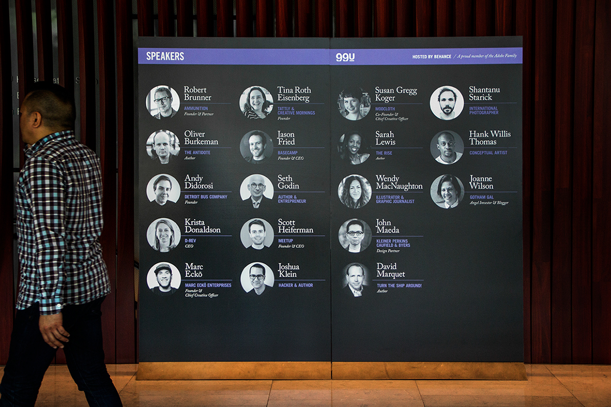
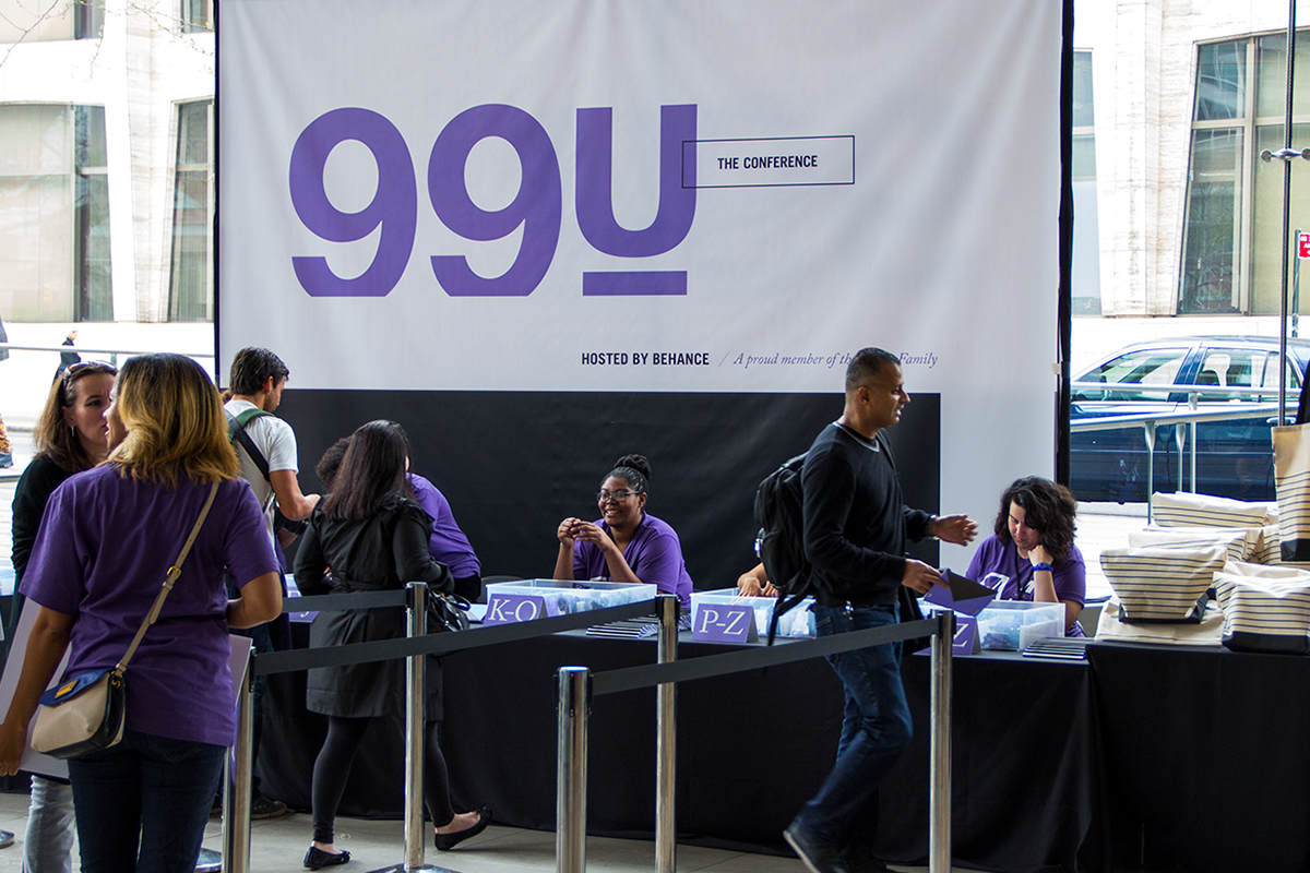
/// THE BRANDING IN ACTION
–