

Itálica
INCM Book Collection
—
Imprensa Nacional's Itálica is a collection of comparative translations of Italian classics.
With the brief of designing a “modern classic”, we began our research with the purpose of translating early Italian printing motifs to contemporary techniques.
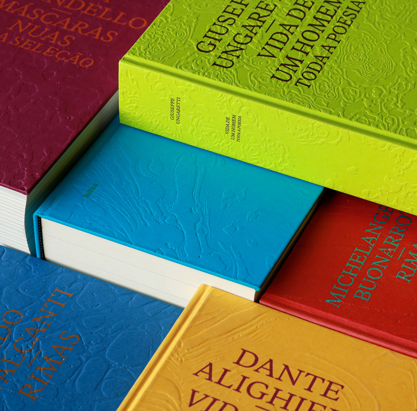
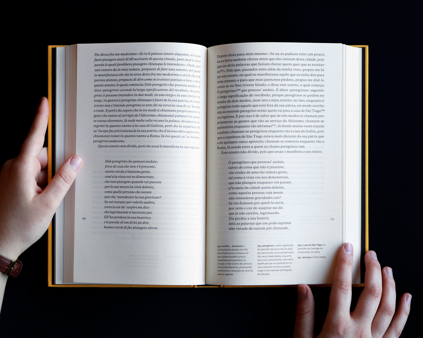
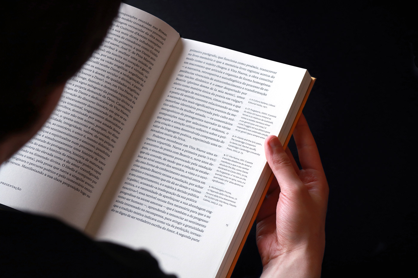
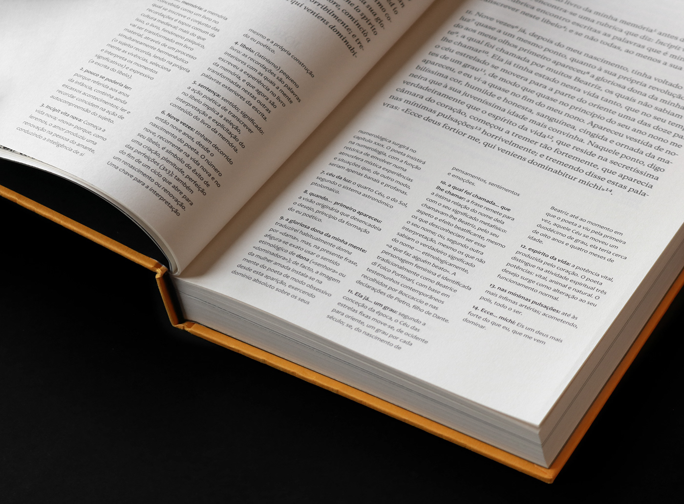
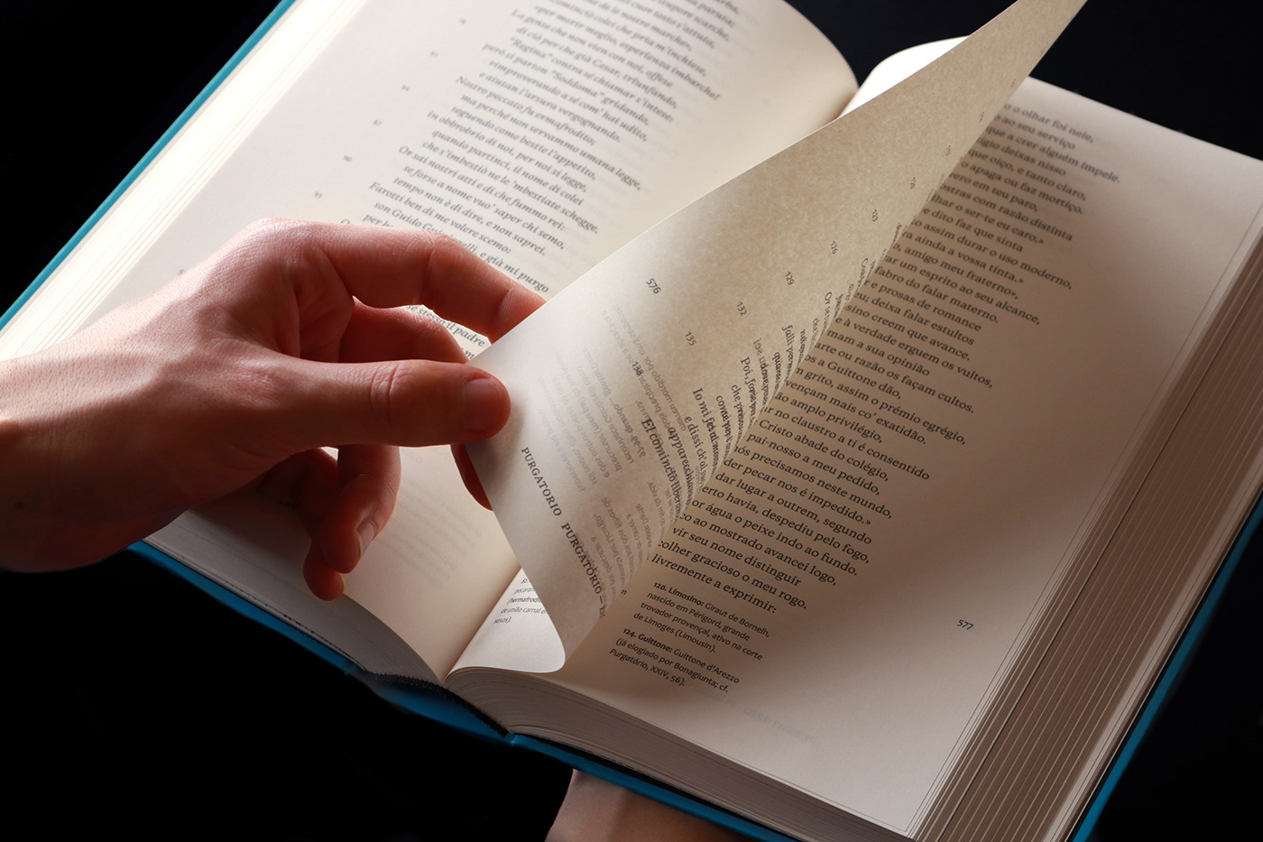
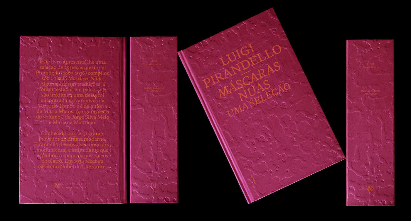
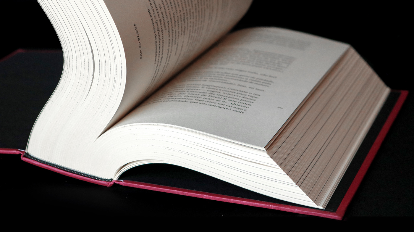
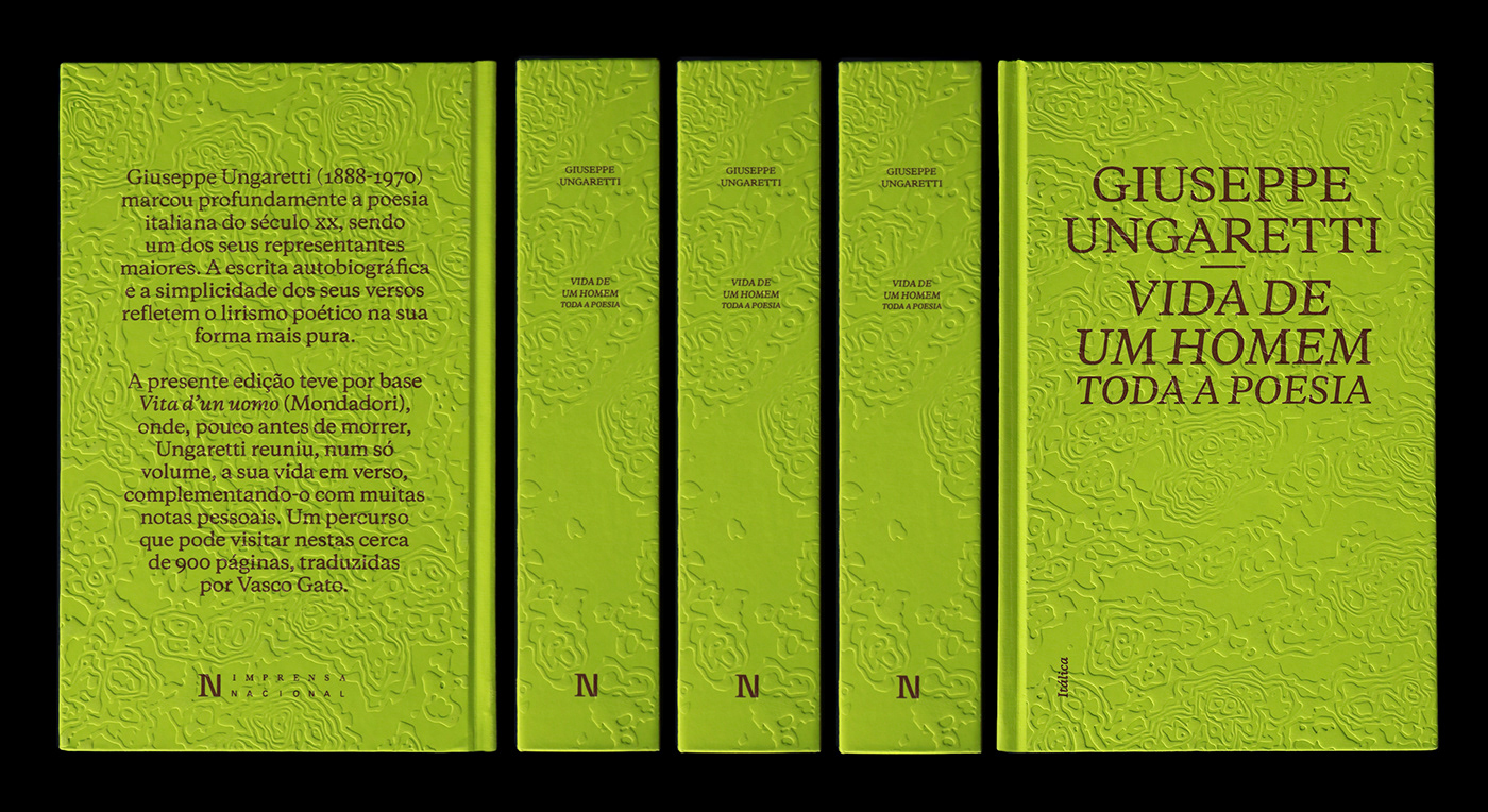
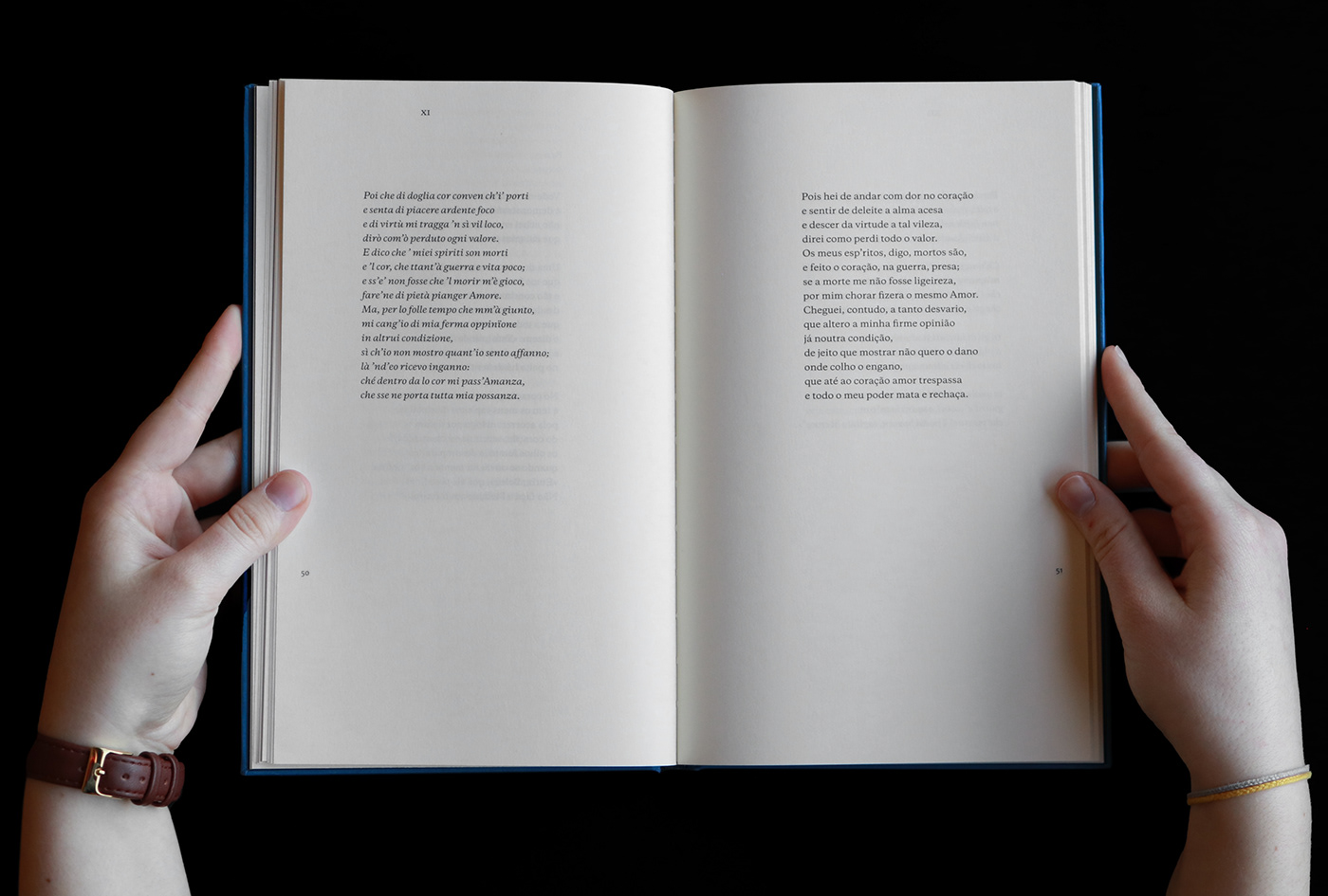
To this effect – and starting with typography –, we settled on the typeface Galaxie Copernicus, itself based on Aldus Moretius’ work. Also in tandem with sixteenth century printing, only the roman and italic cuts were used, discarding bold cuts, all at the same body size. Hierarchies between paratexts are achieved by typographic notation and case, not by colour.
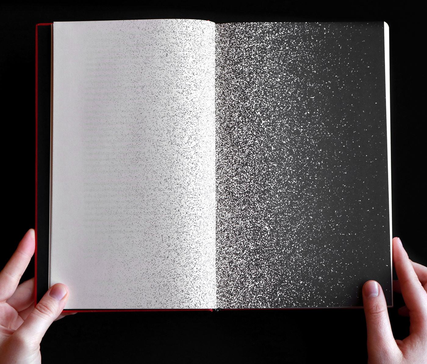
Transitions between sections rely on the metaphor of a theatre play’s curtain swipes, as well as the fade in and out of light. For this effect, we developed software to produce vector gradients that emulate mezzotints grain, modulating each dot in shape, amplitude and frequency.
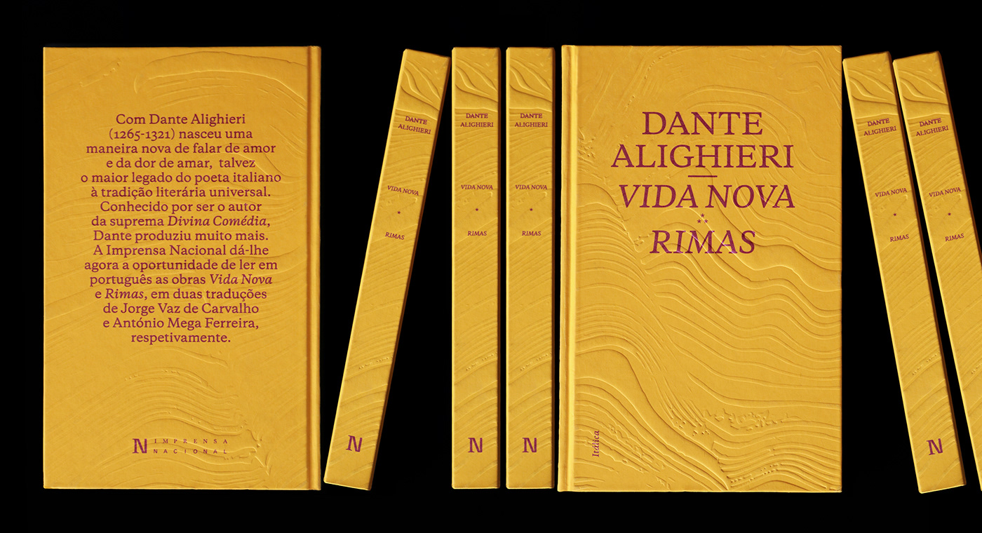
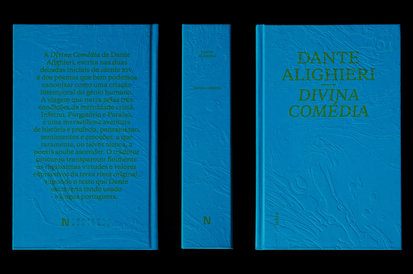
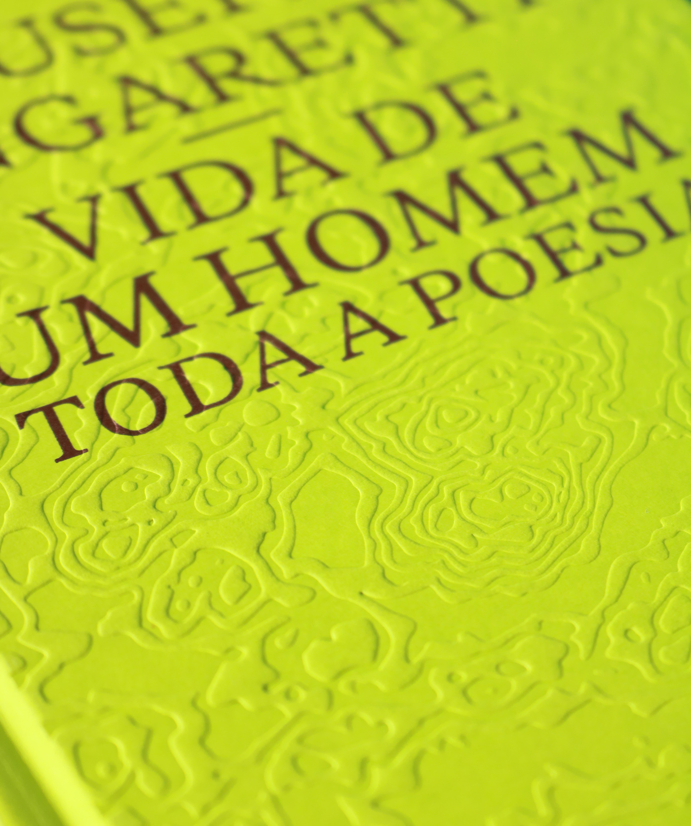
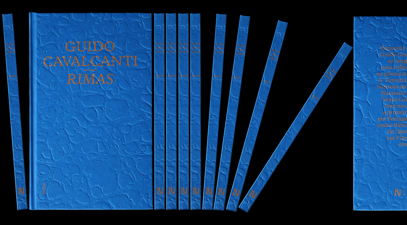
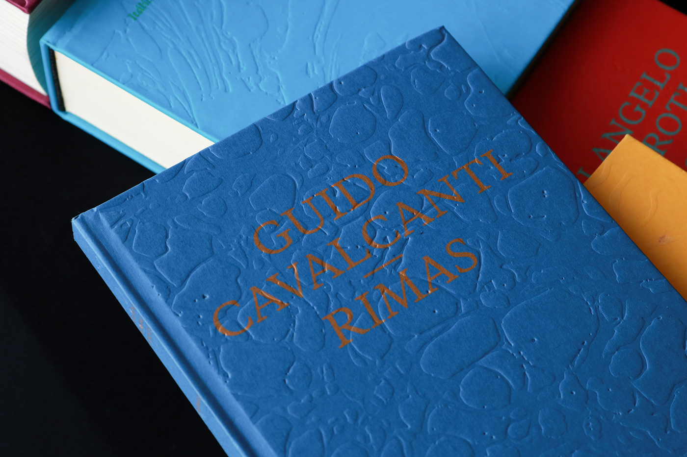
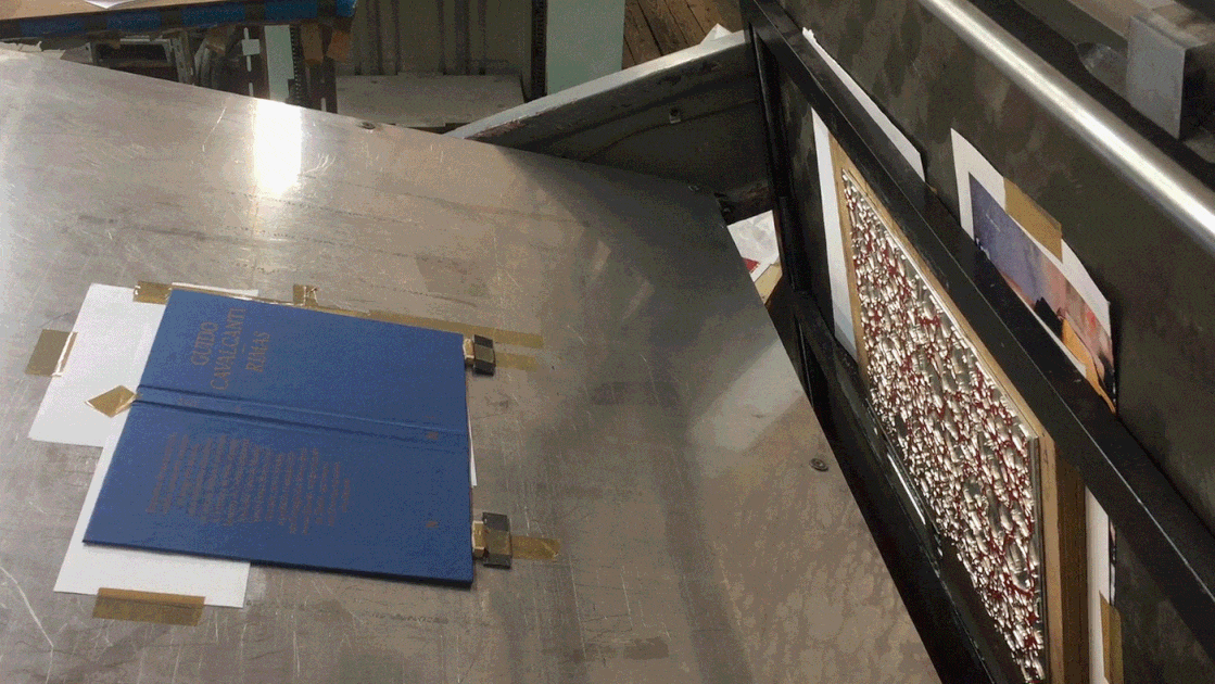
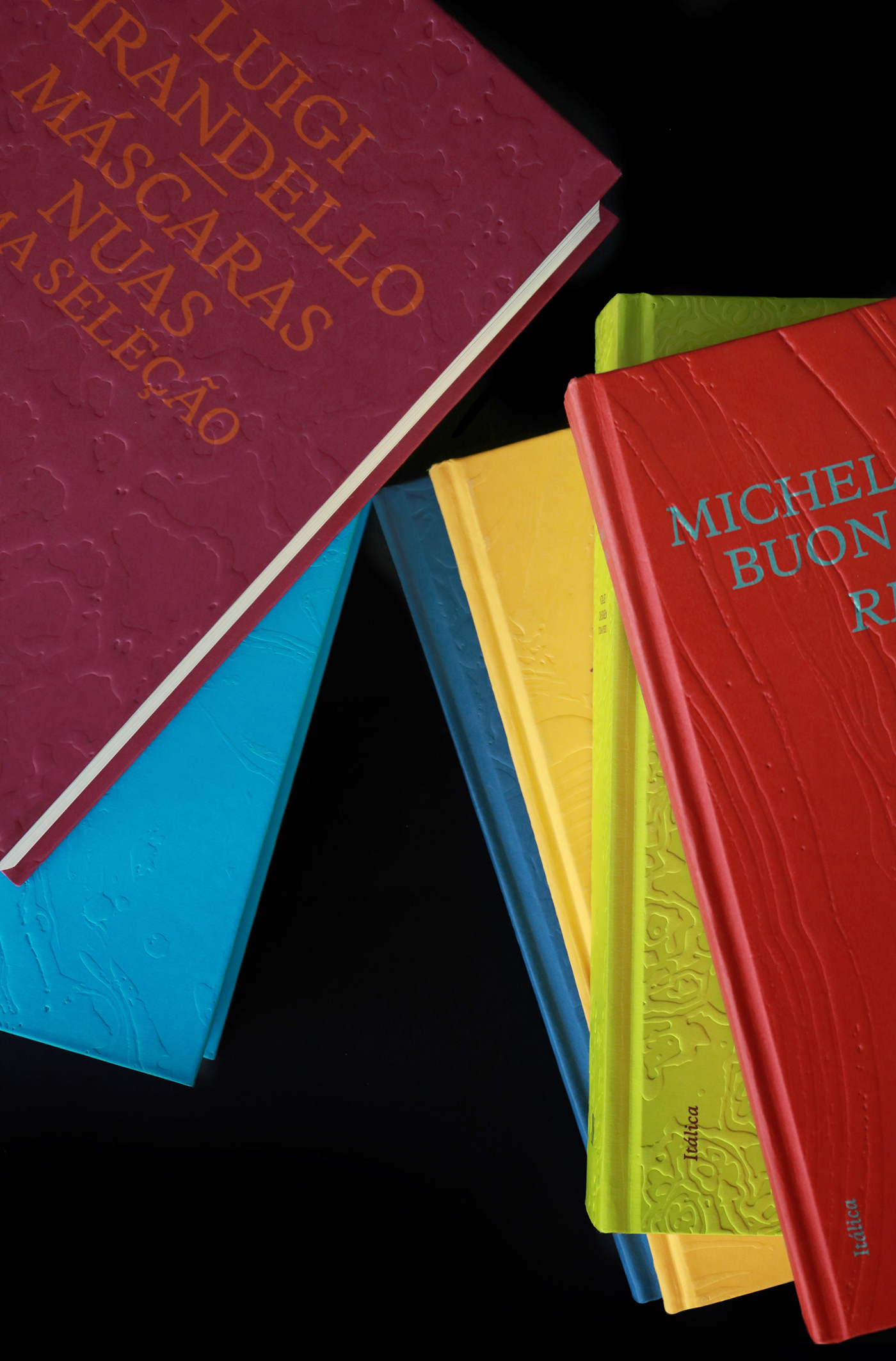
The approach to the covers was two-fold: graphic and tactile. Graphic elements are analogues of early Venetian printing, inspired by frontispieces and Roman monumental writing. The covers’ embossings are marbled paper textures, converting visual information to a tactile one.


Collection Title Itálica
Books
Dante Alighieri — Divina Comédia (Poetry, 992 Pages);
Luigi Pirandello — Máscaras Nuas: Uma Seleção (Theatre, 1472 Pages);
Giuseppe Ungaretti — Vida de um Homem (Poetry, 848 Pages);
Dante Alighieri — Vida Nova*Rimas (Poetry, 384 Pages);
Guido Cavalcanti — Rimas (Poetry, 72 Pages);
Michelangelo Buonarroti — Rimas (Poetry, 688 Pages).
Publisher IN – Imprensa Nacional
Date 2020/2021
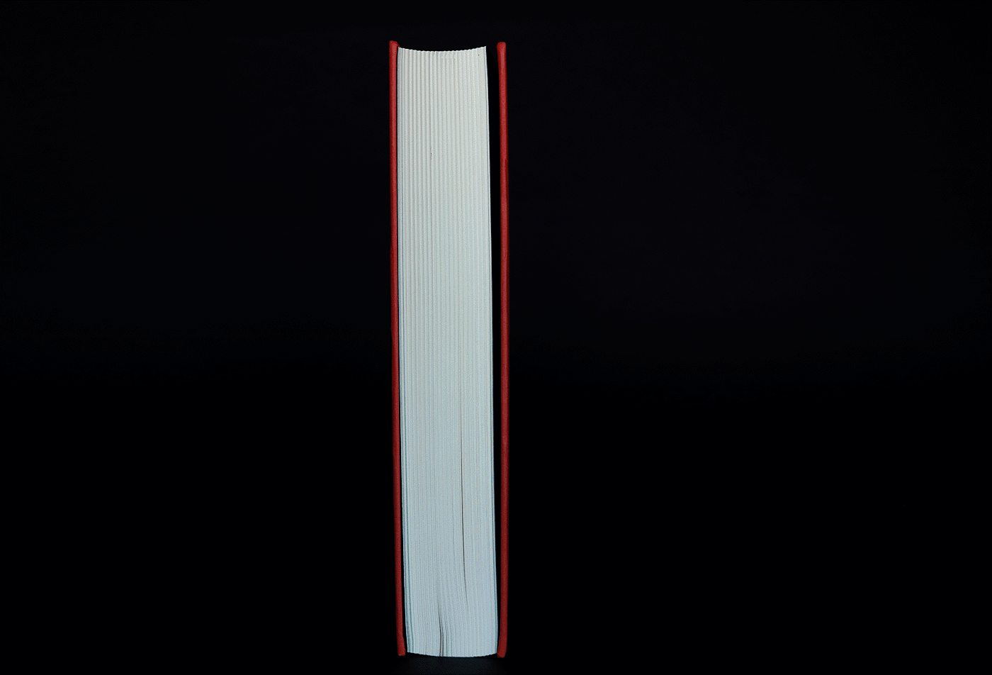
Format 145×245 mm
Binding Smith Sewn
Cover Traditional flat spine hardcover,
Print Screenprinted metallic inks over coloured paper


