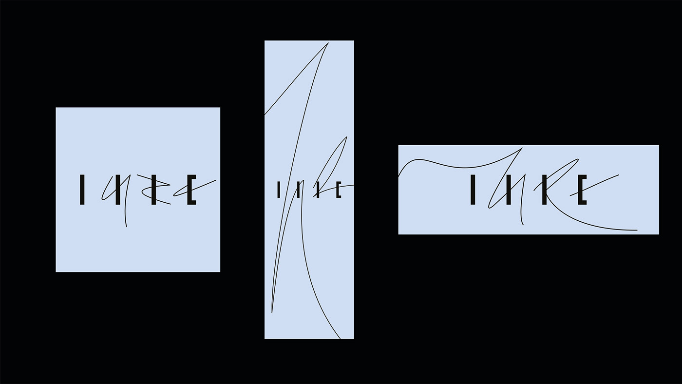
A logotype for Dubai based woman led luxury real estate agency and lifestyle gallery LURE is remarkably feminine. It takes inspiration from abstract dance movements presenting a metaphor of a tempting whirl around a dream space – a beautiful house.
Glyphs of the name were deconstructed into steams reminiscent of an architectural structures and expressive free flowing curves complete the logotype with its signature energy.
Hight contrast of elements is a trait of a strong woman character. Aesthetically logotype is a twist on an authentic Arabic script.
Glyphs are deconstructed into bare steams and completed with curves. By removing straightforwardness we created mysterious symbol of luxury that can be used as a key graphic throughout any medium or application, yet it still states the name of the brand for those who are in the know.
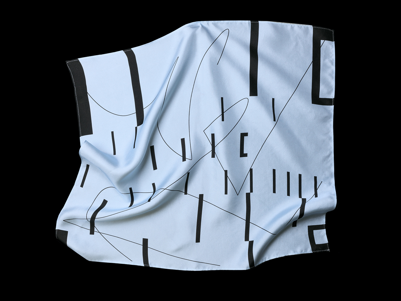
Bold steams serve as metaphor of walls of the house while curves represent tempting life energy in between them.

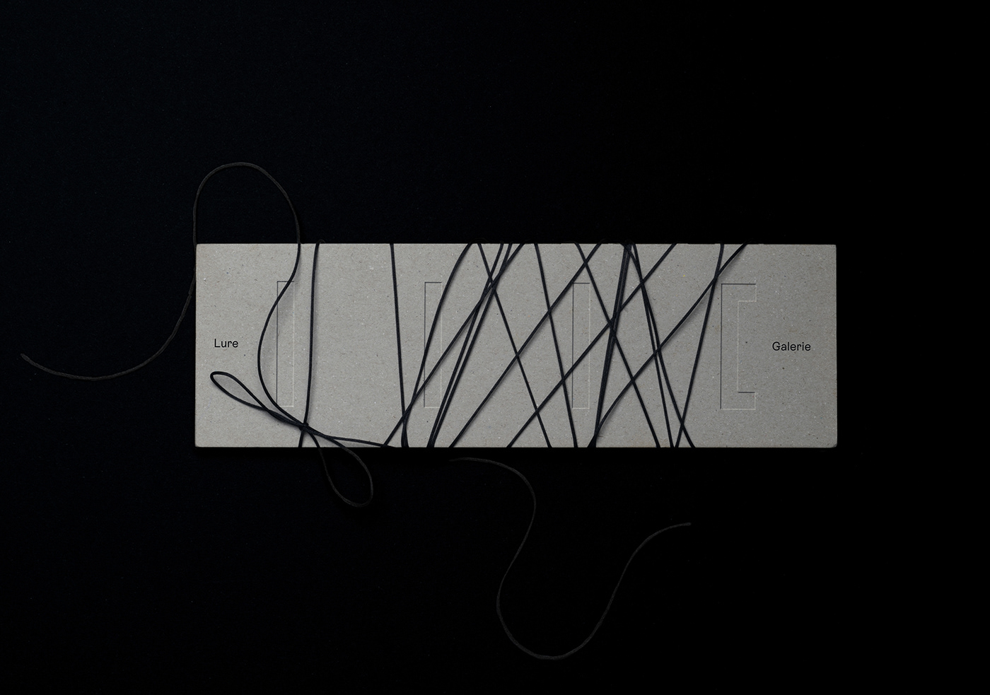
It is flexible. It evolves from compact symbol into spacious graphics for stationary, versatile digital formats, patterns and beyond.
Brand identity colour palette composed with sky blue, sparkling gold, concrete grey, black and white cloud-like textured Conqueror Contour paper creates tranquil atmosphere.
Typesetting emphasises movement via spacing between blocks, remaining minimal with sizes and styles. The font ES Rebond Grotesque is used.