

( BRAND NARRATIVE ) ( BRAND IDENTITY ) ( PACKAGING DESIGN )
Tequila 125
In the heartland of Mexico, the town of Tequila harvests its lush agave fields to create the full-flavoured spirit it is famous for. To reach this renowned place you must drive through the beautiful landscapes down Highway 125. There you will find generations of families who are committed to preserving the traditional methods of tequila production passed down through the centuries. It is here we find the story for our rebrand of Tequila 125.


(THE SOLUTION)
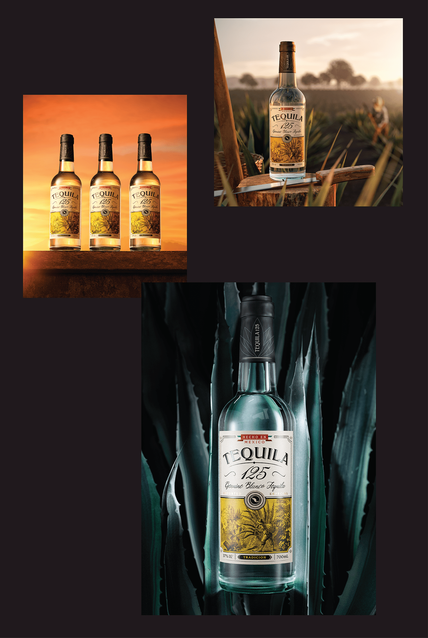
The label design plays out the story of a lone agave farmer, meticulussly harvesting his crop. Through a customary etched illustration, the encompassing agave landscape around him is captured. A wash of vivid yellow brings warmth and stand out when on shelf.
The brand marque typography was crafted at scale to provide more impact, whilst supporting lettering heightens the elegance in first impressions. Intricate detail and assets that reflect the rich cultural heritage of Mexico are added to evoke the spirit of Tequila town and its history. Ultimately delivering a design that helps the tequila liquid exceed expectations and exude craft.