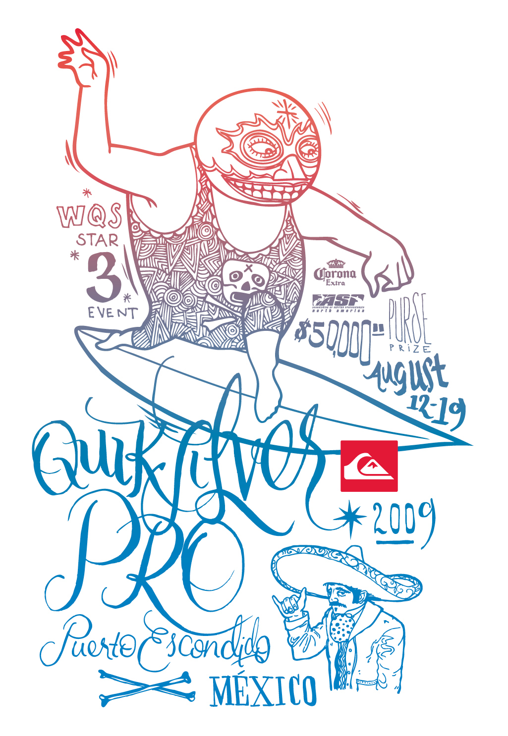
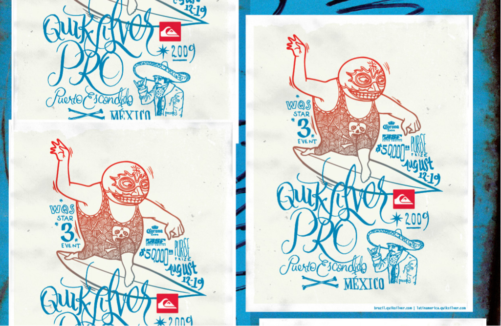
Quiksilver Pro Puerto Escondido
An art package was created to convey the heaviness and history of Puerto Escondido in Mexican surfing, while still being relevant for Quiksilver. The resulting poster was silkscreened in a traditional two-color gradient and wheat-pasted around the city. Wheat-pasting was carried through to print ads, event signage, web, TV and product. A limited-edition set of 250 posters was available for sale online and at the event.
poster size: 18" x 24", uncoated white paper.
typography: natas kaupas
illustrations: randy noborikawa
art director: scott richards
printer: graham street press
This poster is part of the AIGA 365: 31 permant collection.

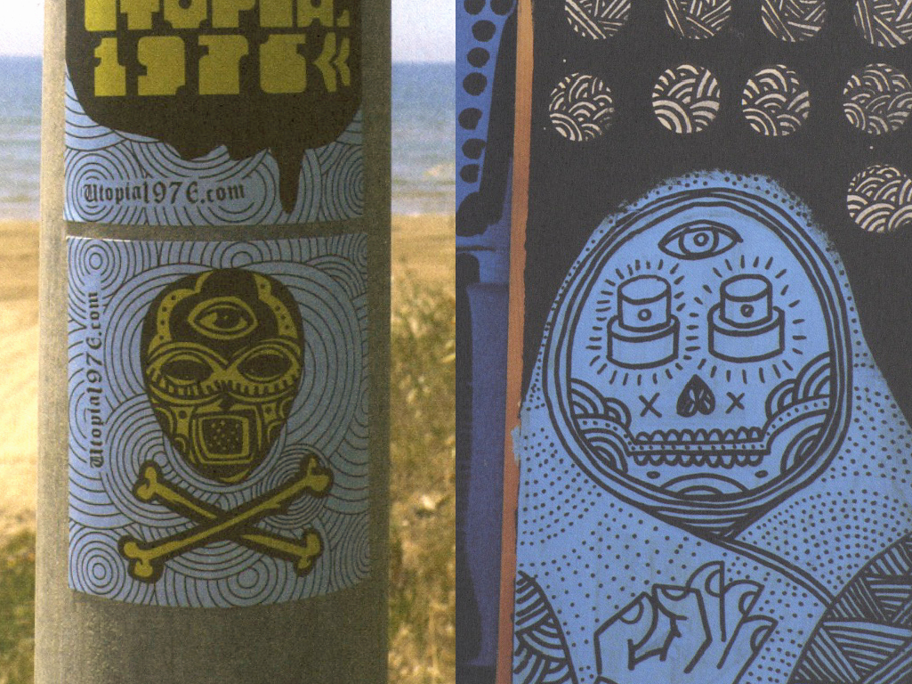
Inspiration tears:


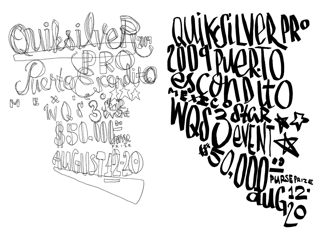
A few of the early type sketches and poster comps:
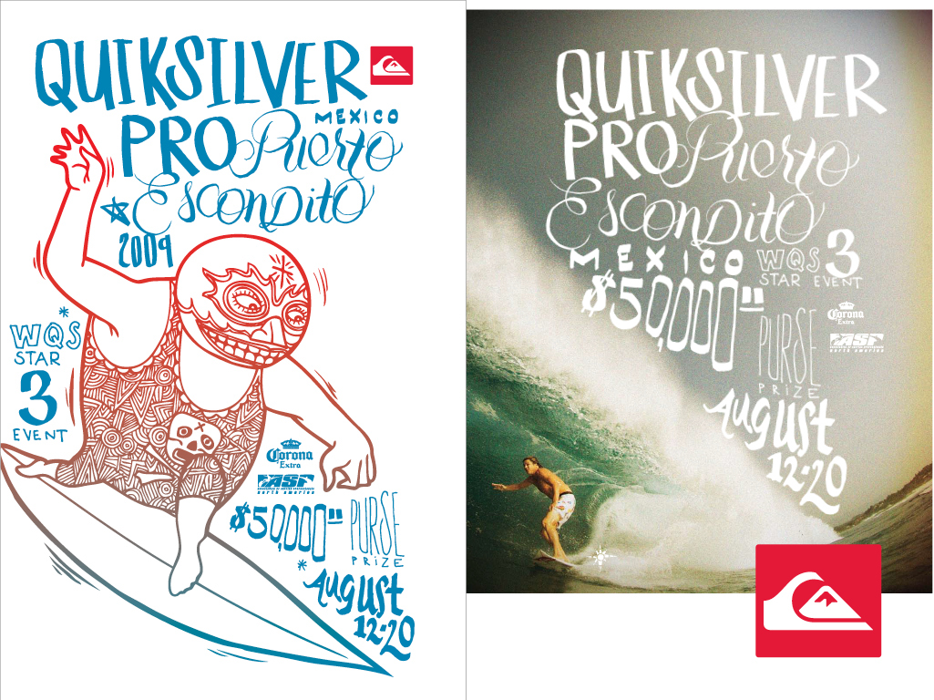
250 18" x 24" posters were hand silkscreened in a traditional two-color gradient
magazine ads:
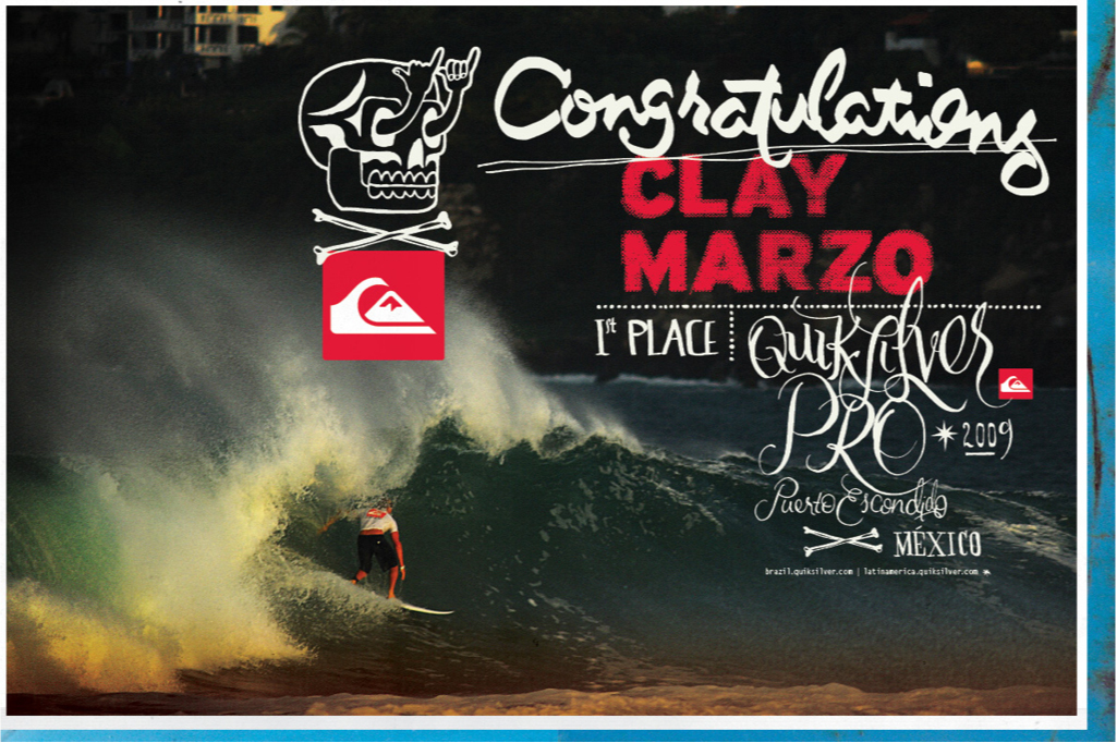
Adiós Amigo


