Clarest Health
Challenge: ProCare LTC was an institutional pharmacy provider with a proven track record of compassionate caring as they provided patients with their proper medication, on time and at a fair price.
ProCare saw an opportunity to both embrace technology and expand beyond the community it was serving—institutional long-term care facilities—to directly serve patients transitioning from skilled nursing facilities and rehab to homecare, and patients managing chronic disease at home.
By adopting a new master brand, the company could better communicate its new offerings to existing clients while signaling a change to the broader market, generating greater awareness.
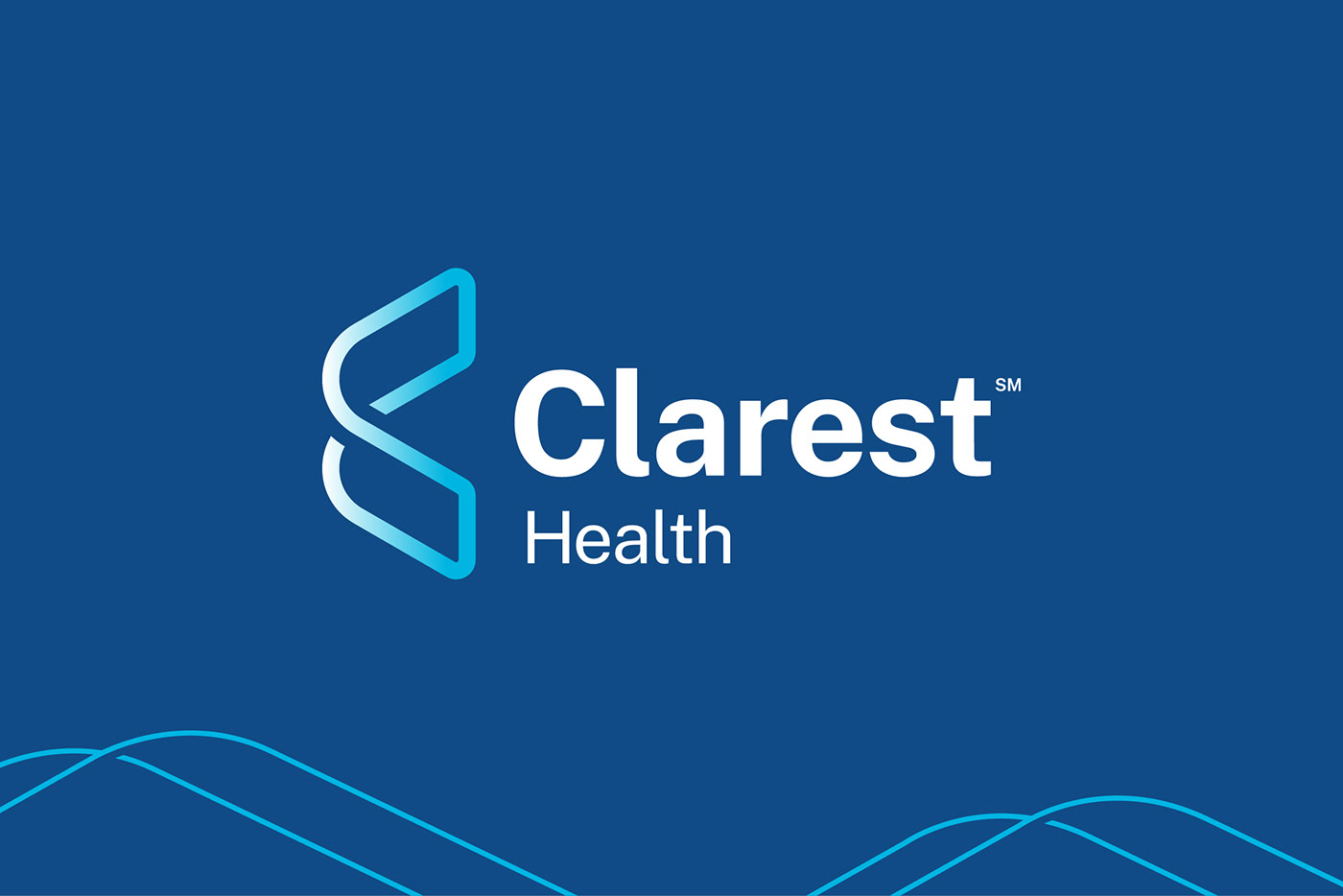
Solution: Our team developed a new name, Clarest, and implemented a master brand to support their current and future growth opportunities. Clarest—a simple but bold new name—combines the words clarity and best, attributes that are essential from a medication provider.
The Clarest name was then expressed by the creation of a new visual identity. A modern C symbol simultaneously suggests Clarest’s powerful integrations, connectivity, and a pair of wings taking flight—which is symbolic of the peace of mind patients gain through Clarest-provided medication management.
Agency: Sustena Group
Role: Creative Director / Designer

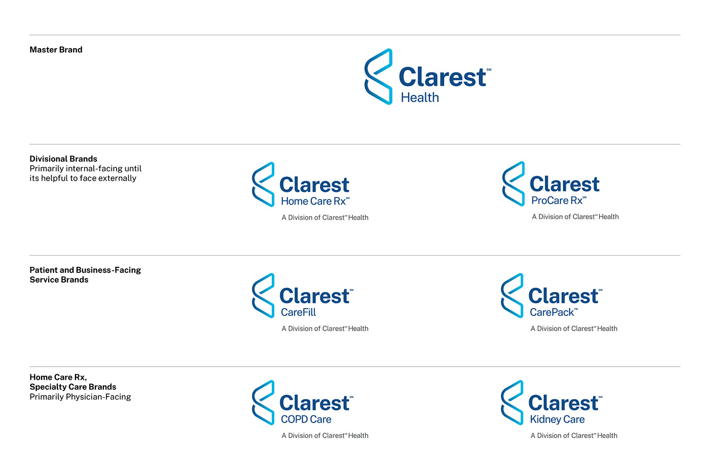
Clarest brand architecture
Clarest adopted a master brand strategy and a tiered brand architecture that highlighted Clarest’s divisional brands—creating internal unity—while also focusing on patient-facing service brands, and physician-centric brands and offerings.