


RE-BRANDING GRENADA
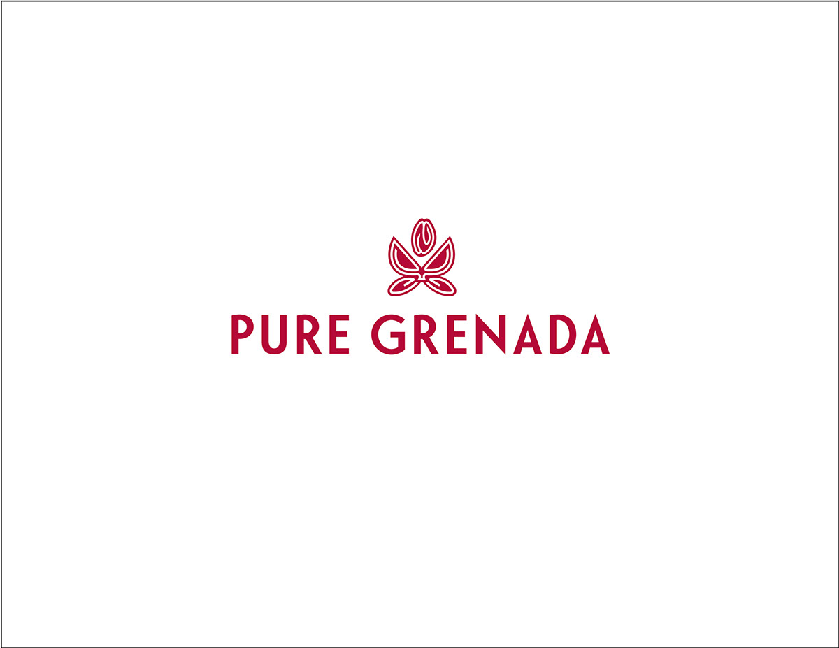
The new brand identity reflects the island's deep ancestral heritage, while still encapsulating the heart of the nutmeg — which has been the backbone of the island's trade and export.
Paired with a nautically inspired typeface, 'Le Havre', this icon of the jewel of the Caribbean is also composed of an interpretation of a Fabergé egg case opening.
The honest, untainted beauty of the people and place inspired the feeling of being "free to wander" and "free to wonder".
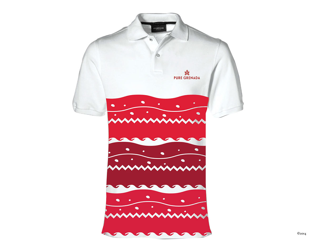
Three brand property patterns represent the three-island state - Grenada, Carriacou and Petite Martinique - with lush hills and nature, fragrant nutmeg spice that fills the air and the pristine waters.
Paired with a nautically inspired typeface, 'Le Havre', this icon of the jewel of the Caribbean is also composed of an interpretation of a Fabergé egg case opening.
The honest, untainted beauty of the people and place inspired the feeling of being "free to wander" and "free to wonder".
Three brand property patterns represent the three-island state - Grenada, Carriacou and Petite Martinique - with lush hills and nature, fragrant nutmeg spice that fills the air and the pristine waters.
Company: Inglefield/Ogilvy and Mather Caribbean
Head of Design: Tanya Marie
Associate: Blayne Clarke
grenadagrenadines.com
Head of Design: Tanya Marie
Associate: Blayne Clarke
grenadagrenadines.com
……………………………………………………………………………………………………………………………………………………………………
Design Studio: studiotanyamarie.com


