


This UI project is a response to a design challenge: "Redesign an Ideal Classroom Experience". My chosen experience is a shared student wood shop in the Industrial Design department at the Rhode Island School of Design. As a student that uses the shop myself, as well as a monitor, the goal of this project is to improve and streamline the experience in the wood shop, both for the students and the monitors.
My research process began with listing out my assumptions and personal experiences as a student and a monitor before interviewing the shop users. This process allowed me to realize my biases that I may have when going into the interview process.

Initial assumptions and personal experiences

Interview responses. Credits to (students) Stacia Seetoh, Victoria Liang, Palmy Vilailuck, Robin King, (monitors) Amy Zhu, Charlotte LaPee, Amy Qu, Jasmine Xu, Lauren Glenn, and Mark Johnston.
From the interview responses, observations, and personal experience, I created an experience map for students and monitors, listing all the actions and the details, including the goals, interactions, pain points, and solution opportunities.

The common pain points between most students and monitors are the sign-up sheet being analog (printed sheets of paper in a binder), as well as the shop being too crowded and unorganized. I decided to create a mobile app solution that includes the following feature-set:
- A sign-up sheet page for the lathes.
- A communication platform for students, monitors, and technicians.
- A schedule/calendar page for classes and appointments.
- A check in/check out system.
Wireframe
Testing & feedback for the wireframe:
- Notifications and announcement can be combined into one page.
- The schedule page should be on the navigation bar.
- Include the wood classes schedule.
- The monitor names should be relocated.
- Notifications and announcement can be combined into one page.
- The schedule page should be on the navigation bar.
- Include the wood classes schedule.
- The monitor names should be relocated.

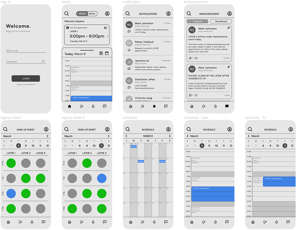
High fidelity prototype
Testing & feedback for high fidelity prototype:
- The sign-up sheet layout is visually pleasing, but it could be unintuitive for some. Instead it could be a drop-down system (like booking a flight or a movie ticket).
- The app is nice and simple, with only the necessary functions!
- The announcement page could use some of the coral color to differentiate the text hierarchy.
Please click HERE to view a working Figma prototype!
(Click on the play button on the top left to try the app.)


