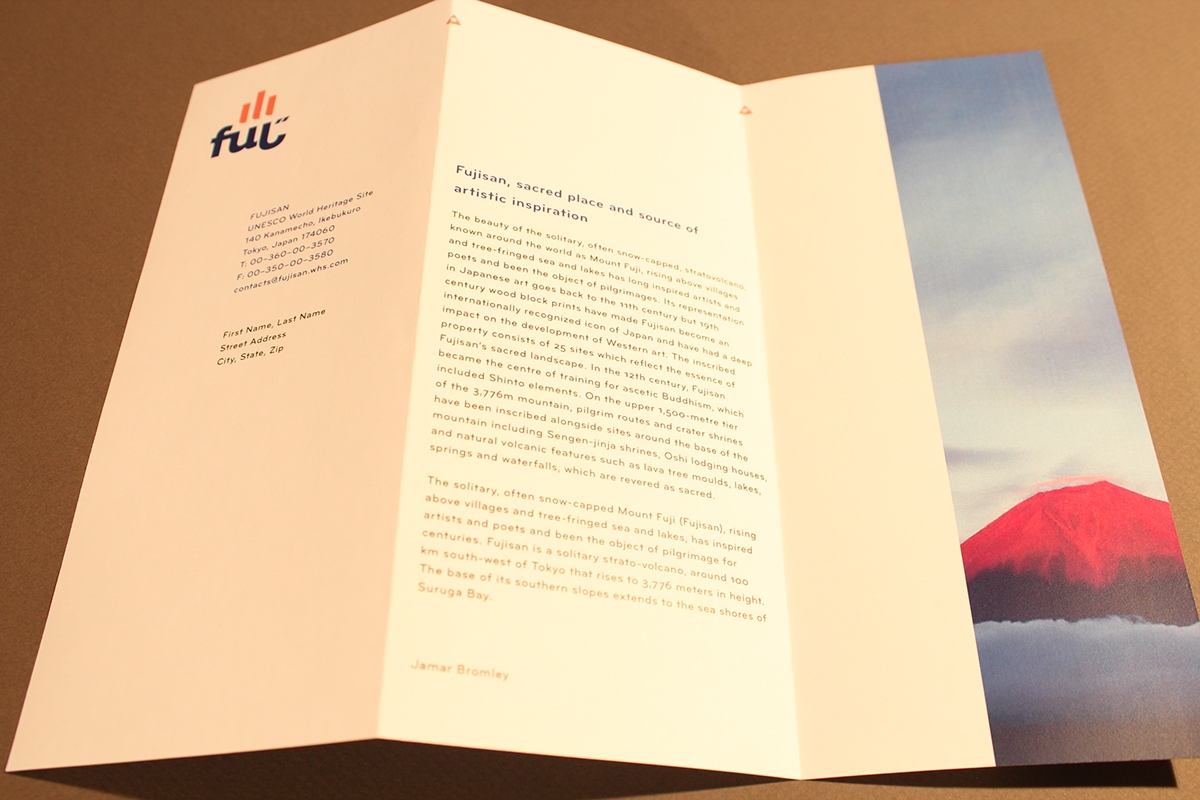
For this project, I was tasked with branding a UNESCO World Heritage Site. I chose Mount Fuji and therefore, looked upon the natural beauty of not only the landscape and the volcano, but of the Japanese language itself. Japanese uses Kanji which are slightly modified (simplified) Chinese characters. These characters are both quintessentially abstract and simple. The natural beautfy and simplicity of the Chinese character for mountain, 山 (san), contains everything that I needed to make a striking logo identity. With a few modifications to the basic qualities of the letter, I was able to create a symbol both unique and familiar.
As for the logotype, I used a typeface Pluto, designed by Hannes von Döhren, due to its thickness of stroke and its playful nature. Instead of spelling Fuji in only roman letters, I took the second syllable of Fu-ji and used the Japanese Hiragana character; however, I used the letter J to represent it. Therefore, the logotype is this interesting fusion of both Japanese and English and the optical qualities of the letters creates a strange fusion that's quite powerful and attractive. I wanted both Japanese and English readers to see and read the logo in both languages without quite realizing that it is indeed two languages.


A fictional New Yorker Advertisment


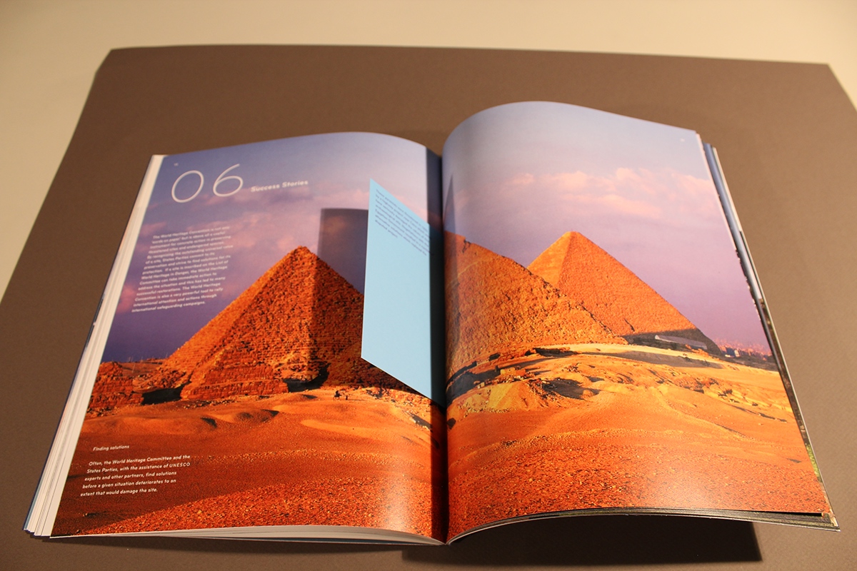
This UNESCO World Heritage Booklet also includes information on sites around the world that are in danger of destruction or effacement, in addition to sites that have recovered due to conservation efforts.