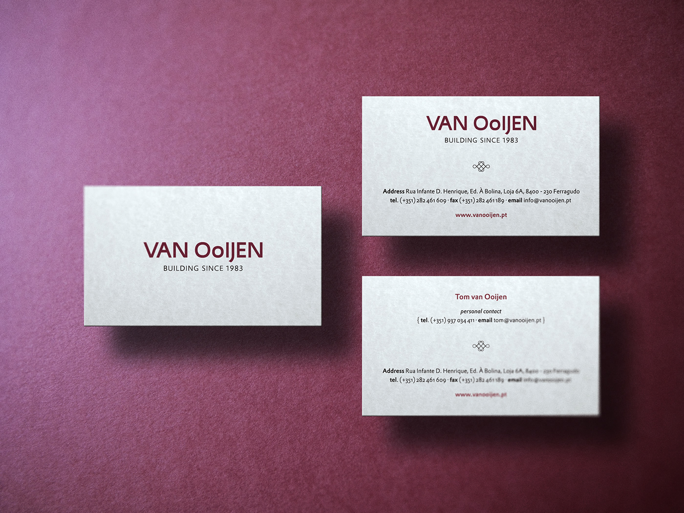
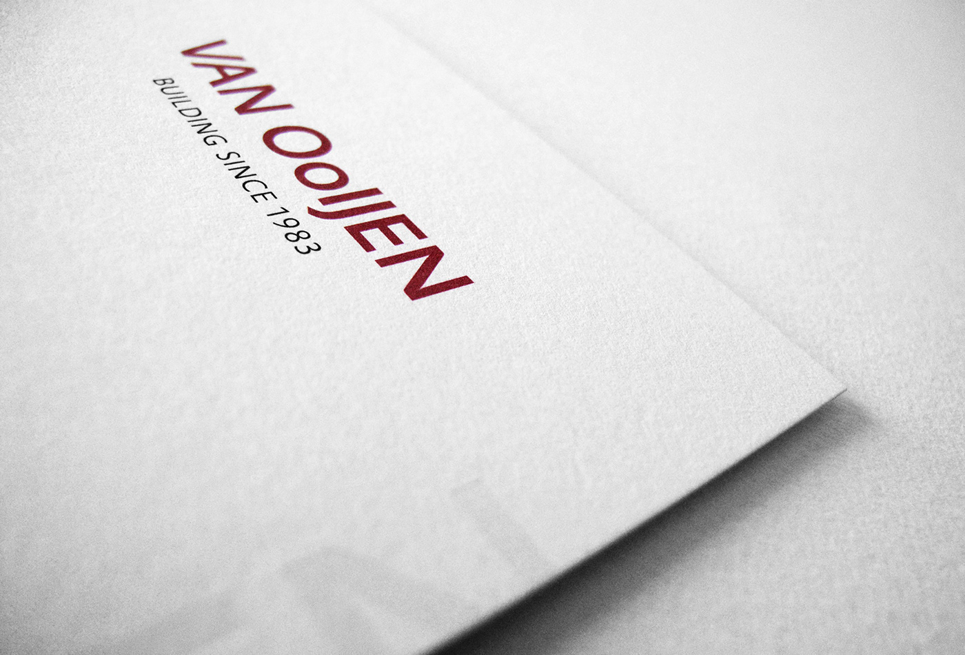
Van Ooijen
Redesign a visual identity for an architecture and luxury homes construction business with more than 30 years of existence.
The vision was to create a clean and sober graphic system with a high-class feel. One that also had the strength to survive in a commercial and competitive environment as a brand.
We designed a typographic composition to identify the brand. The wordmark will be the central element of all the company's graphic identity. We selected a typeface that well expresses the characteristics and values of the company.
The result was the born of a strong, elegant, and secure visual narrative representing the brand's mission and purpose.
Client
100% Noir
Location
Algarve, Vilamoura
Role
Creative direction & Visual Identity