MIC SUB-BRANDS LOGO DESIGN
The MIC has evolved and so has its activities and programs. After the re-branding of the organization, the team of the MIC decided that it was time to change the image of all the activities and programs of the company.
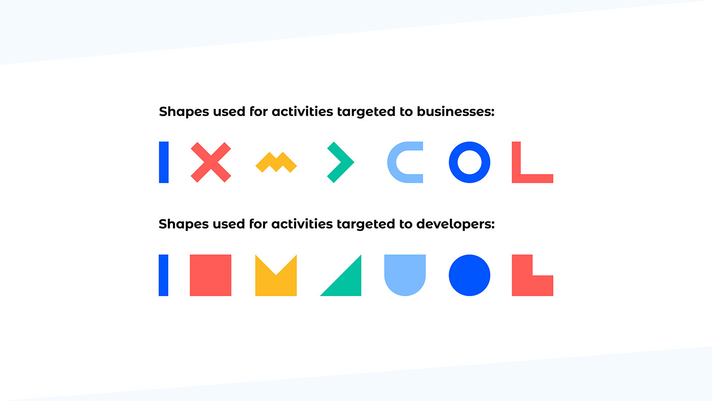
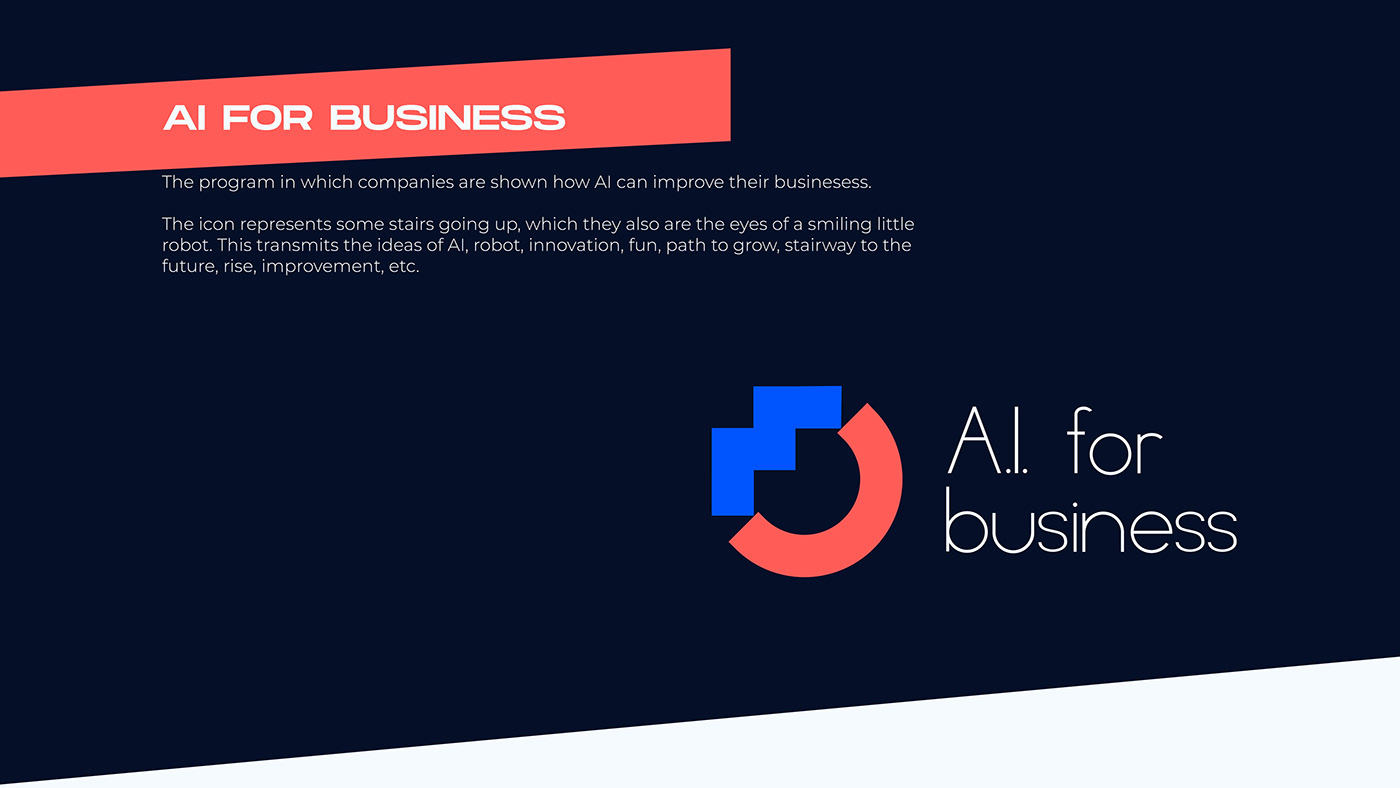
Therefore, I created a whole icon language using the shapes and colors of the main logo, which helped me to design and choose isotypes for each sub-brand that transmit their mision, vision and values.
This way, all MIC's image is homogeneous, with similar shapes and colors, creating a very professional, corporate and modern looking overall identity.


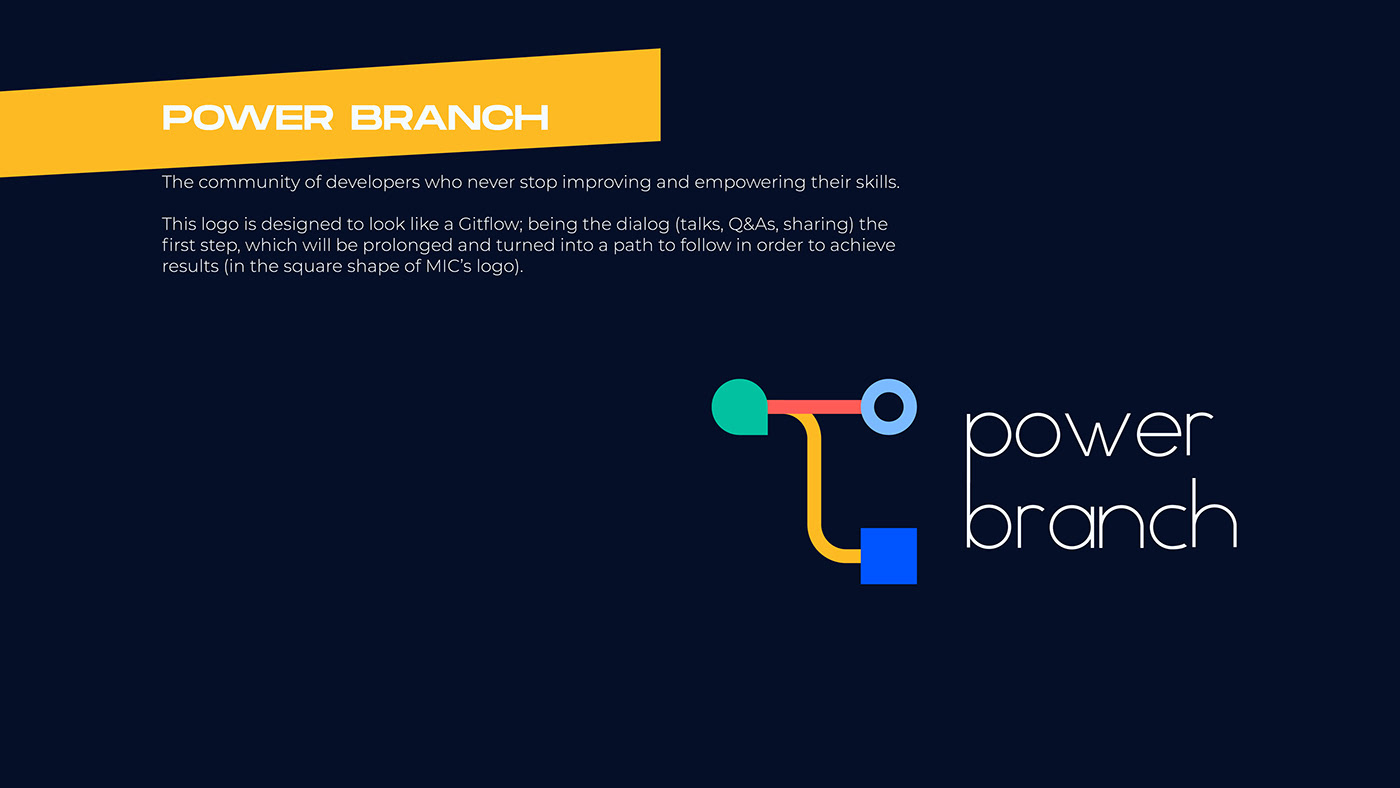

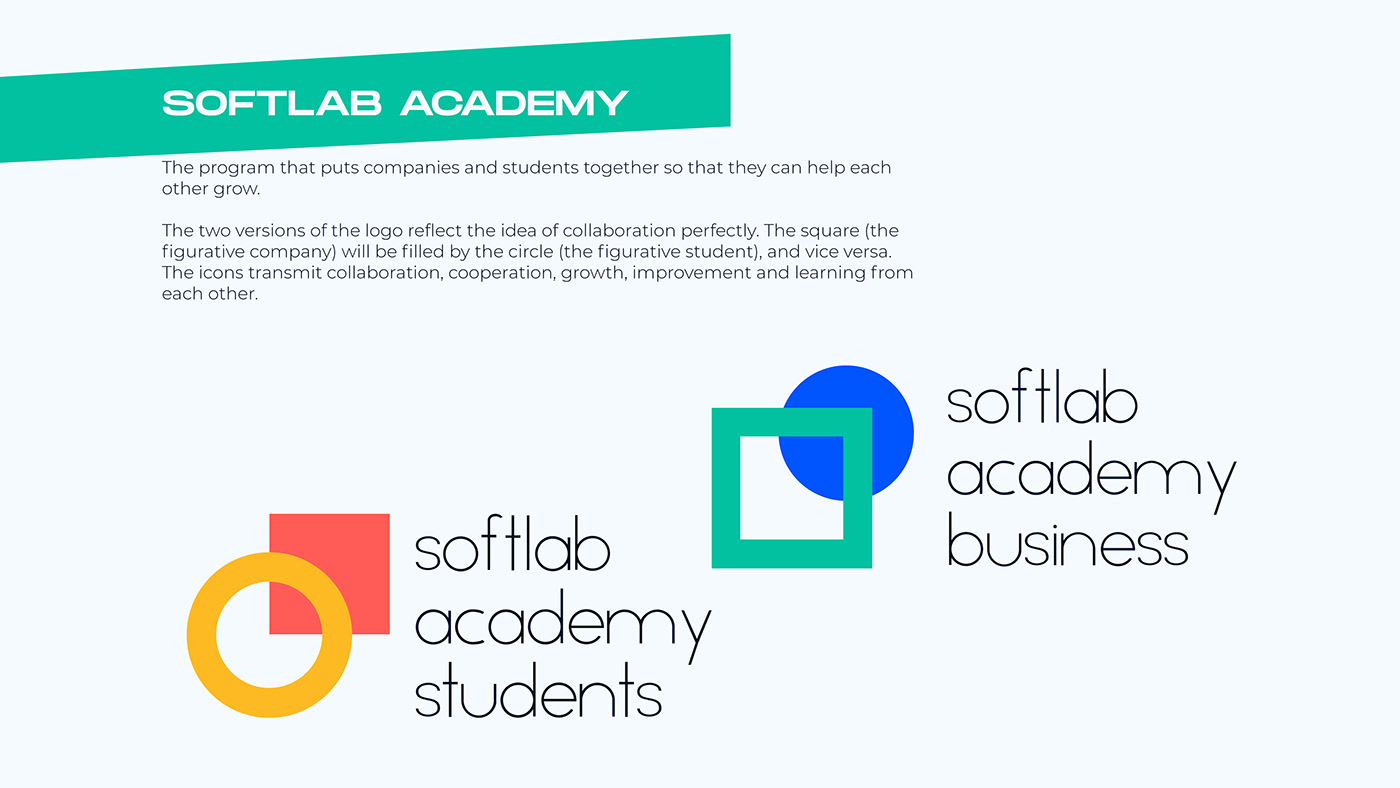
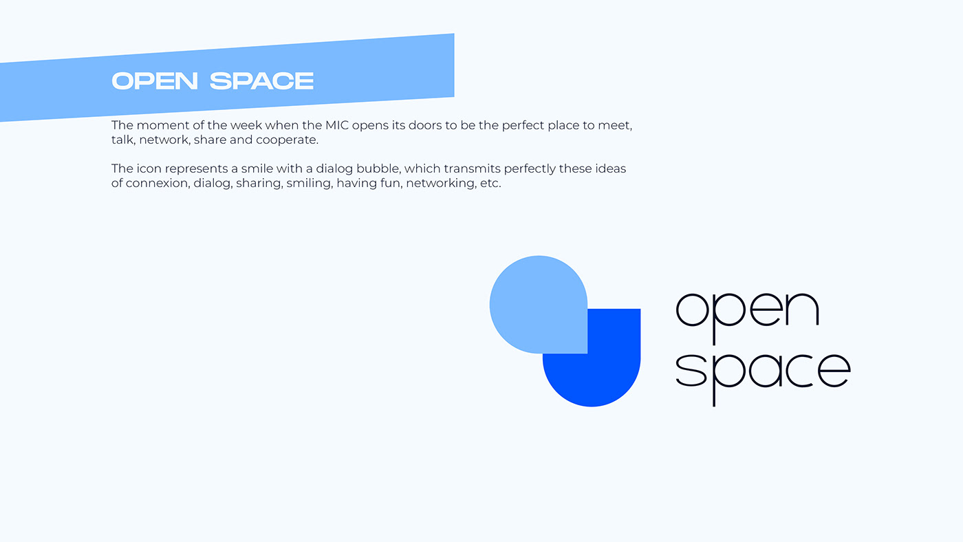


All these logos embrace perfectly MIC's new corporate image. The company's communication now looks more homogeneous, professional and modern.