


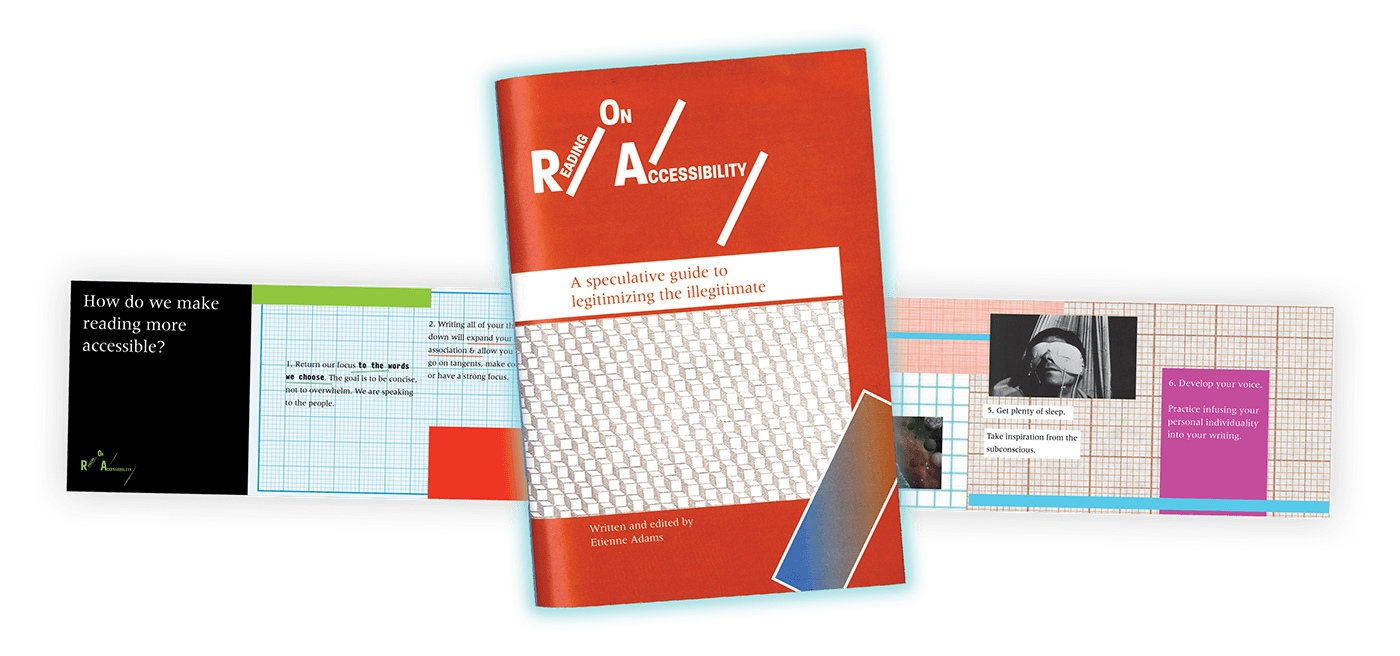
Reading on Accessibility is a short guidebook that questions the ways in which we process and transmit information and experiences. It makes the argument that intelligence shouldn't be defined by the density of your writing but rather its degree of humanity. That by focusing less on what and how we're saying it, and more so on just saying something to begin with, we open ourselves up to more avenues in a stream of consciousness sort of way, legitimize the illegitimate, and solidity the product of our everyday lives.


The accordion book format is meant to tie back to the idea that we read words in lines of text. And that instead of doing that hundreds of times throughout a page or a book, why not extend the format of a line to a single idea at a time.


The traditional book format, despite being a book, is not traditional in its content. Each spread is treated with a new layout meant to reflect the subjects discussed. The type is big, and spaced out, to give readers room to breathe and actually process thoughts in real time. The bold, bright color palette is meant to insight excitement, and the use of Meridien as the typeface takes inspiration from the natural world, being based on Adrian Frutiger's examination of plant & bamboo anatomy.


