EN
Talo is first of all a young company. The intention is to offer comfort, convenience and quality of life to our customers, with foods made from real ingredients. A great taste in products that will make the routine lighter and easier.
"We will work with transparency in all areas, from the choice of ingredients, the preparation and the final product".
-Nicolle Portugal, Owner.
-Nicolle Portugal, Owner.
One of the strong features of the company will be the take-away service. It is a practical way to keep the routine. There will be monthly plans to buy executive lunches, for example. Besides, it will be a sales point for local entrepreneurs.
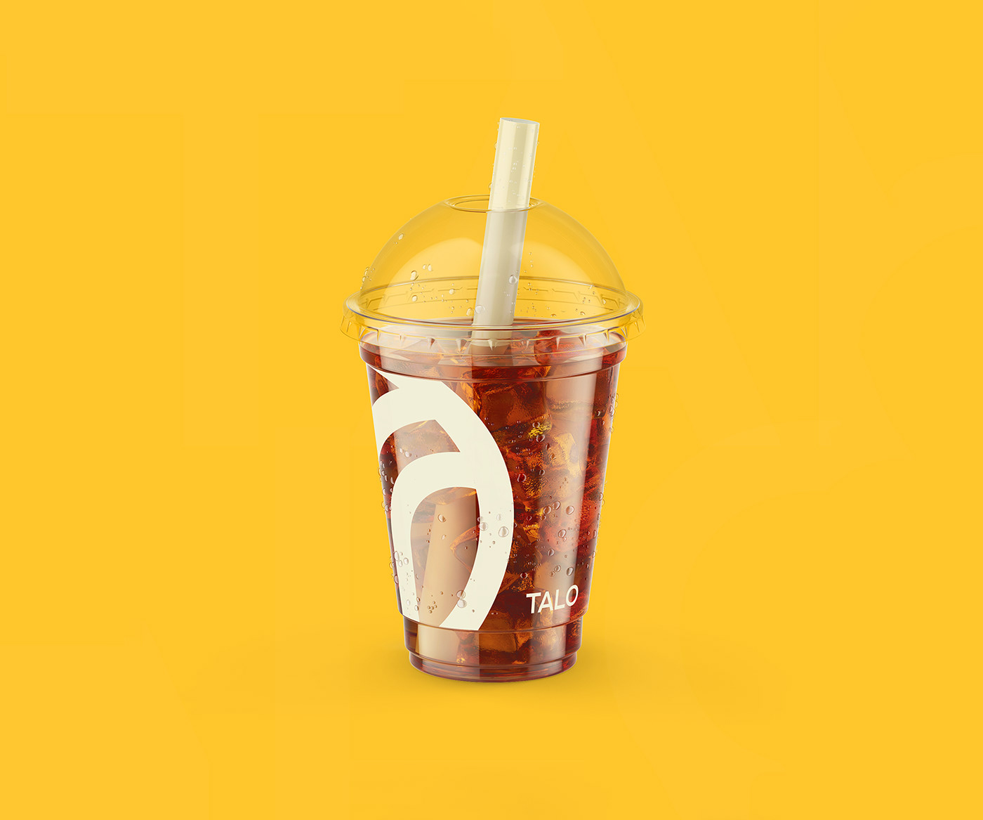
The chromatic palette is alive and present. Each color was selected aiming to be in agreement with the attributes of the brand, making a balance between the cheerful and the young, without making it childish. At the first moment, the main colors will be yellow,"flamingo" orange and white/off-white. The goal is to make this identity strong with those colors, especially yellow.
-
PT-BR
Talo é acima de tudo uma empresa jovem. O intuito é oferecer conforto, praticidade e qualidade de vida para nossos clientes, com comidas feitas a partir de ingredientes de verdade. Muito sabor em produtos que vão deixar a rotina mais leve e fácil.
"Iremos trabalhar com transparência em todos os âmbitos, desde a escolha dos insumos, o modo de fazer e a preparação até chegar ao produto final."
-Nicolle Portugal, Proprietária.
Uma das fortes características da loja será o serviço de take-away. É um caminho prático para manter a rotina. Haverão planos mensais para compra de almoços executivos, por exemplo. Além disso, será um ponto de vendas para empreendedores locais.
A paleta cromática é viva e presente. Cada cor foi selecionada visando estar em concordância com os atributos da marca, fazendo um balanço entre o alegre e o jovem, sem torná-la infantil. No primeiro momento, as principais cores serão o amarelo, o laranja "flamingo" e o branco/off-white. O objetivo é tornar essa identidade forte com tais cores, principalmente o amarelo, cor nº 1 da marca.

EN
I used as inspiration for the brand symbol a vegetable stalk. The stalk is the beginning. The stalk is the first part of the plant to expose itself to the sun. The stalk is the origin. The interlacing on the symbol represents the birth, the growth, the sowing.
Seeking to make it more unique, I made the cut in a way that is represented not only a stalk, but also the letter T, initial of the brand. To make the logo as uniform and geometric as possible, I used only circles and straight lines in the construction, creating a strong and memorable symbology.
-
PT-BR
Utilizei como inspiração para o símbolo da marca o talo de um vegetal. O talo é o início. O talo é a primeira parte da planta a se expor ao sol. O talo é o princípio de um alimento que vai evoluir para ser consumido pelo mundo. O entrelaçado no símbolo representa o nascer, o crescer, o semear.
Buscando torná-lo mais único, fiz o corte de forma que é representado não só um talo, mas também a letra T, inicial da marca. Para tornar o logo o mais uniforme e geométrico possível, utilizei na construção apenas círculos e linhas retas, criando uma simbologia forte e memorizável.