
Quotient
BUSINESS DASHBOARD
One of the projects I designed since working at Quotient is an internal analytics dashboard for the executive team. Note: I’m displaying dummy data in these mockups.
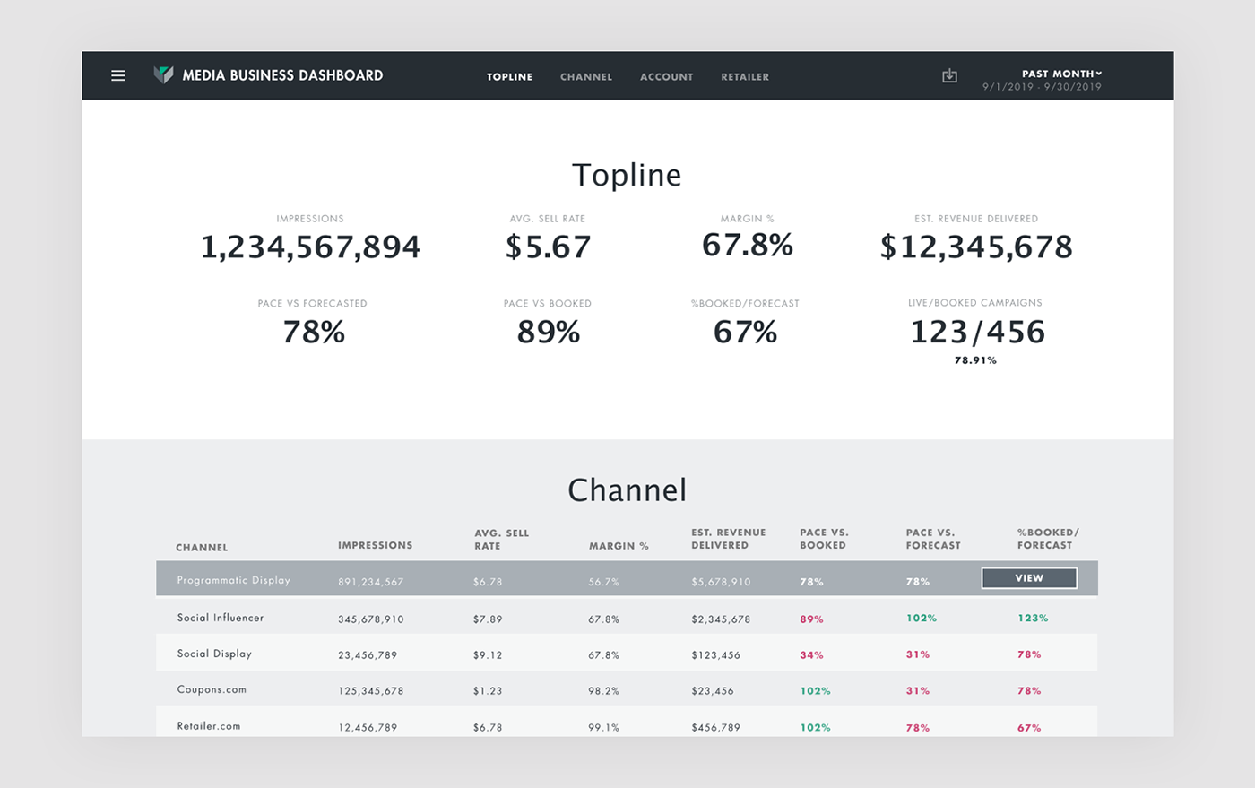
TOPLINE METRICS
The topline metrics display performance data across the whole media department. Answering the job: at a glance how are we performing.
GRANULAR DATA
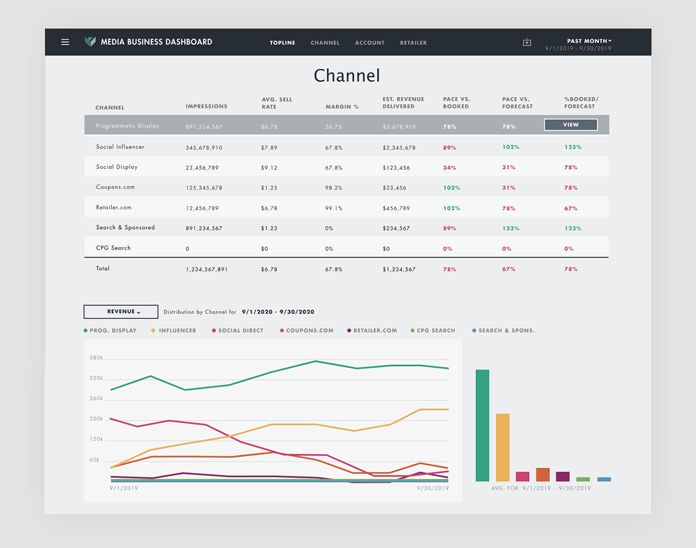
More granular data is presented in a table showing how the individual channels are performing. Below the table is a graph with the ability to view key metrics over time across the revenue channels.

CHANNEL PAGE
Each channel also has its own page with even more granular data describing how the channel is performing in detail.

VISUALIZATIONS
Initially when I designed the business dashboard it had a lot more data visualizations. However working through the stakeholder feedback, I realized what the executive team actually wanted was raw data cleanly displayed. It also took a couple rounds of feedback to land on the correct metrics to display.


