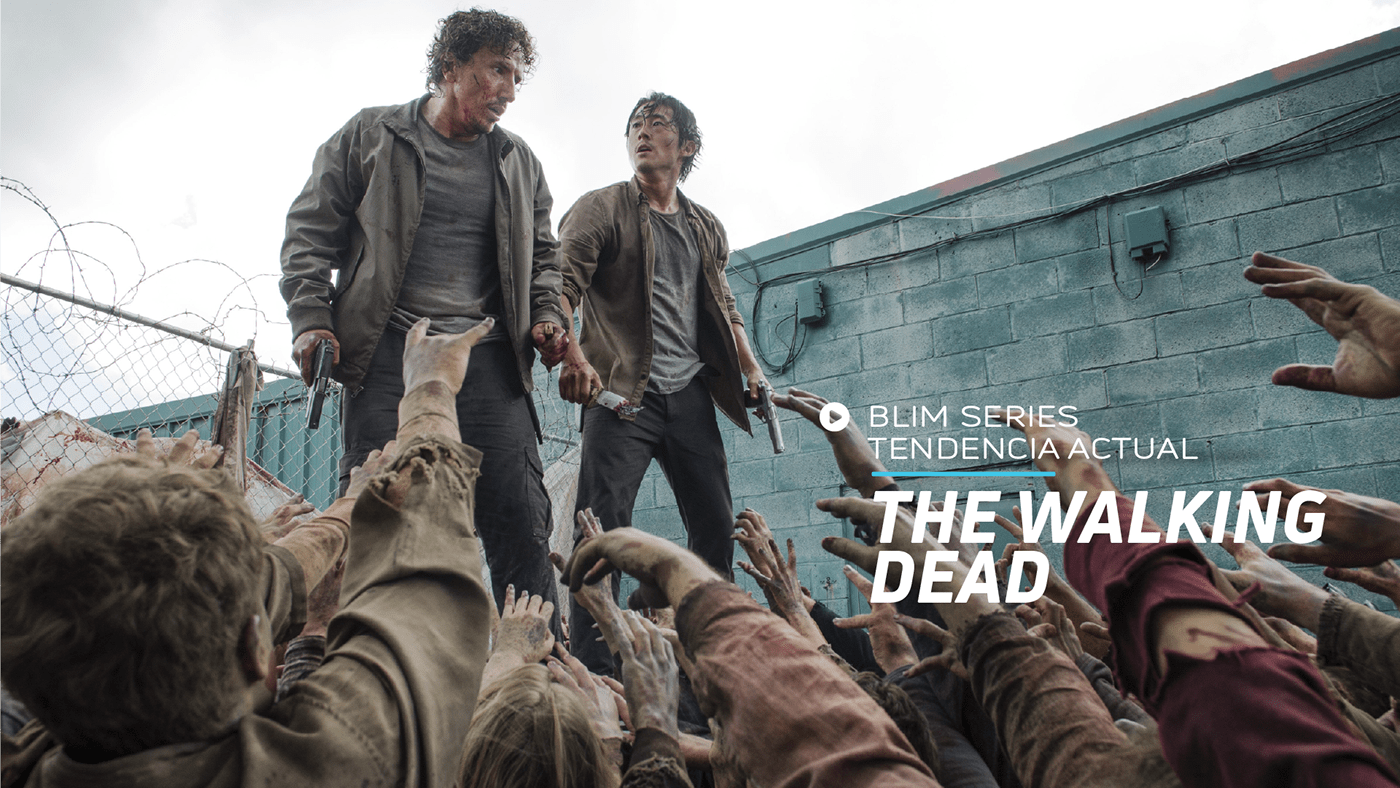
Another project that I had to define an art direction, make the still frames and polish the previous image that this brand had.
The main idea was to use something very simple, clean and objective. "Things as they are". And with it everything else using the outline of the brand shapes that are round in their contours.
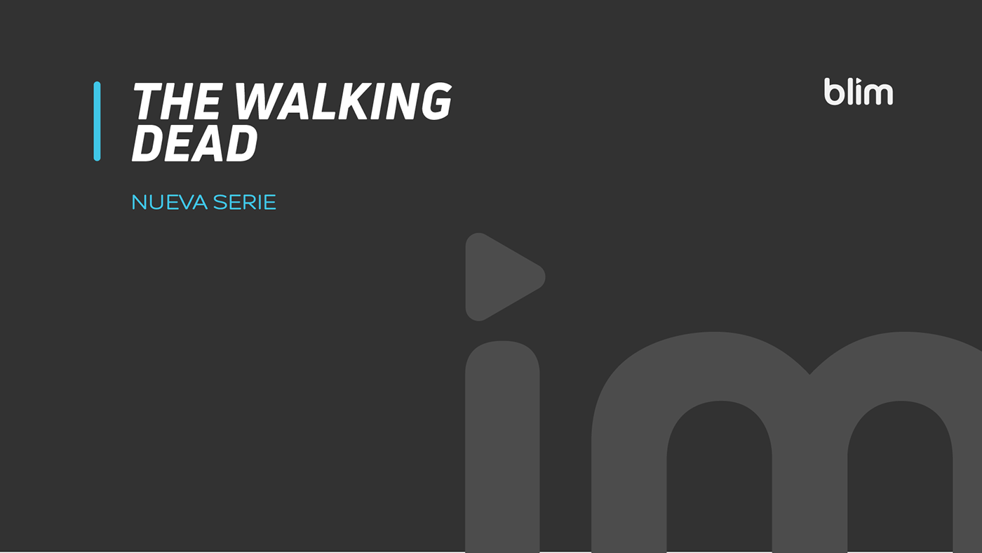
I decided to propose using the last 2 letters of their logo, to strengthen the brand under the pretext of "I`m Blim". And try to establish an identity with greater strength and better appearance.
This idea was proposed for a launch that would take place in 2017. In the end it did not take place due to customer decisions.